Nerd plus Dork=Nork Font
Free for Commercial UseAbout
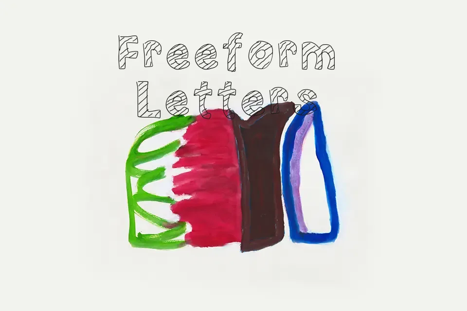
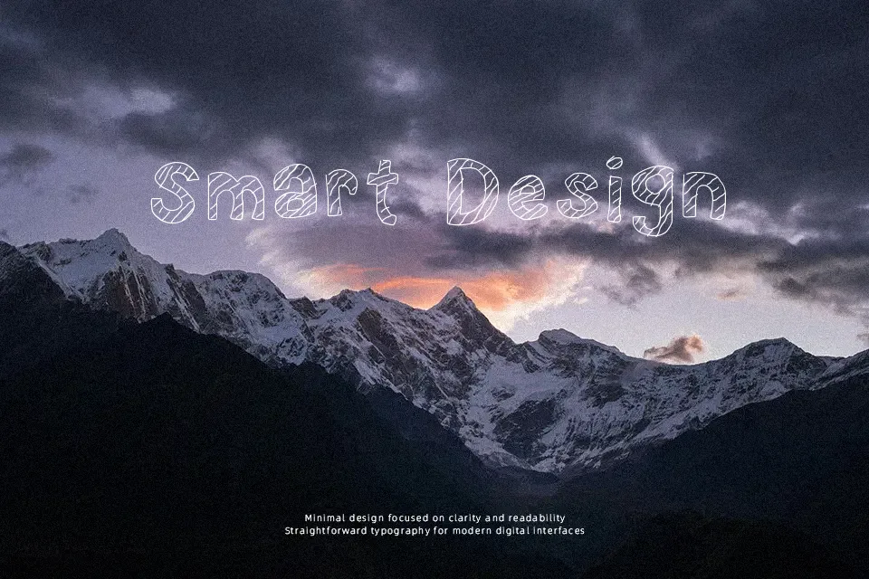
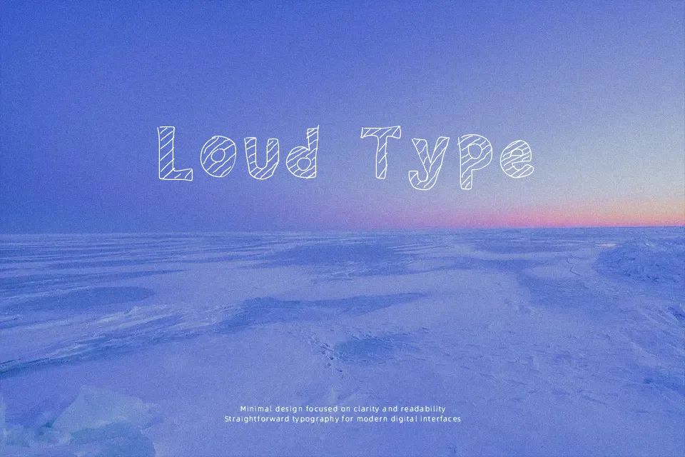
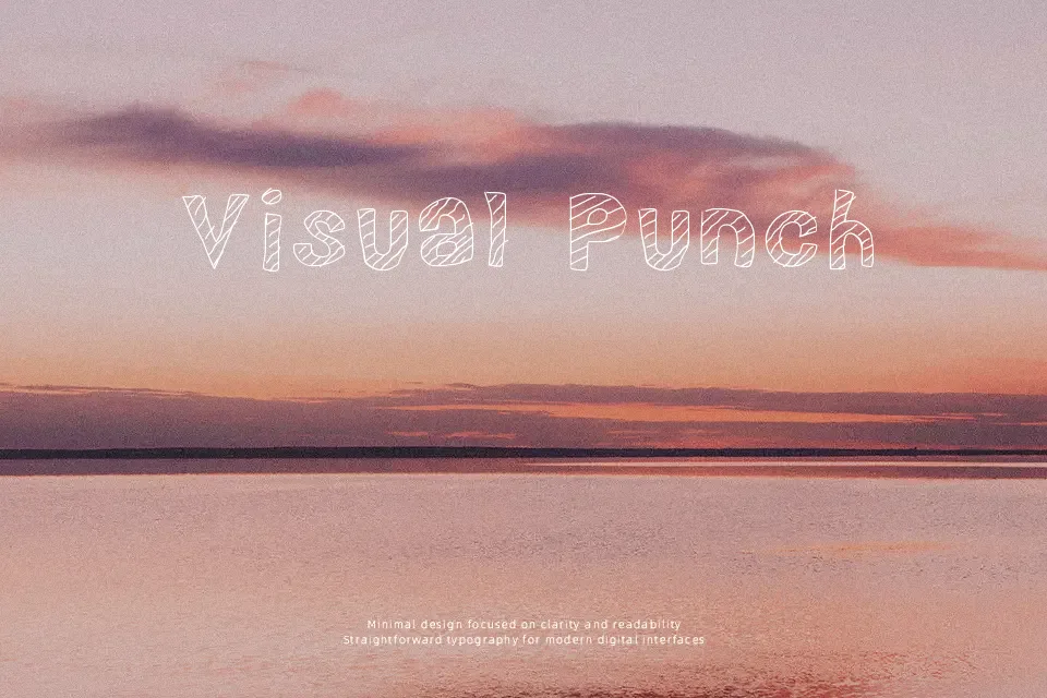
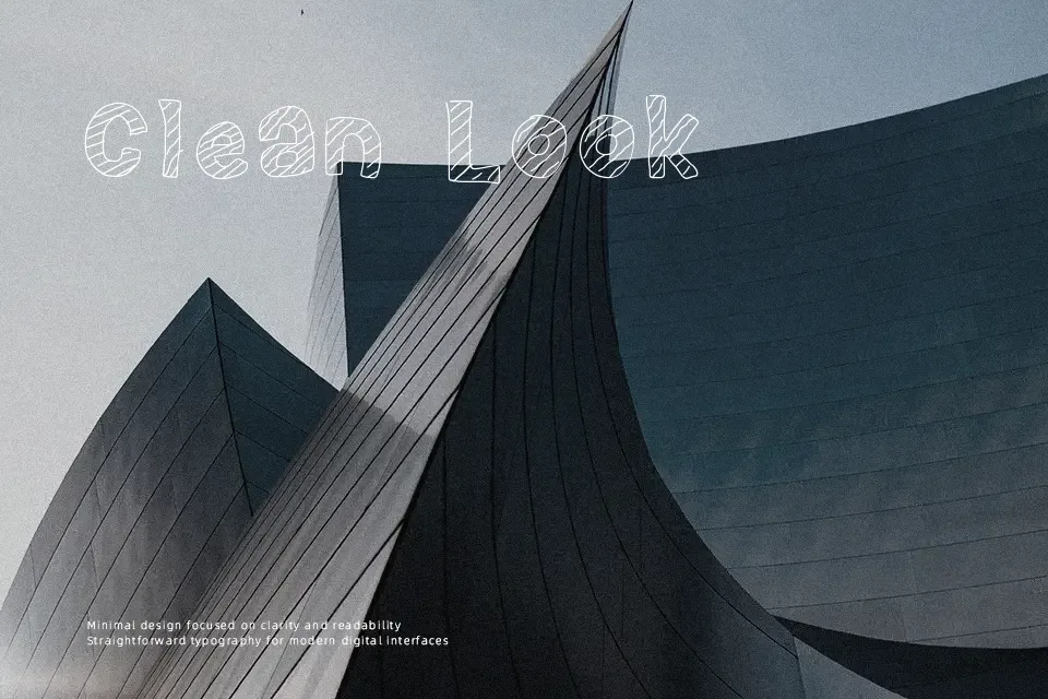
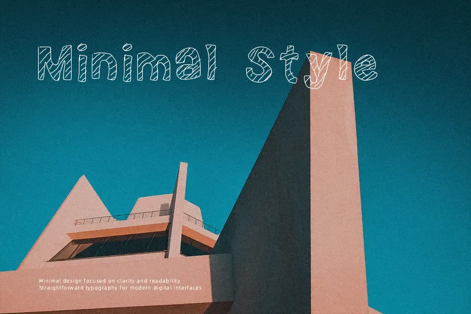
Large, blocky characters with irregular outlines and hand-drawn curves give this typeface a rough, cartoon flavor rather than a clean comic look. Strokes appear thick and mostly uniform, with edges that wobble slightly, so shapes feel energetic instead of precise. Spacing stays fairly tight, which keeps words compact and punchy in short headlines but could feel crowded in dense text lines. The overall structure favors big, simple silhouettes, so letters remain easy to tell apart at display sizes, though smaller captions are likely to lose definition. It is most effective when used sparingly as a loud visual accent instead of continuous reading text.
Best For:
children’s book title pages
school event posters
playful YouTube or Twitch banner text
kids’ product or toy packaging labels
Not Ideal For:
long paragraph text
formal business documents
small interface labels
dense instructional manuals
Perfect for headline, kids, and packaging, with a bold and cartoon style.
License
Gallery