Nata Sans Font
Free for Commercial UseAbout
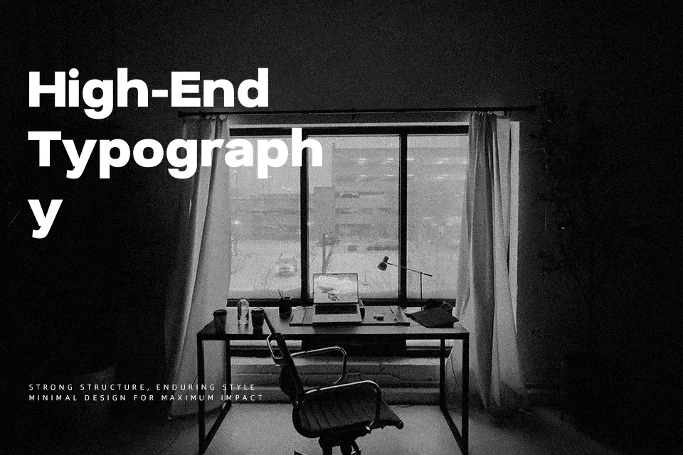
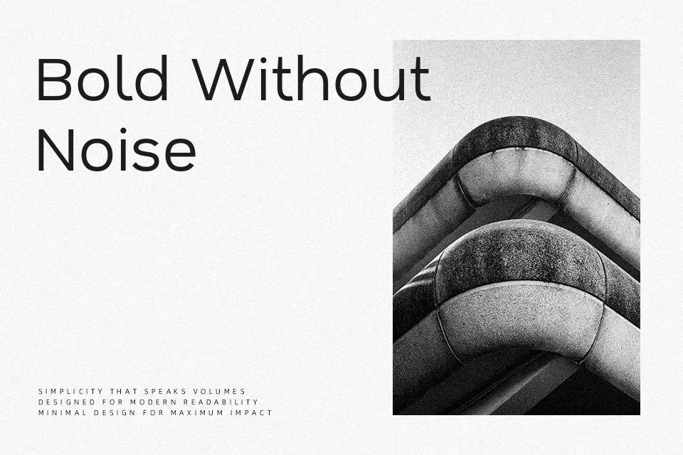
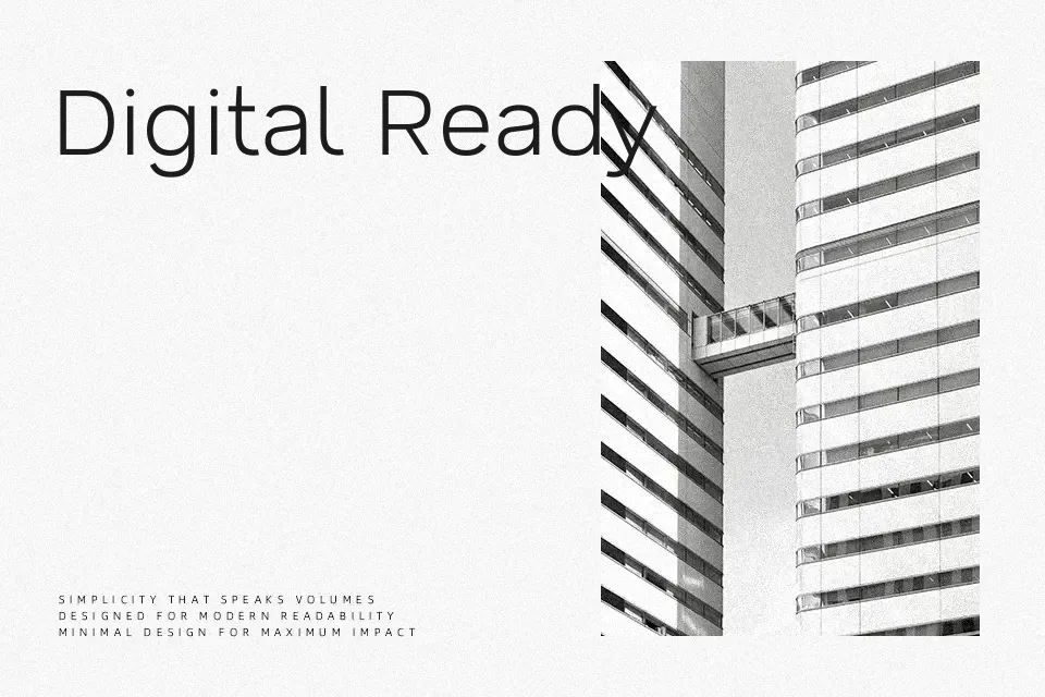
Nata Sans is a grotesque sans serif with wide proportions, short ascenders and descenders, and a generous x-height that helps text feel open rather than cramped. Strokes are even and restrained, with gentle curves in letters like “o” and “a” that keep it from feeling cold or purely geometric. The variable weight range from thin to black makes it practical for building consistent hierarchies across dashboards, websites, and product UI copy. It shines in digital interfaces, headings, and medium-length copy where clarity and a calm tone are important, but it can feel too neutral if you need something expressive or highly decorative for character-heavy branding.
Best For:
UI Design dashboards
app and web headings
product interface copy
clean branding systems
Not Ideal For:
ornate or expressive logos
highly decorative layouts
very long print novels
vintage or retro branding
Perfect for branding, headline, and logo, with a calm and geometric style.
License
Gallery