Mynerve Font
Free for Commercial UseAbout
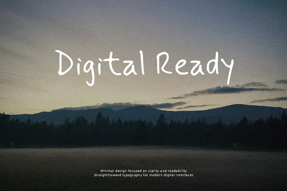
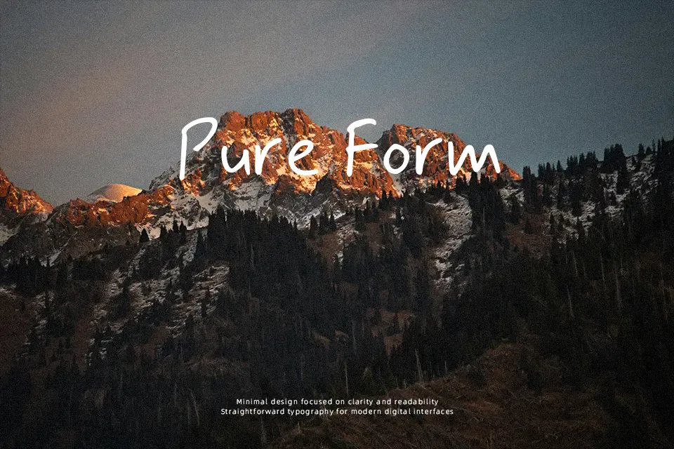
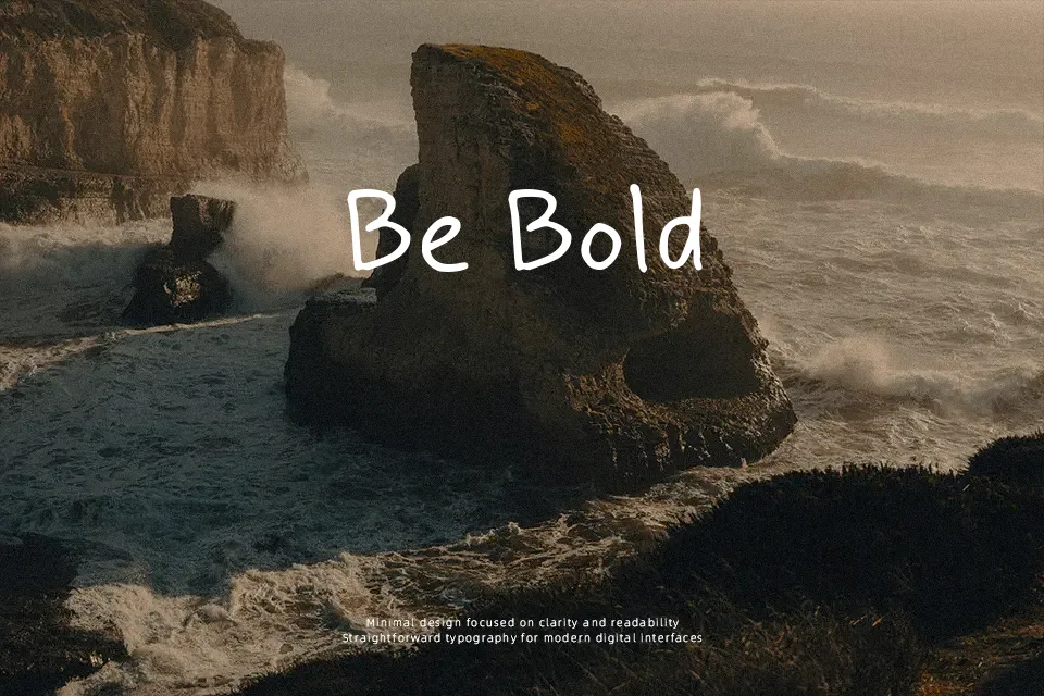
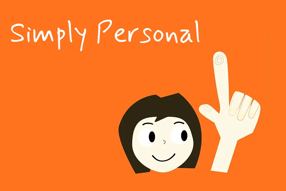
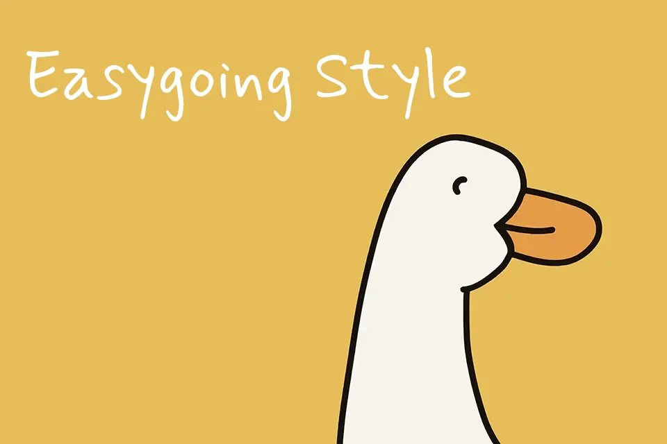
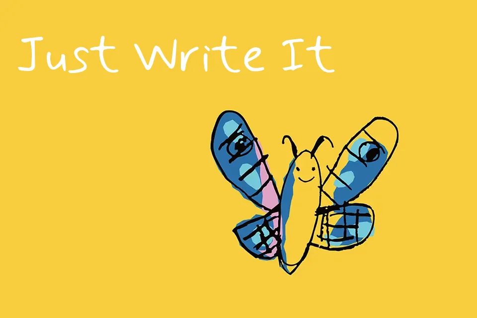
Mynerve looks like fast, tidy handwriting with uneven strokes, subtle wobble in the baseline, and generous letter spacing that keeps words airy and easy to scan. The structure leans informal and human, closer to a neat notebook scrawl than a polished calligraphy script, with alternates and ligatures helping repeated letters feel less mechanical. It shines in contexts where you want text to sound like a side note or margin comment—think classroom worksheets, how‑to PDFs, casual brand annotations, or YouTube thumbnail side labels rather than the main title. For dense paragraphs, serious corporate decks, or luxury branding, the loose rhythm and hand-drawn energy can look underdressed and slightly messy, so I would reserve it for short, conversational lines instead.
Best For:
handwritten notes on worksheets
casual annotations in presentations
informal social media captions
friendly labels on planners or journals
Not Ideal For:
long reading paragraphs
formal corporate branding
high-end luxury identities
legal or academic documents
Perfect for branding, headline, and kids, with a creative and display style.
License
Gallery