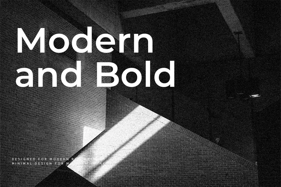
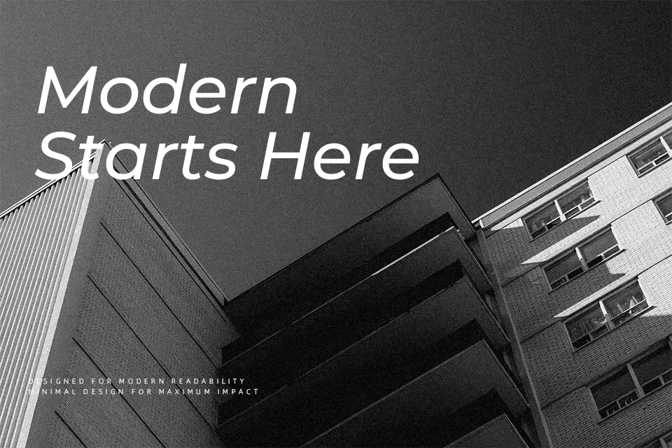
Montserrat Font
Free for personal useAbout
Montserrat takes its character from the hand-painted signs, posters, and café canopies that populated Buenos Aires’ Montserrat neighborhood between the 1920s and 1950s. The design carries that energy into a geometric sans-serif with uniformly even stroke weight, a high x-height, and open counters that remain legible at small screen sizes without losing structure. Softened angles keep the geometry from feeling mechanical.
It holds up well in tech startup branding, SaaS product interfaces, and poster headlines where a clean, contemporary tone is expected. The wide weight spectrum — Thin through Black — makes it capable of carrying a full typographic hierarchy on its own. Where it underperforms is in long-form editorial contexts; the geometric evenness begins to feel flat across extended reading, and faces with more optical variation tend to sustain attention better.
Best For:
– tech startup and SaaS branding
– web UI headlines and navigation labels
– poster and advertising layouts
– social media graphic titles
Not Ideal For:
– long-form body text and editorial reading
– formal legal or academic documents
Perfect for branding, headline, and logo, with a bold and geometric style.
License
Gallery