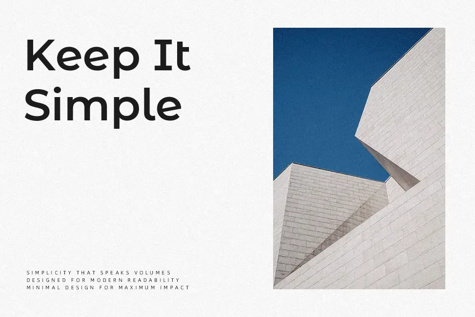
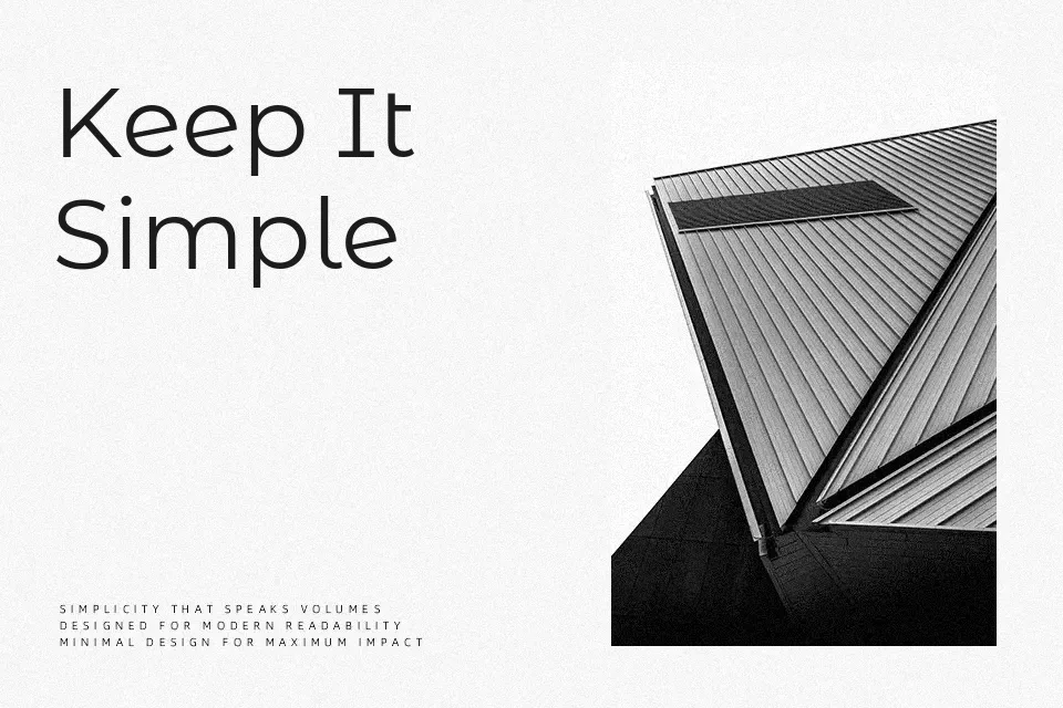
Montserrat Alternates Font
Free for Commercial UseAbout
Where the standard Montserrat keeps things neutral, Alternates introduces character-level variations — a single-story lowercase ‘a’, subtly angled terminals, and reshaped cap constructions — that give the same geometric skeleton a more expressive voice. Stroke contrast remains low, spacing is open, and the overall texture is clean enough for screen rendering at small sizes. The 18-weight range (Thin through Black) supports typographic hierarchy from fine editorial subheadings down to heavy display use. It works well in brand systems that need a sans-serif with just enough personality to avoid feeling interchangeable. That said, the alternate letterforms can feel slightly restless in long body copy, and the loose spacing makes it a poor fit for dense text settings like annual reports or legal documentation.
Best For:- editorial cover headlines
– app UI header text
– streetwear and lifestyle branding
– poster typography with typographic hierarchy
Not Ideal For:- dense body copy in print documents
– formal corporate or legal text layouts
Perfect for branding, editorial, and headline, with a clean and geometric style.
License
Gallery