Montagu Slab Font
Free for Commercial UseAbout
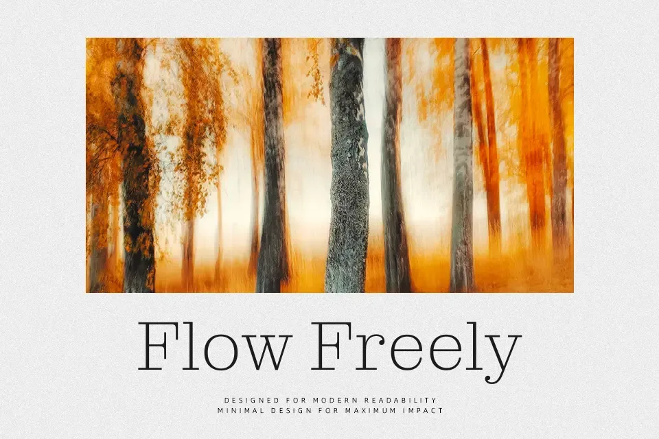
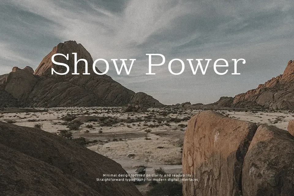
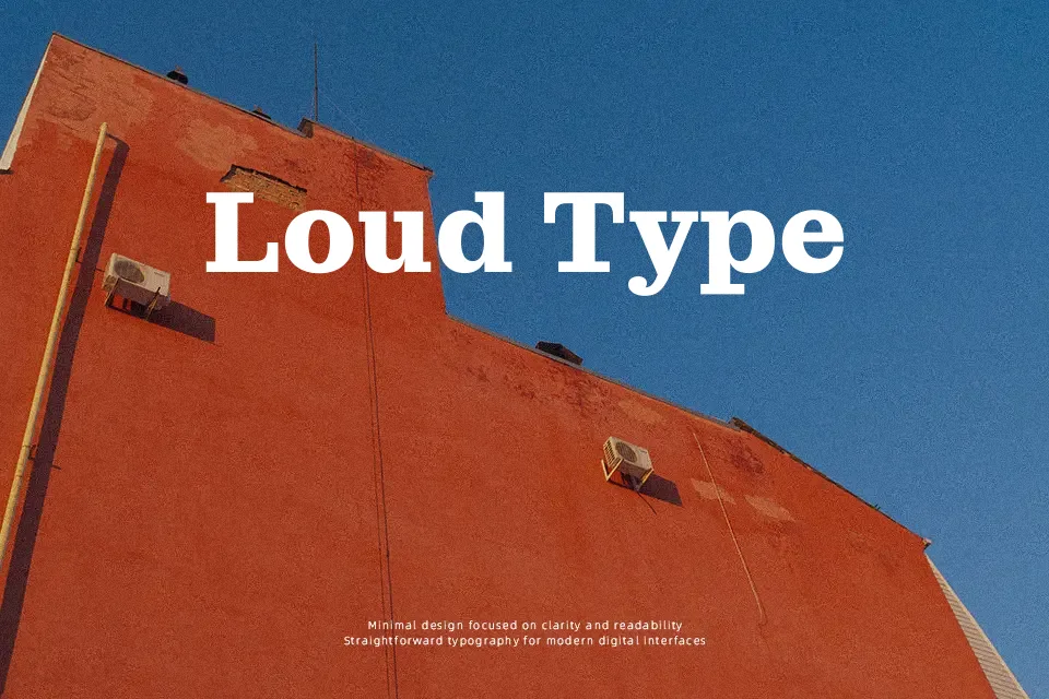
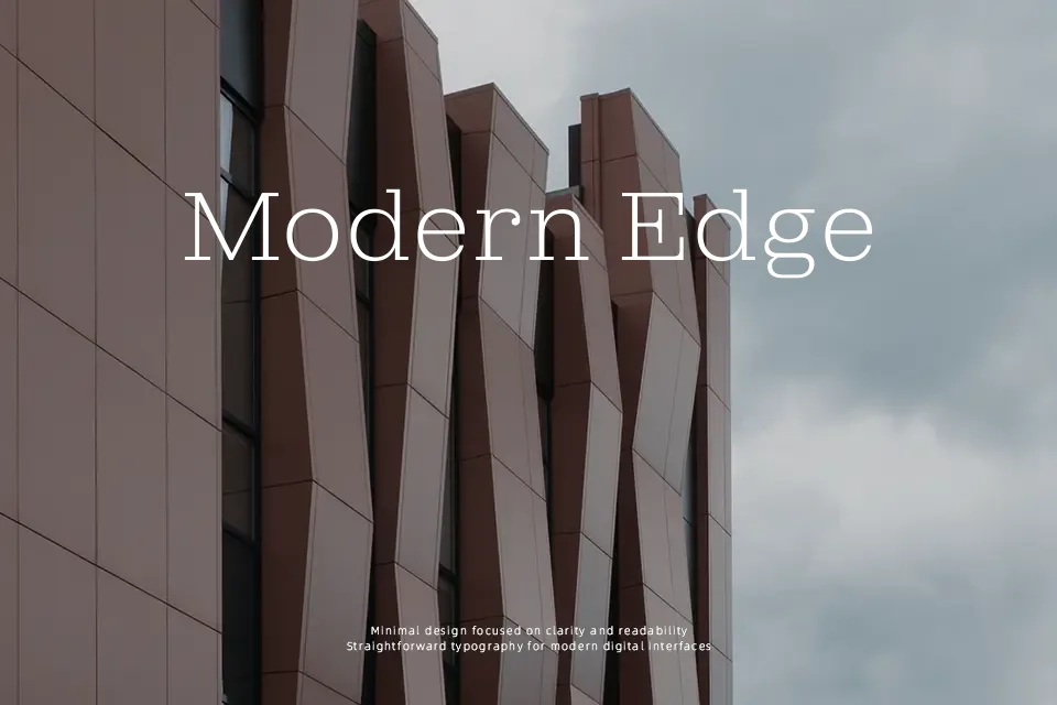
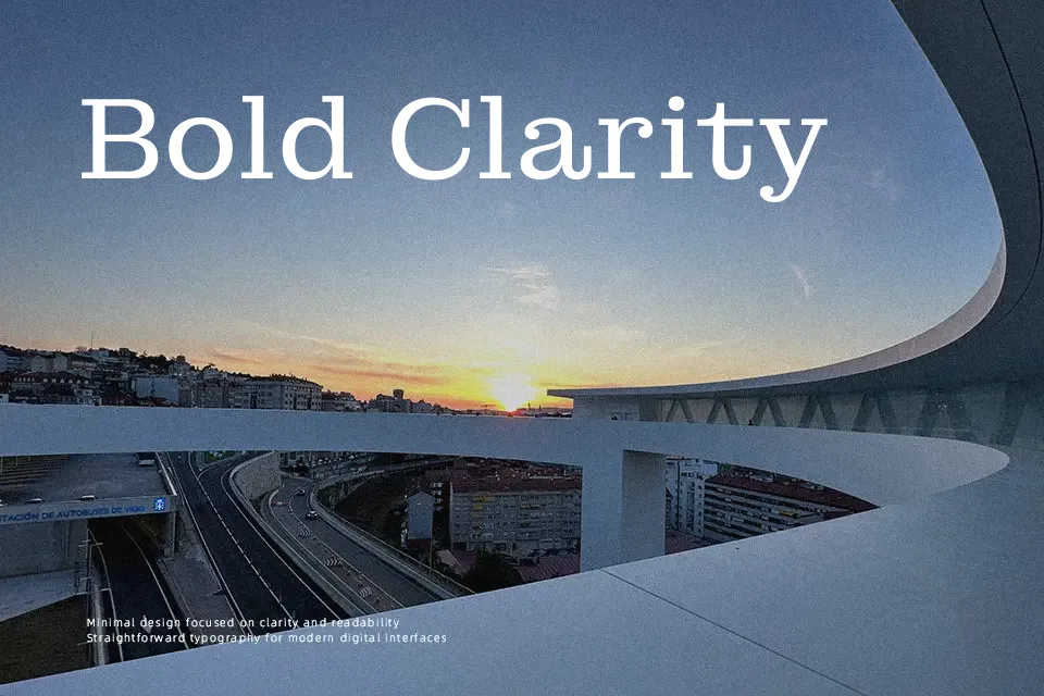
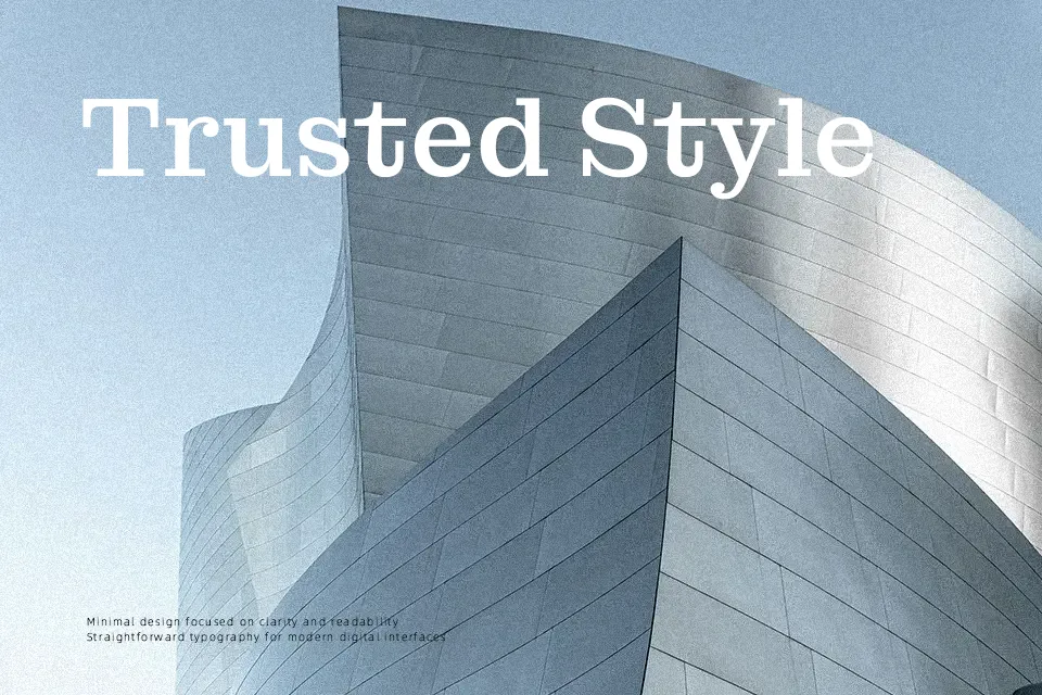
Montagu Slab doesn’t just look like a classic slab serif — it behaves like one that’s been rebuilt for contemporary workflows. The variable optical size axis does the heavy lifting: at smaller sizes, x-height opens up, contrast lowers, and spacing loosens to preserve readability. Scale it toward display territory and the letterforms tighten considerably, contrast climbs, and distinctive upturned terminals emerge without tipping into decorative territory. Seven weights from Thin to Bold let designers build a full typographic hierarchy from a single family. It earns its place anchoring magazine covers, premium packaging headlines, and editorial spreads. That said, its strong personality and structured slab construction make it a misfit for neutral UI labels, dense legal copy, or interfaces where a clean sans-serif is the safer call.
Best For:
– editorial headline layouts
– print magazine covers
– packaging display text
– brand identity typesetting
Not Ideal For:
– long-form body copy
– UI label and interface text
– neutral minimalist designs requiring a sans presence
Perfect for branding, editorial, and headline, with a classic and display style.
License
Gallery