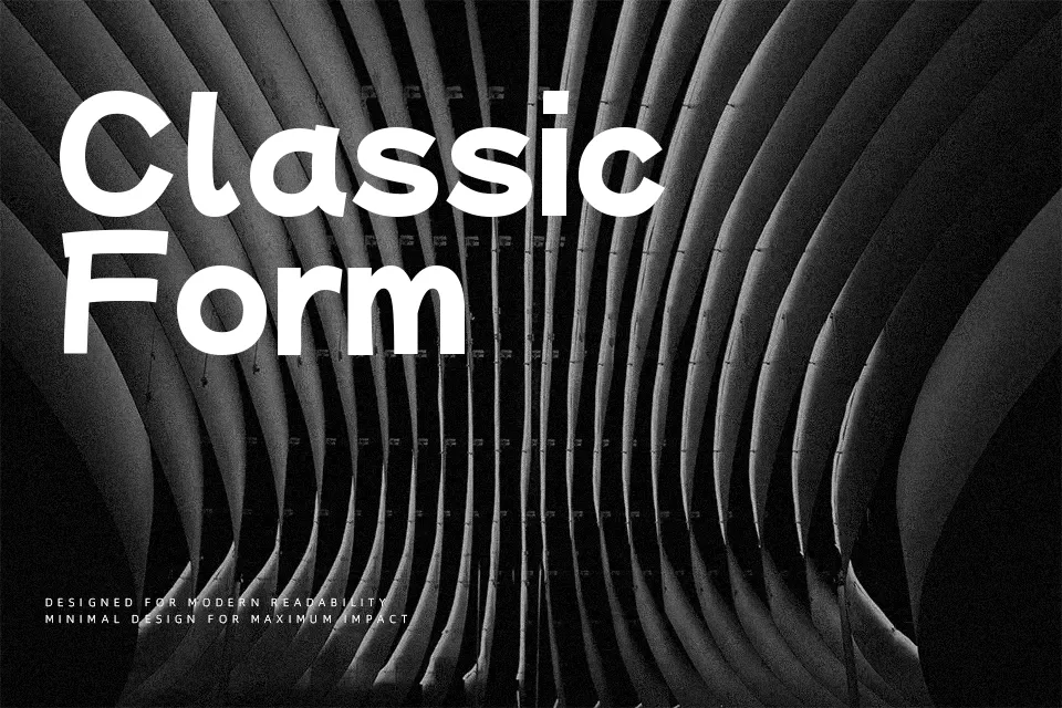
Mochiy Pop P One Font
Free for Commercial UseAbout
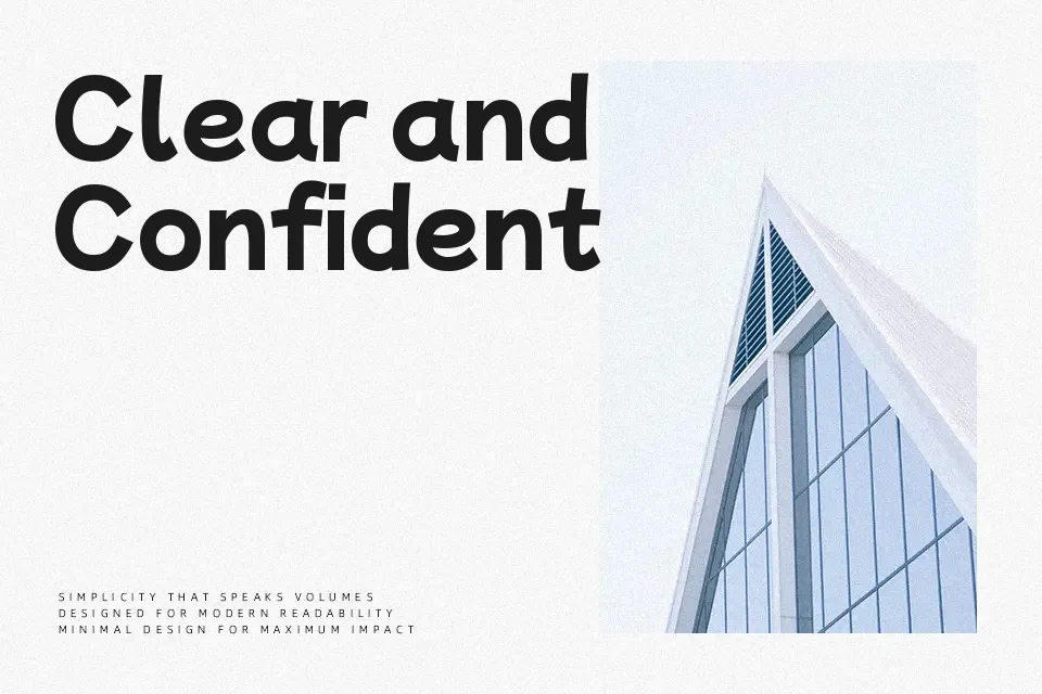
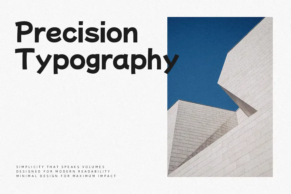
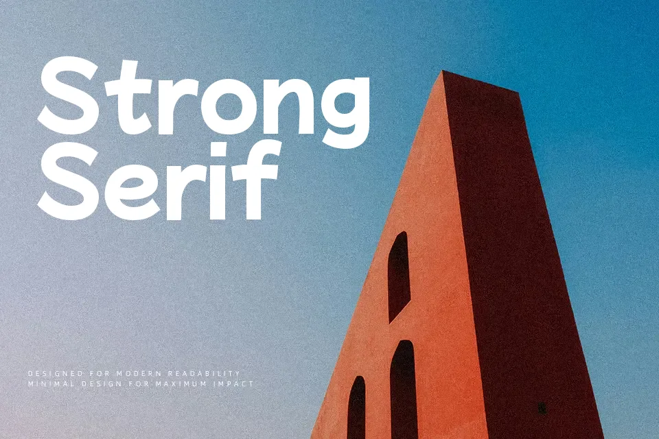
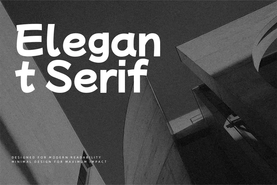
Mochiy Pop P One mixes a sturdy sans serif skeleton with plump, rounded strokes and a fairly high x‑height, so text stays readable even when you push the size down. Counters are generous, spacing is slightly tight, and the overall rhythm feels like tidy handwriting filtered through a geometric grid. On screen it delivers a lively, youthful tone that works especially well for Japanese–Latin bilingual layouts, app tabs, streaming service thumbnails, and kids product packaging where you want energy without visual chaos. It can feel too chunky and informal for long editorial text or corporate reports, so keep it for display roles and short UI strings rather than dense reading passages.
Best For:
playful app headers
kids product packaging
bilingual JP–EN UI labels
video and streaming thumbnails
Not Ideal For:
long-form body copy
formal business documents
dense data tables
traditional print editorials
Perfect for headline, kids, and logo, with a bold and display style.
License
Gallery