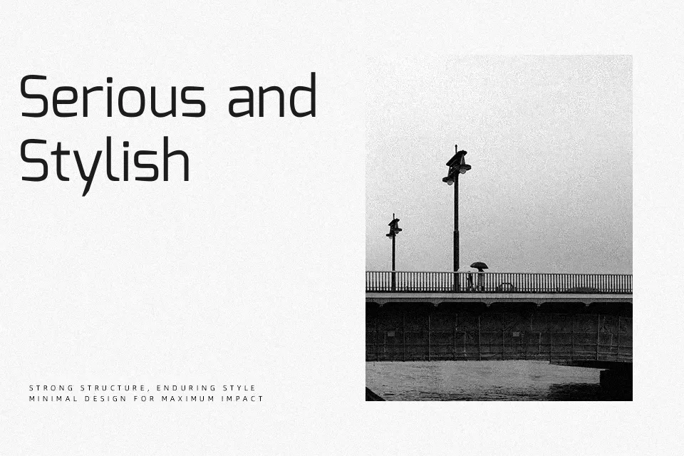
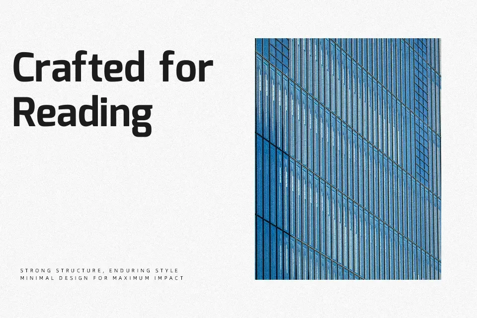
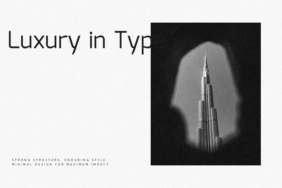
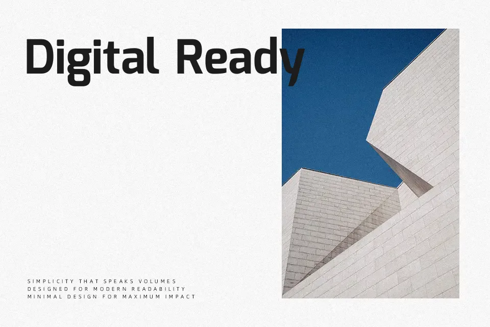
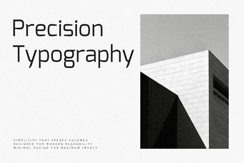
Mina Font
Free for Commercial UseAbout
Mina combines low-contrast strokes, open counters, and a compact vertical rhythm to keep Bangla and Latin text visually aligned without feeling stiff. The shapes lean geometric, with straightforward curves and a modest x‑height that hold up on screens and in dense layouts. In practice it feels contemporary rather than flashy, so it suits navigation labels, UI strings, and short editorial copy where you need bilingual clarity more than personality. For long, immersive reading or highly expressive branding, it can feel a bit restrained compared with more calligraphic or humanist options.
Best For:
bilingual ui labels
bangla-latin headlines
short product descriptions
compact editorial layouts
Not Ideal For:
very long paragraphs
ornate luxury branding
highly decorative logotypes
Perfect for advertising, editorial, and headline, with a clean and geometric style.
License
Gallery