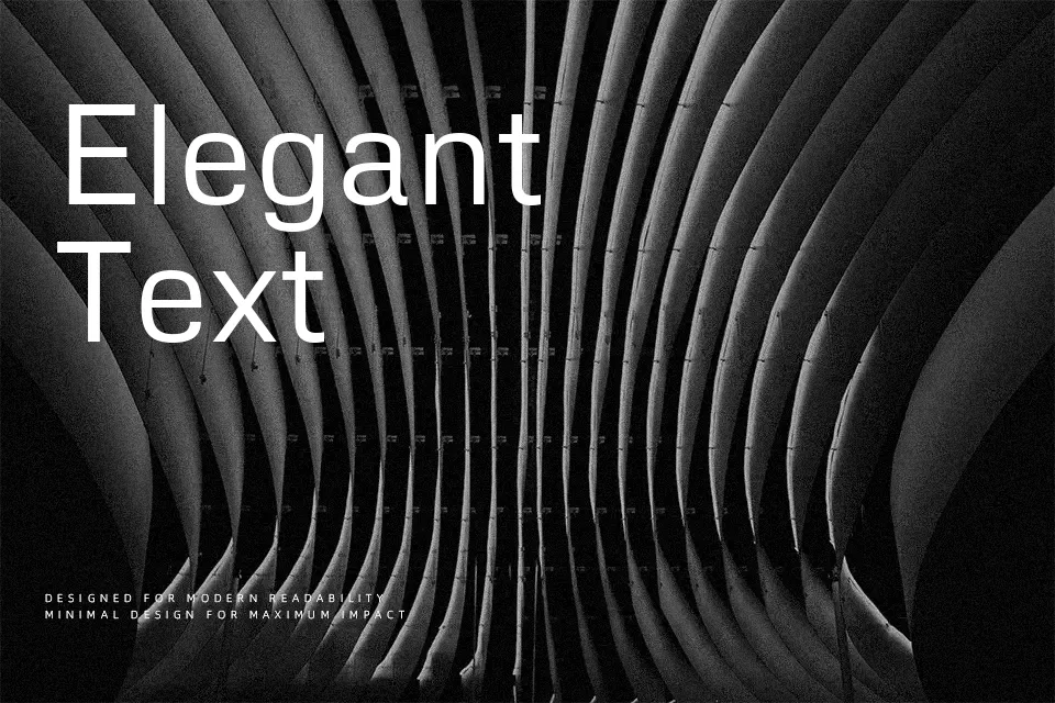
Metrophobic Font
Free for Commercial UseAbout
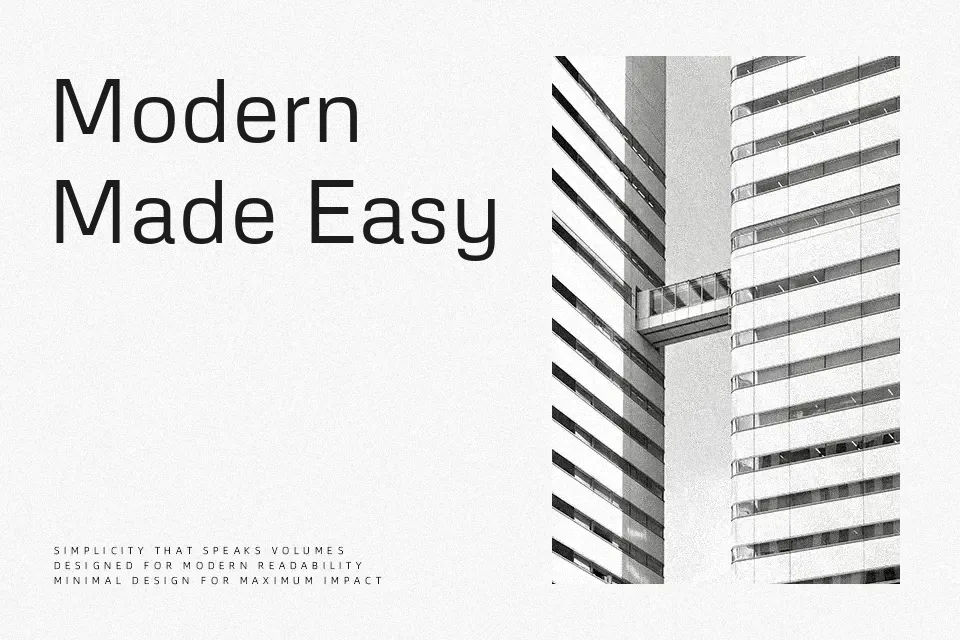
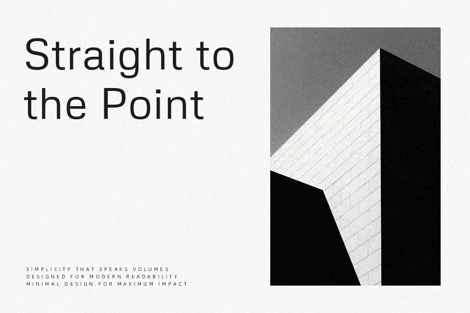
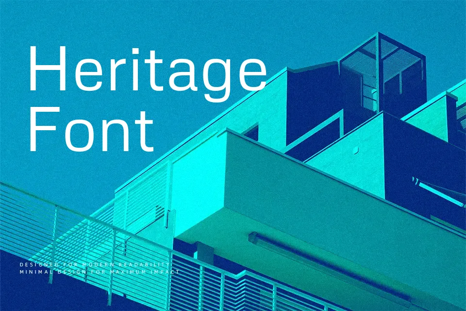
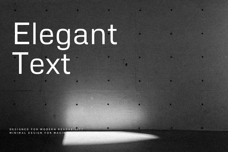
Metrophobic is a sans serif with a semi‑geometric skeleton, open counters, and low contrast strokes that read smoothly on screens. The weight sits on the lighter side of regular, and its spacing feels airy enough to keep longer lines from looking cramped. It comes across as modern and neutral rather than flashy, which makes it more of a quiet workhorse than a logo centerpiece. In practice, it works well in web dashboards, blog articles, and app UI where you want a consistent tone across headings and body copy. If you need highly expressive branding or super-tight display work, its restraint and relatively modest contrast can leave the design feeling a bit too plain.
Best For:
clean web dashboards
editorial-style blog layouts
interface labels and menus
subtle branding on tech products
Not Ideal For:
highly expressive wordmarks
dense long-form print books
very small captions on complex backgrounds
Perfect for body text, branding, and headline, with a calm and geometric style.
License
Gallery