Marko One Font
Free for Commercial UseAbout
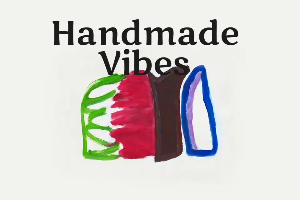
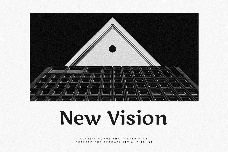
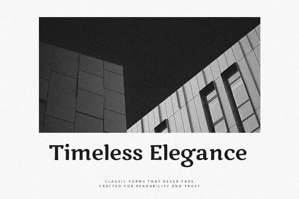
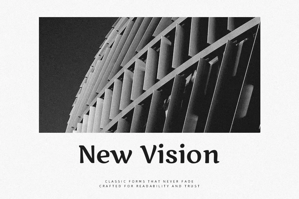
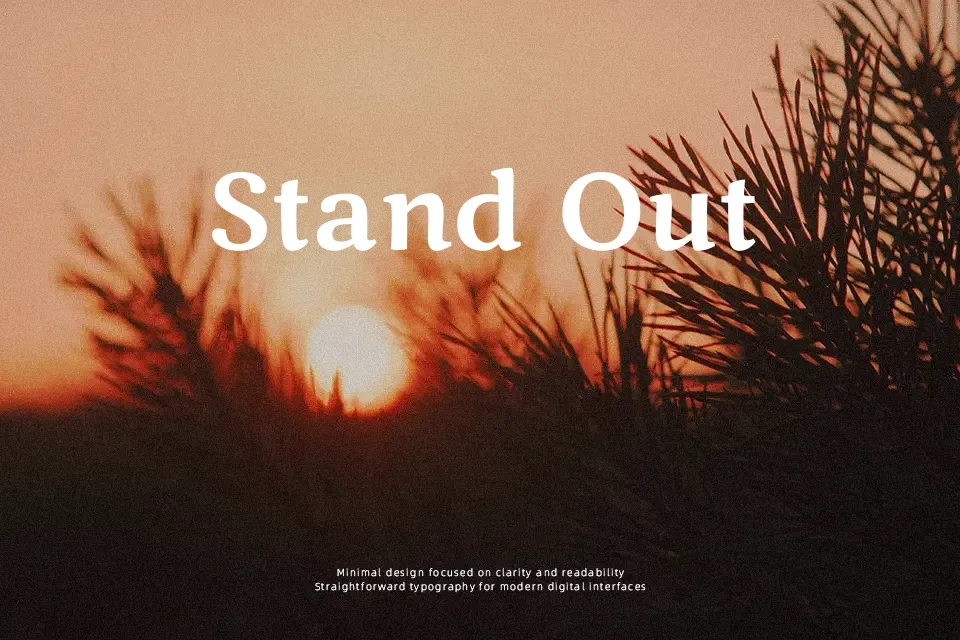
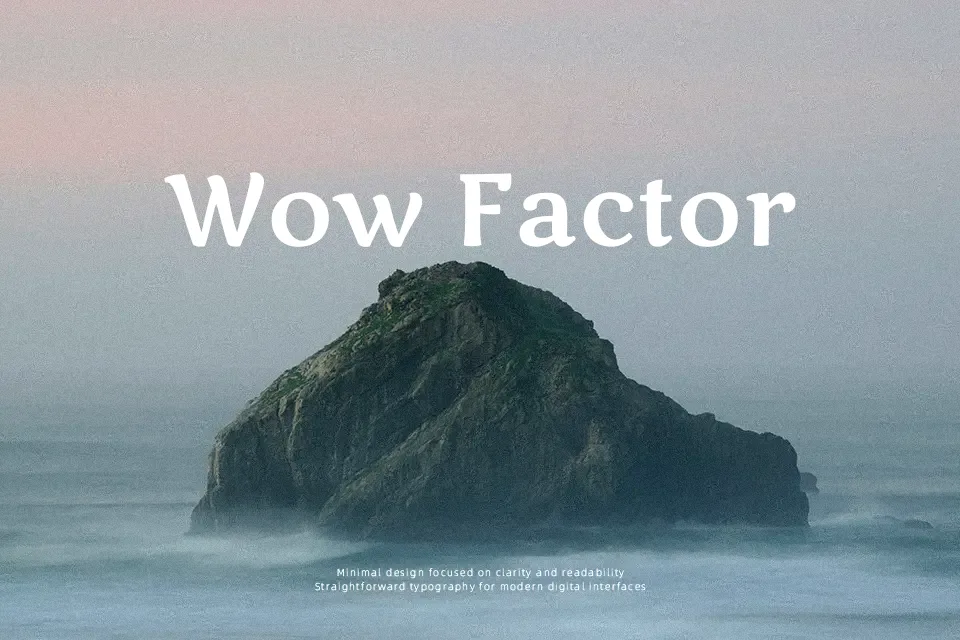
Marko One was drawn from handwritten sketches and calligraphy, so its strokes feel slightly irregular, with rounded terminals, generous curves, and a gentle internal tension that keeps the letters lively on the page. The single regular weight is moderately thick, with open counters and a bit more width than a typical book serif, which helps words stay readable at medium sizes while still looking playful. It leans toward a storybook, brush-flavored serif rather than a strict text face, sitting somewhere between classic children’s book types and casual display serifs. In practice, it works nicely for chapter titles, picture-book captions, game interfaces aimed at kids, or packaging for family-oriented products, but it can feel too informal and bouncy for corporate reports, dense body copy, or sober editorial layouts.
Best For:
children’s book titles
friendly UI headlines
kids product packaging
playful poster slogans
Not Ideal For:
long-form body text
formal business documents
minimalist corporate branding
small-size legal copy
Perfect for body text, branding, and headline, with a classic and display style.
License
Gallery