Manrope Font
Free for Commercial UseAbout
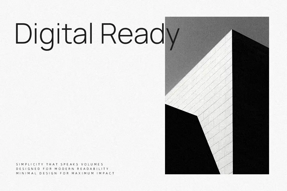
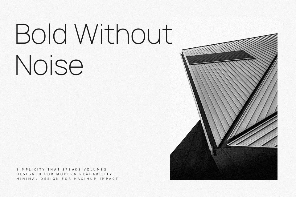
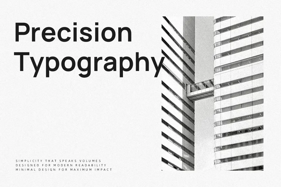
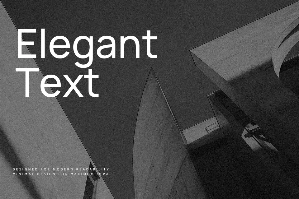
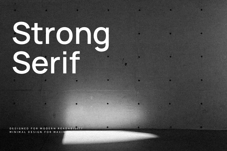
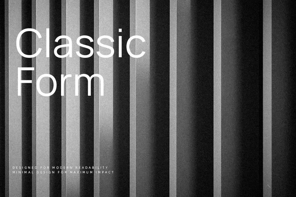
Manrope sits between geometric and grotesque: open apertures, even curves, and calm, low-contrast strokes give it a clear, tech-aware tone without feeling cold. The family spans multiple weights and a variable font, which makes it easy to tune hierarchy from muted UI labels to punchy hero lines while keeping a consistent voice. Spacing is on the generous, screen-friendly side, so it reads smoothly in product copy, dashboards, and slide decks rather than dense book pages. It works especially well when numbers, short paragraphs, and microcopy share the same system, but it can look a bit plain if you need expressive display lettering or highly characterful branding.
Best For:
interface labels and navigation
data dashboards and analytics screens
product marketing pages and pitch decks
modern editorial-style landing pages
Not Ideal For:
highly decorative logo wordmarks
ornate event stationery
longform book typography
loud, expressive display headlines
Perfect for branding, editorial, and headline, with a clean and geometric style.
License
Gallery