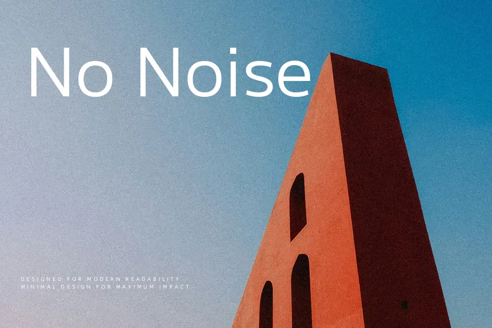
M PLUS 1 Font
Free for Commercial UseAbout
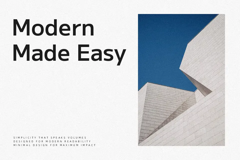
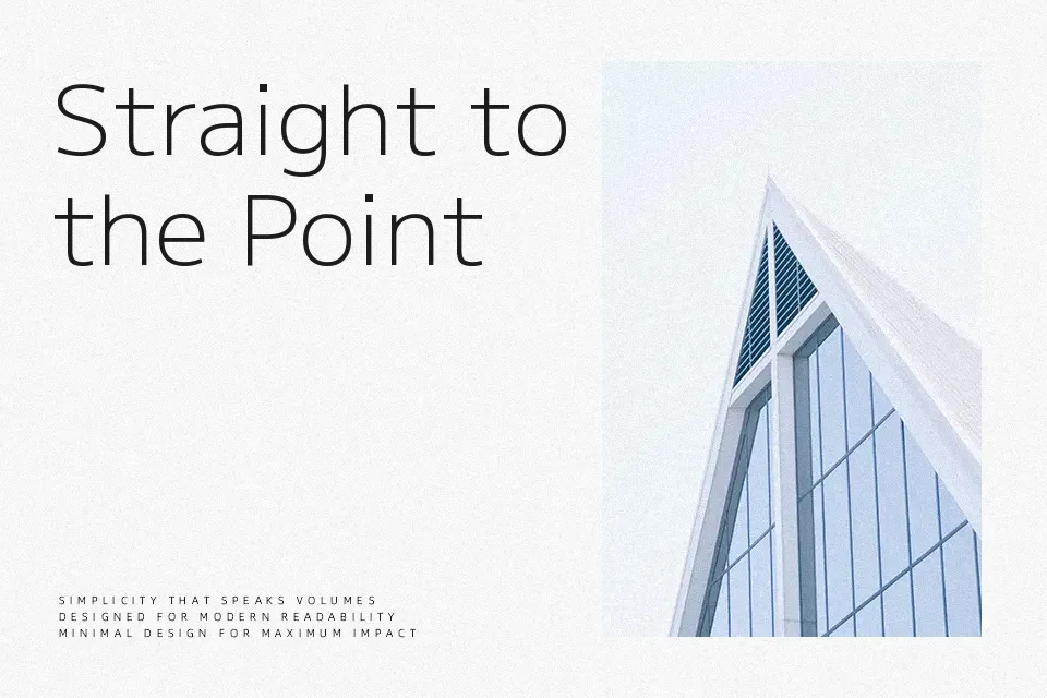
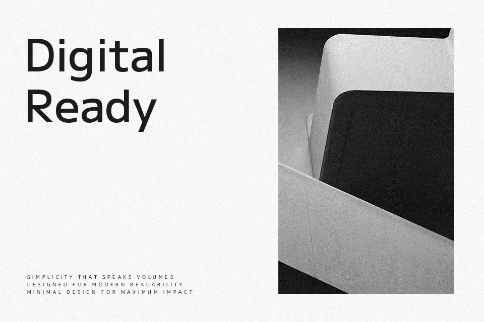
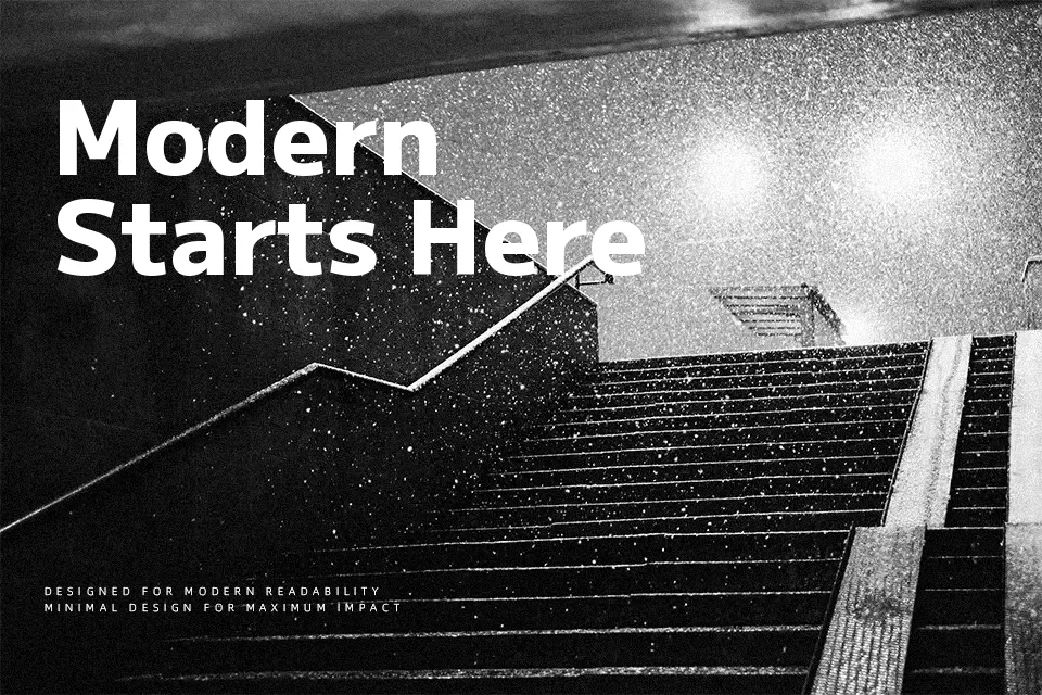
M PLUS 1 has a distinctly measured structure — calm geometric forms where clean straight strokes settle into gently rounded terminals, landing somewhere between rigid and warm. At lighter weights, it holds up well across both Japanese and Latin script in dense body copy; push it heavier and it carries enough visual weight for display use without turning aggressive.
The generous spacing and tall x-height give it strong legibility on screen, making it a solid workhorse for multilingual app interfaces, tech product documentation, and Japanese editorial design. It won’t dominate a loud poster or cut through streetwear branding — that’s not its character. For those moments, something with more personality is the better call. If you want the same DNA with softer energy, M PLUS Rounded 1c pulls in that direction.
Best For:
– Multilingual UI and mobile app design
– Japanese editorial and web typography
– Body text in digital products and documentation
– Tech branding with understated warmth
Not Ideal For:
– High-impact advertising or streetwear graphics
– Decorative headline-only poster contexts
– Formal printed documents where classic serif authority is expected
Perfect for body text, editorial, and headline, with a clean and geometric style.
License
Gallery