Lusitana Font
Free for Commercial UseAbout
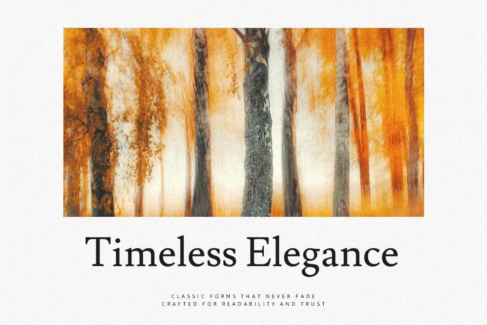
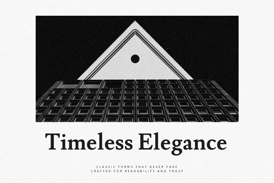
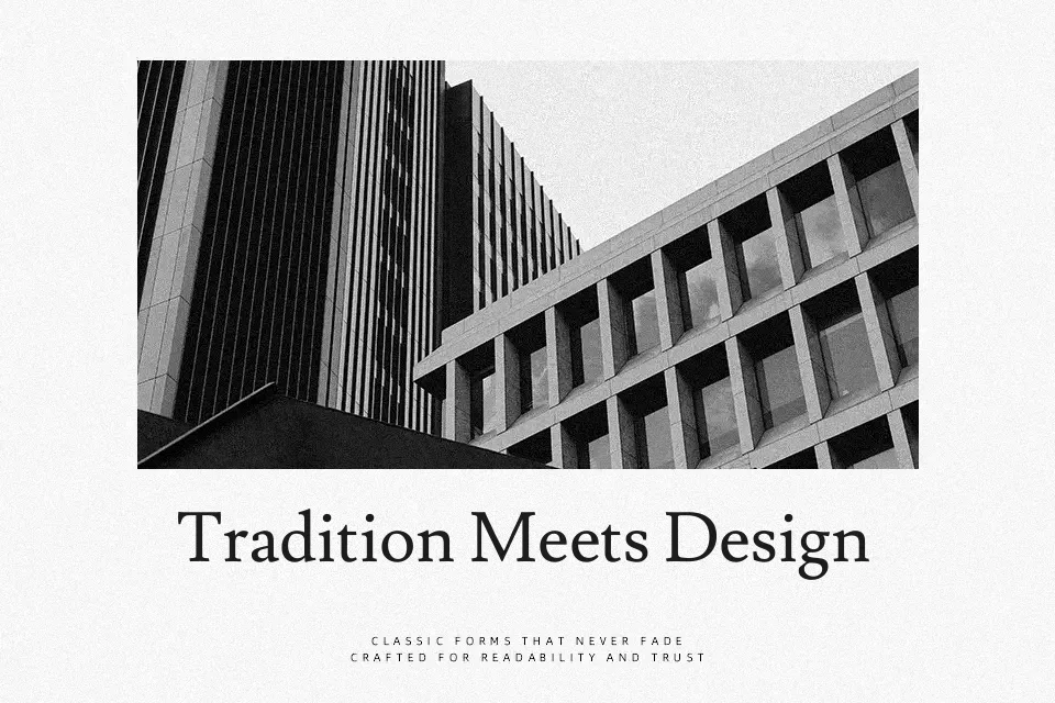
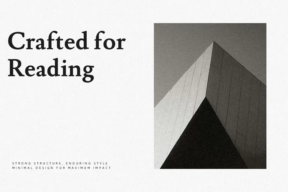
Lusitana draws its proportions from the type used in the 1572 first edition of Os Lusíadas, Luís Vaz de Camões’s celebrated Portuguese epic poem. The humanist serif features moderate stroke contrast, open apertures, and a generous x-height — all contributing to sustained readability across long passages at small point sizes. At display scale, the letterforms carry a quietly classical refinement reminiscent of Garamond, though with a warmer, more Iberian character than strict Italian formality allows.
It performs well in editorial websites, literary publications, and academic documents where the writing deserves typographic dignity without decorative interference. It has reportedly been used in real-world editorial publishing, including an earlier version of Bill Gates’ personal blog — a meaningful signal of its text-setting credibility.
Where it falls short: only Regular and Bold weights are widely available, which limits typographic hierarchy across complex layouts. The understated design also loses its voice in branding or display contexts that demand stronger visual impact.
Best For:- editorial website body text
– literary and academic publishing
– long-form article layouts
– text-heavy print editorial design
Not Ideal For:- bold display headlines
– branding requiring strong visual presence
– multi-weight typographic hierarchies
Perfect for advertising, body text, and branding, with a classic and serif style.
License
Gallery