Lora Font
Free for Commercial UseAbout
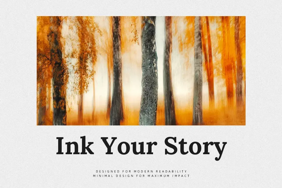
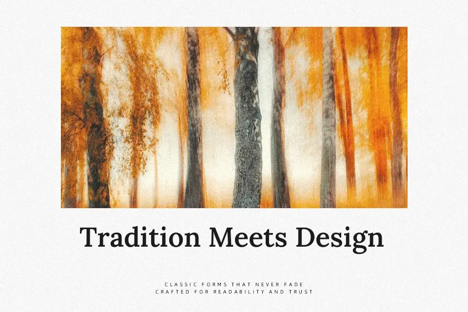
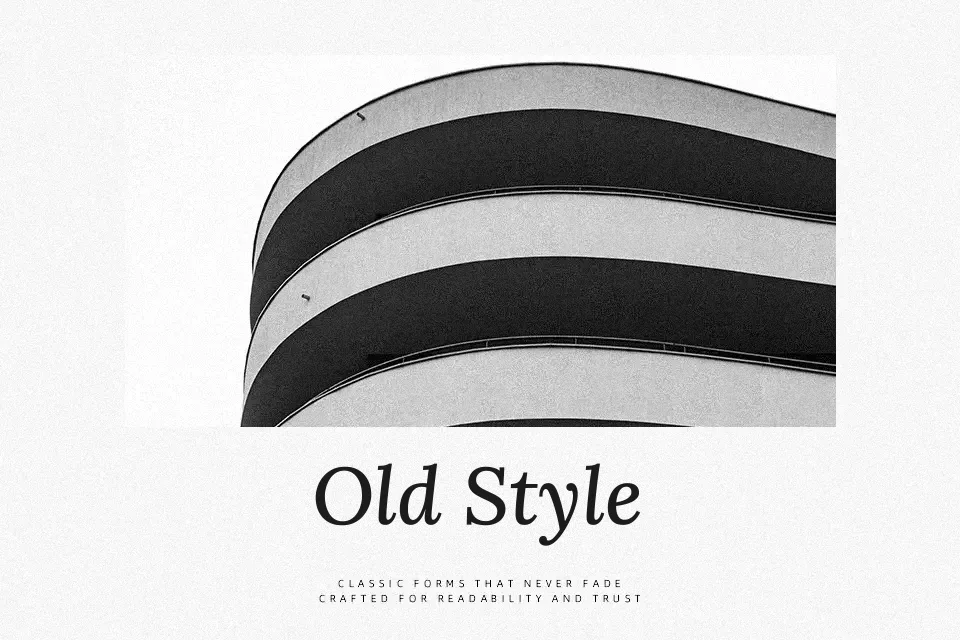
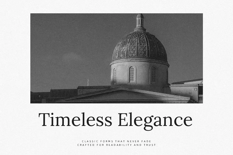
Lora carries the warmth of calligraphy without the fussiness that typically comes with it. Its moderate contrast between thick and thin strokes gives long paragraphs a natural rhythm, while the brushed curves prevent the letterforms from feeling mechanical or cold. The serifs actively drive the eye forward — a quality that pays off in sustained reading contexts like literary magazines, personal essays, or arts journalism. One of Lora’s genuine strengths is holding legibility at smaller screen sizes, which many calligraphy-influenced serifs tend to sacrifice. Where it falls short is high-impact display use: at large sizes, the softness in its structure becomes noticeable, and it lacks the tension that Didone-style typefaces bring to commanding headlines. Best deployed where tone matters more than visual aggression.
Best For:- editorial body text
– literary and cultural blog layouts
– printed journal or magazine pages
– book cover secondary text
Not Ideal For:- bold display headlines at large scale
– minimal tech or SaaS branding
– high-contrast poster typography
Perfect for body text, branding, and editorial, with a calm and serif style.
License
Gallery