Livvic Font
Free for Commercial UseAbout
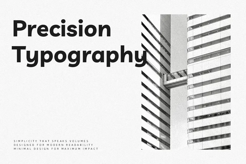
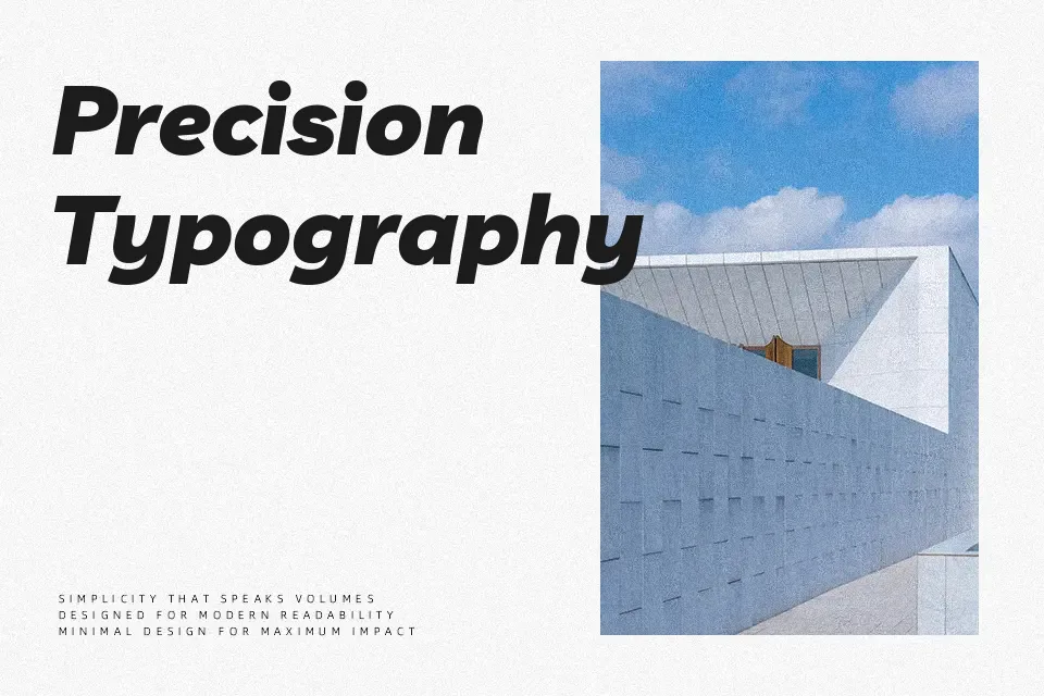
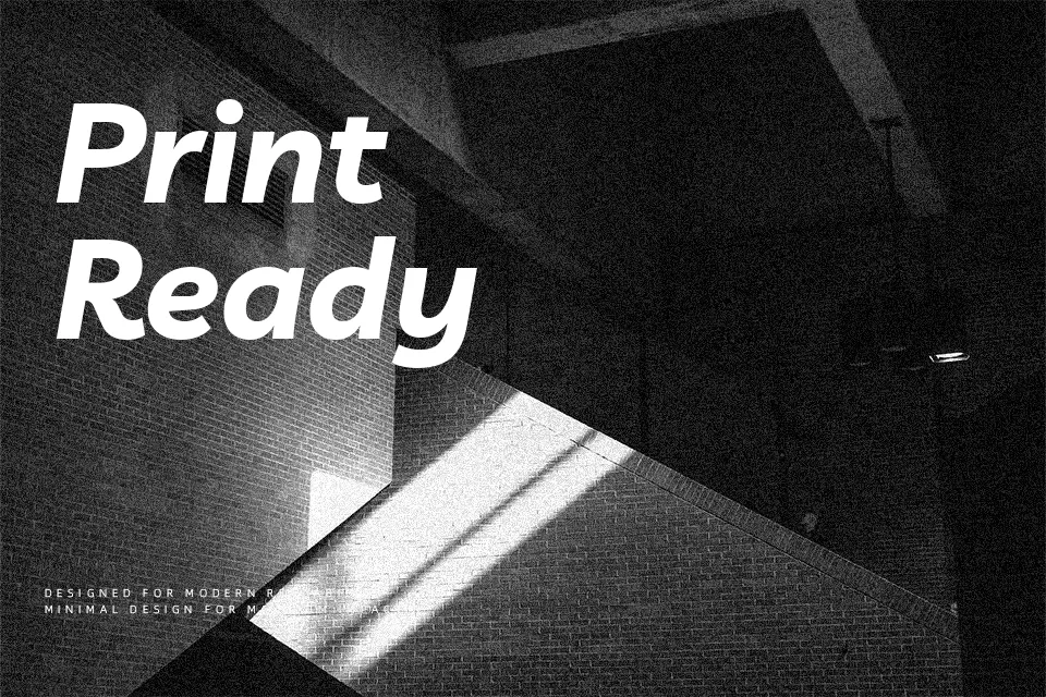
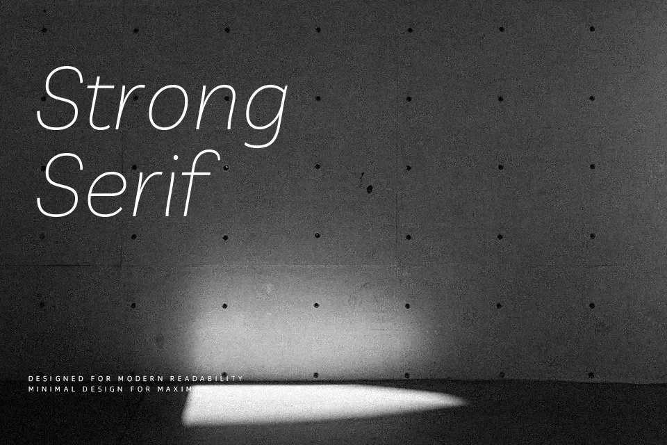
Livvic carries the hallmarks of a well-funded corporate commission — balanced stroke contrast, open apertures, and a weight range that performs consistently across print and screen. Designed by Jacques Le Bailly for UK insurer LV=, it blends humanist warmth with geometric structure, landing somewhere between approachable and professional without tipping into either extreme. The roman and italic styles share matched metrics, which makes building cohesive typographic systems noticeably easier. It works well in tech startup branding, mid-scale web UI, and editorial layouts that need a sans-serif with some character. That said, it doesn’t carry enough visual tension for high-impact display work, and designers expecting a neutral workhorse may find its personality slightly too pronounced for dense body copy.
Best For:- Brand identity systems
– Tech startup and corporate branding
– Web UI and editorial interfaces
– Multi-weight typographic hierarchies
Not Ideal For:- High-impact display headlines needing strong visual tension
– Dense long-form body text
– Luxury or high-fashion aesthetics
Perfect for branding, editorial, and headline, with a clean and geometric style.
License
Gallery