Linden Hill Font
Free for Commercial UseAbout
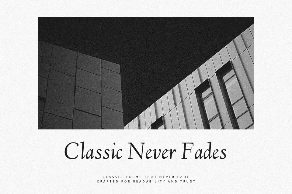
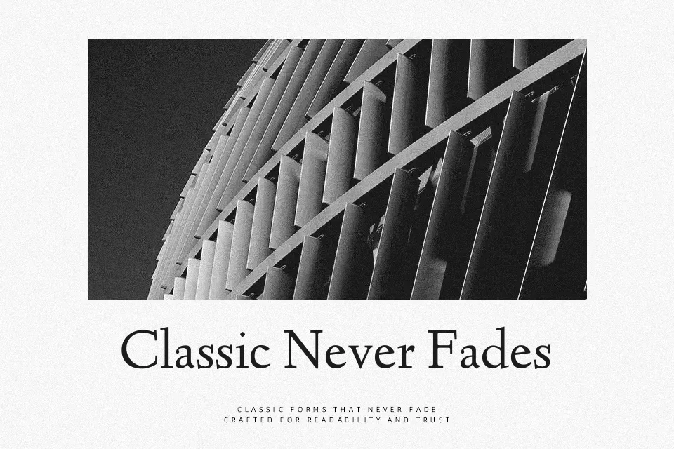
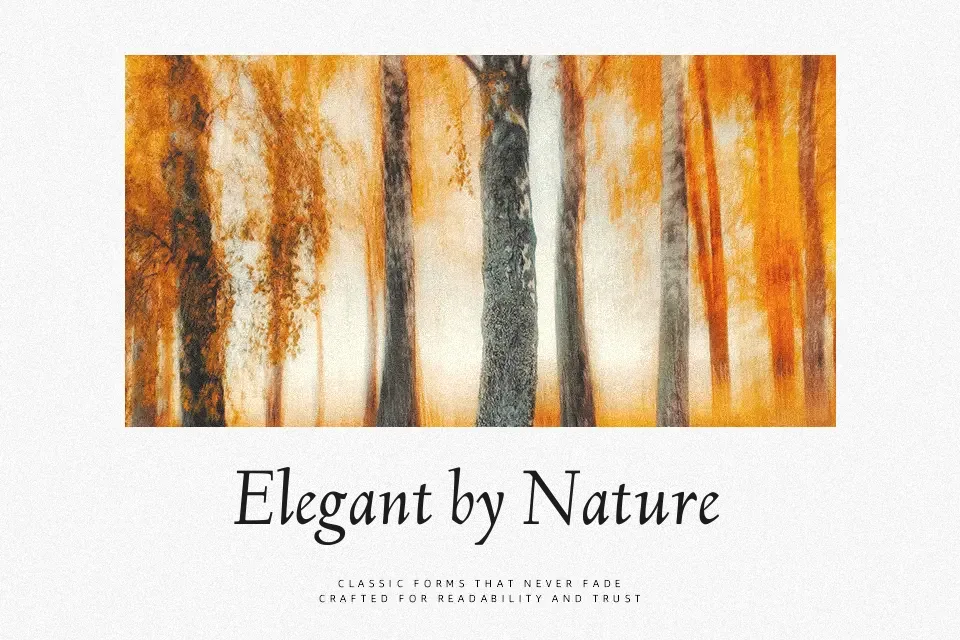
Linden Hill draws directly from Frederic Goudy’s Deepdene, and that lineage shows in every detail — moderately high stroke contrast, gently bracketed serifs, and letterforms with a faint calligraphic pull that keeps text feeling handcrafted rather than mechanical. The roman and italic cuts share a consistent tone, which makes them reliable across multi-page editorial work without clashing.
This font earns its place in literary magazine layouts, journal covers, heritage brand identities, and classic book cover designs. At body text sizes, it reads with quiet clarity; at display sizes, the subtle idiosyncrasies in its letterforms become expressive and distinguished. Where it falls short is modern digital UI work — screen rendering at smaller sizes can blunt its finer details — and it reads as too historically charged for brands chasing a clean, neutral, contemporary aesthetic.
Best For: literary magazine layouts,heritage brand identities,editorial body text,classic book cover design
Not Ideal For: modern UI design,minimalist branding,extended screen reading at small sizes
Perfect for body text, branding, and editorial, with a classic and serif style.
License
Gallery