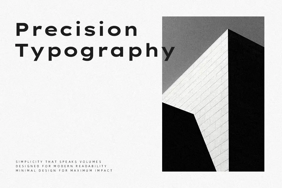
Lexend Peta Font
Free for Commercial UseAbout
Lexend Peta belongs to the Lexend family created to improve reading fluency by adjusting spacing and overall density. Its strokes are clean and low-contrast, with generous letter spacing that keeps words from feeling cramped even at smaller sizes. The wide, open shapes give it a calm, utilitarian voice rather than a decorative one, so it feels at home in interfaces, learning tools, and content portals where users scan lots of text on screens. With weights ranging from thin to black in a single variable file, it adapts easily from subtle UI labels to bold section titles. However, that same airy spacing can look awkward in ultra-tight logo lockups or dense print layouts where space is at a premium, and it lacks the personality some branding projects need. If you like modern, accessibility-minded sans serifs similar to other clean web UI workhorses, Lexend Peta sits comfortably in that space without drawing attention to itself.
Best For:
accessible web interfaces
educational products and apps
data dashboards and UI labels
reading-heavy digital articles
Not Ideal For:
compact print layouts
highly expressive logos
formal editorial book typography
dense multi-language branding systems
Perfect for body text, editorial, and headline, with a calm and geometric style.
License
Gallery