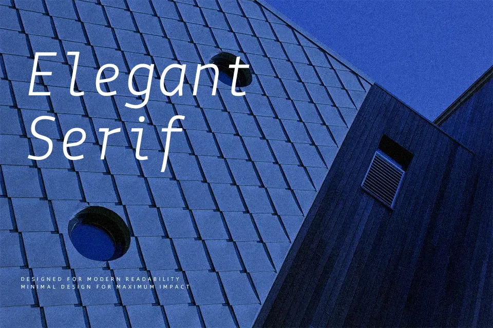
Lekton Font
Free for Commercial UseAbout
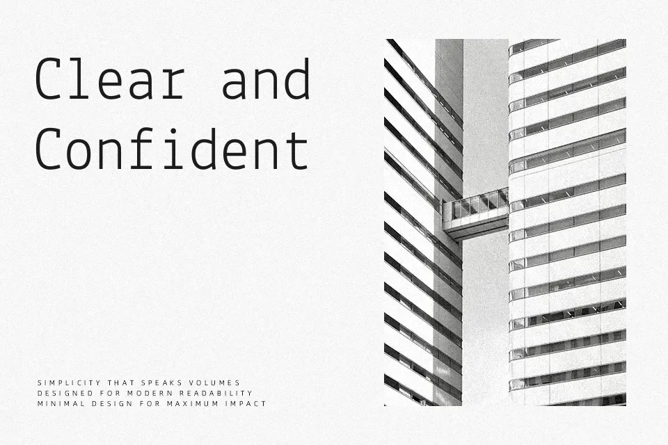
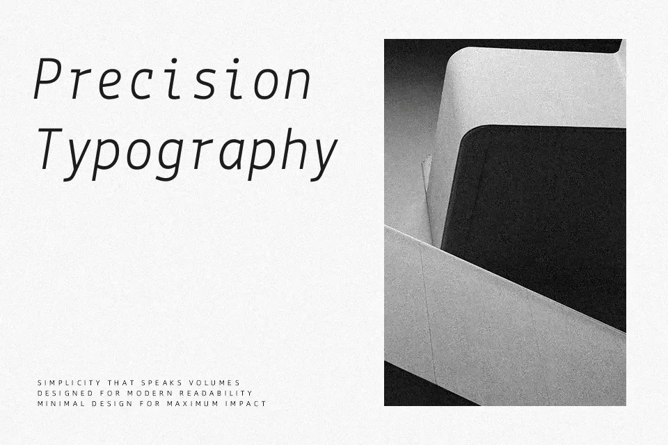
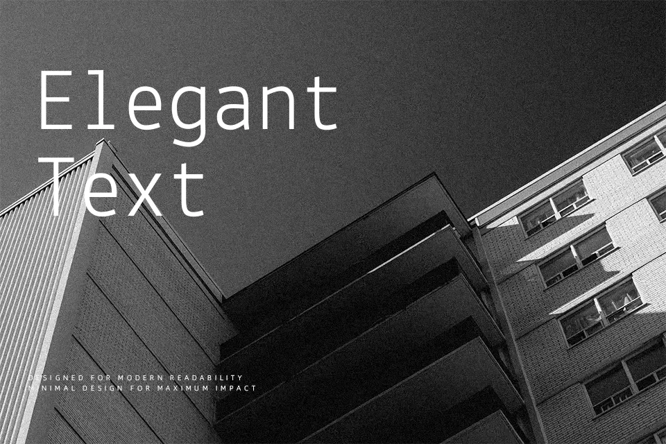
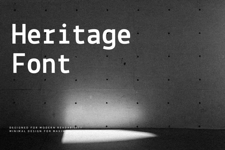
Lekton sits between monospaced and proportional: its trispaced system uses modular widths that keep columns neatly aligned while still feeling more relaxed than a strict coding font. Strokes are low-contrast and mechanically even, with squared curves and open counters that echo Olivetti typewriter output without looking nostalgic or kitschy. On screen, that gives labels, UI chrome, and short paragraphs a dry, technical flavor that still reads smoothly at small sizes. I like it for dashboards, code snippets, and identity systems that want a rational, humanist alternative to the usual terminal faces, but its tight rhythm can feel tiring in dense, book-length text or highly expressive lifestyle branding.
Best For:
technical dashboards and data UIs
code snippets and developer tooling
minimal branding with a typewriter edge
labels, captions, and compact editorial layouts
Not Ideal For:
long-form reading-heavy documents
soft lifestyle or luxury brands
large decorative headlines needing strong personality
kids-focused products or playful layouts
Perfect for body text, branding, and gaming, with a clean and geometric style.
License
Gallery