Lancelot Font
Free for Commercial UseAbout
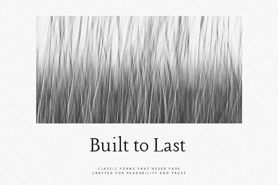
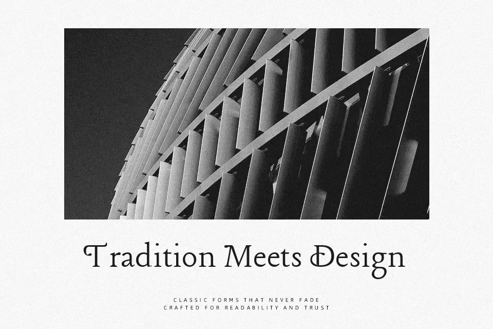
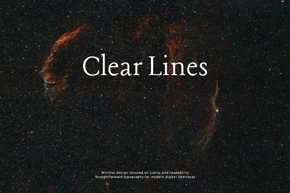
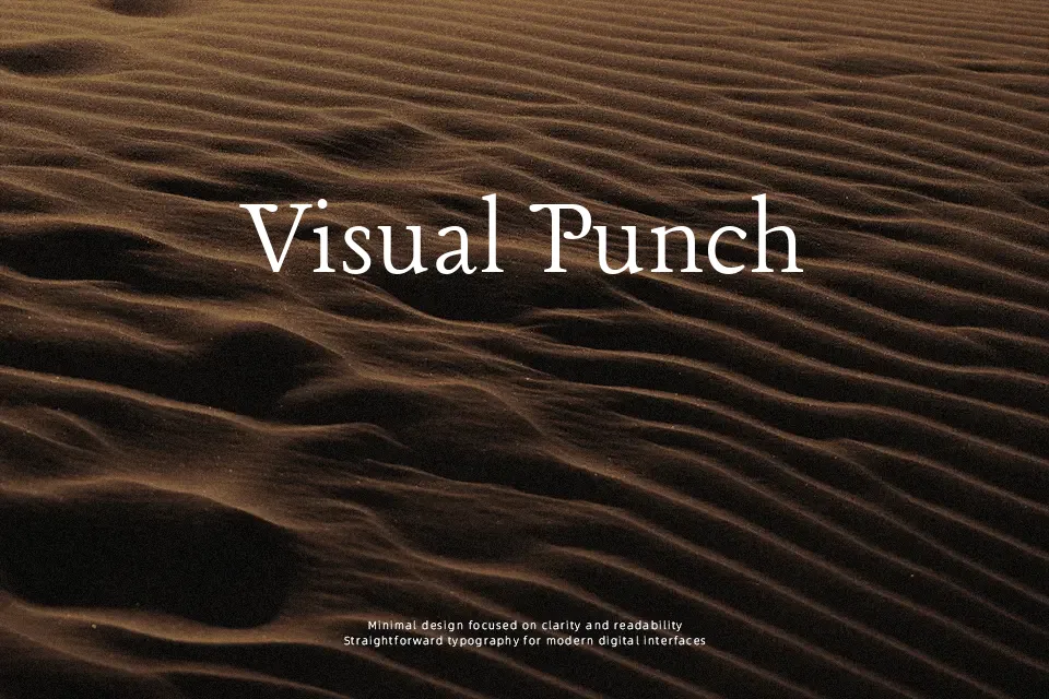
Lancelot is an ornate serif with sculpted strokes, sharp yet graceful terminals, and a slightly compact rhythm that keeps headlines tight while still readable. Its dual sets of capitals and decorative detailing lean toward a historic, French-inspired tone rather than a neutral book face. On screen, the moderate contrast and careful spacing hold up nicely for hero titles, logos, and pull quotes, but extended body copy can start to feel visually heavy. I reach for this font when a project needs a storybook or chivalric edge—think boutique branding, event posters, or section titles in an editorial layout—yet I would avoid it for long reports, minimalist interfaces, or sober corporate decks where a quieter serif is more appropriate.
Best For:
logo wordmarks with character
editorial titles and pull quotes
branding for boutiques or artisan products
thematic posters with historic flavor
Not Ideal For:
long paragraphs or dense articles
formal corporate documents
minimalist UI text
data-heavy presentations
Perfect for branding, headline, and logo, with a artistic and decorative style.
License
Gallery