Lakki Reddy Font
Free for Commercial UseAbout
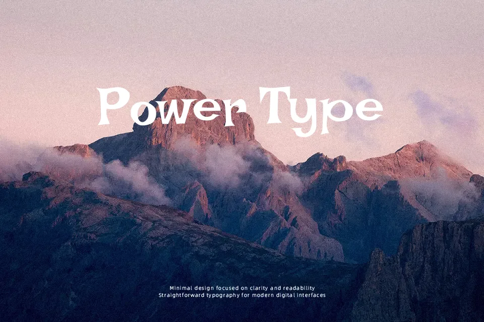
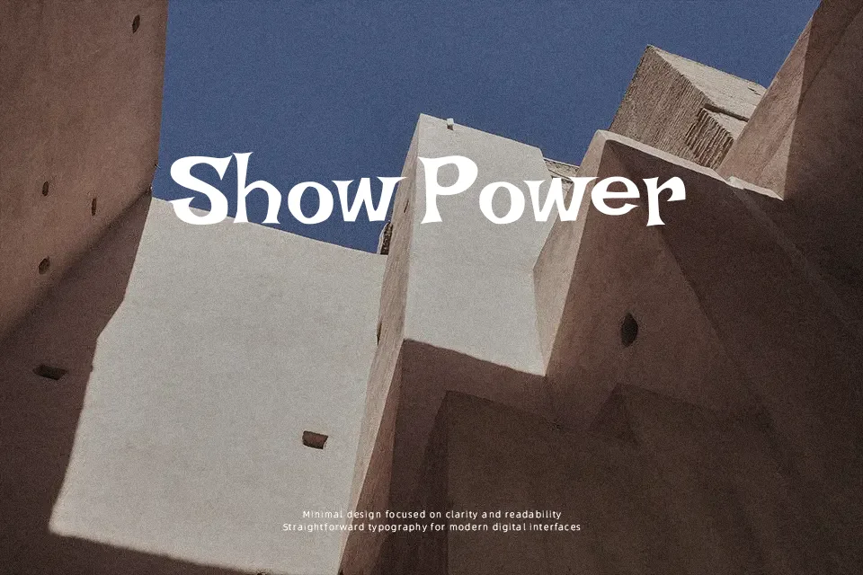
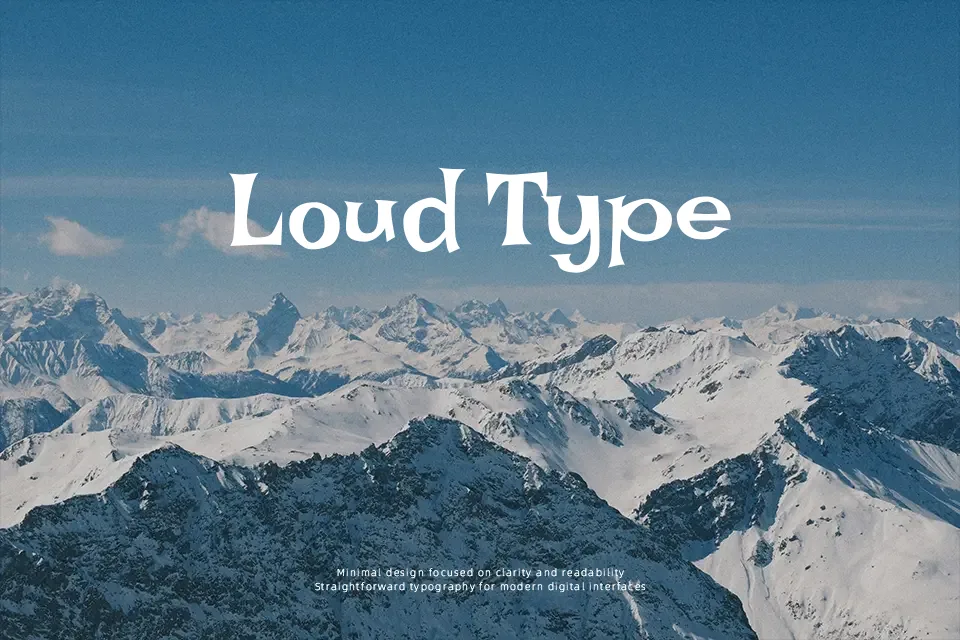
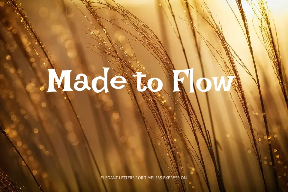
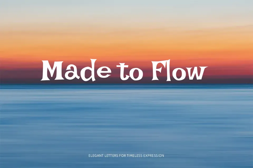
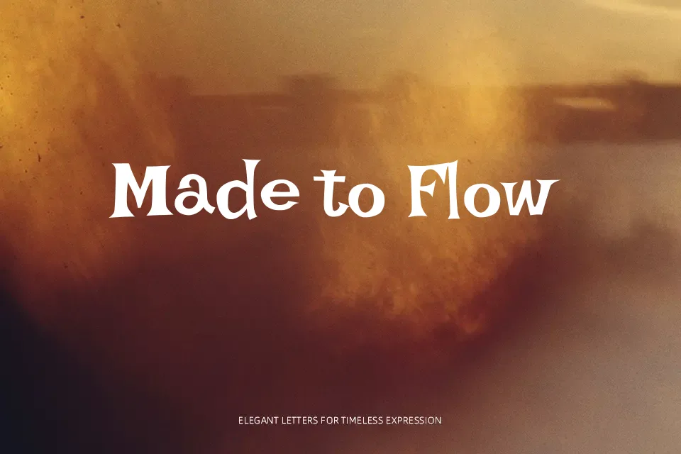
Lakki Reddy has chunky, uneven strokes, with curves that wobble slightly and terminals that feel drawn with a confident marker rather than a precise pen. The spacing is open and a bit irregular, so words look casual and energetic instead of tightly engineered. Overall it reads as a decorative handwriting display face, informal and a bit quirky, closer to a cartoonish script than a neat calligraphic hand. It shines in Telugu and Latin headlines for festival posters, children’s activity flyers, food truck menus, and YouTube thumbnail titles where you want a friendly shout rather than a whisper. For long paragraphs, serious editorial layouts, or strict corporate decks, the wobble and weight quickly become tiring and out of place, so pairing it with a calmer sans or serif for body copy usually works better.
Best For:
playful headings on posters
kids event graphics and invitations
festival or street food branding
YouTube thumbnails and social tiles
Not Ideal For:
long-form reading text
formal corporate documents
minimalist luxury branding
dense data-heavy presentations
Perfect for branding, headline, and kids, with a artistic and display style.
License
Gallery