Laila Font
Free for Commercial UseAbout
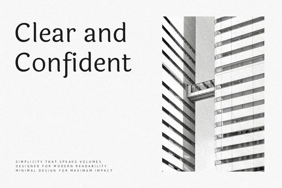
Laila combines a humanist structure with mostly monolinear strokes, a high x-height, and open counters that keep Latin text clear even at smaller sizes. The Devanagari forms feel more fluid and slightly lighter, so mixed-script layouts have an even, lively texture instead of feeling mismatched. Across five weights from Light to Bold, spacing is tight enough for headlines but controlled enough for short paragraphs, navigation, or captions. It works especially well when you want a contemporary, approachable voice on bilingual posters, websites, or product cards, but extended long-form reading can feel a bit informal and brisk.
Best For:
bilingual headlines and subheads
short UI or app text
event posters with Devanagari
product cards and captions
Not Ideal For:
dense long-form body copy
highly formal corporate reports
small-print legal or technical text
Perfect for body text, branding, and headline, with a artistic and display style.
License
Gallery