Krub Font
Free for Commercial UseAbout
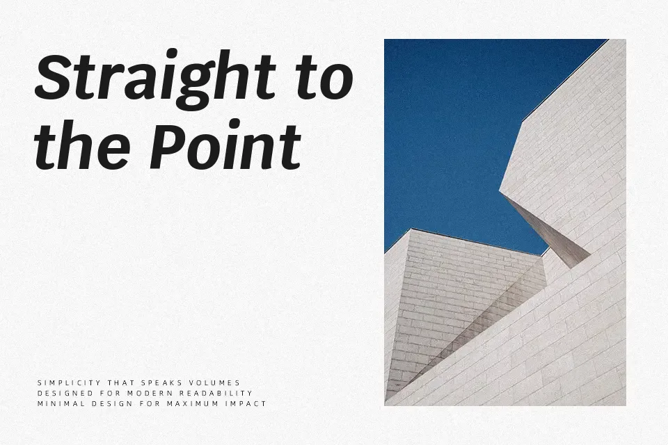
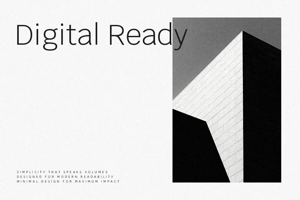
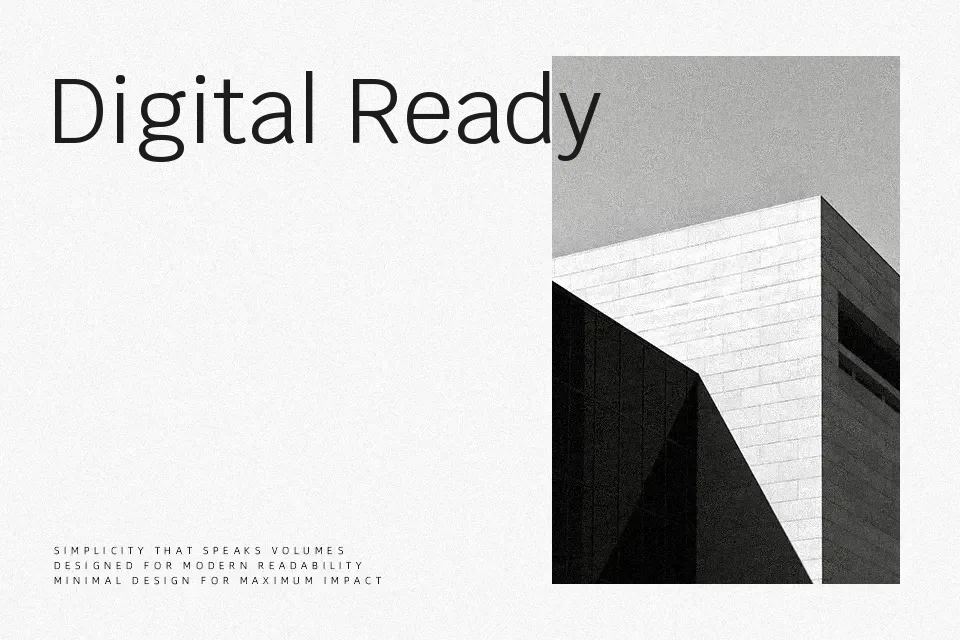
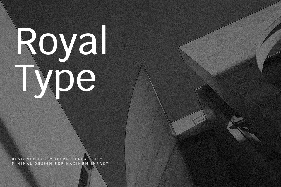
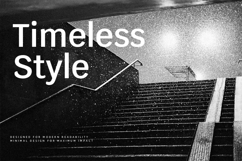
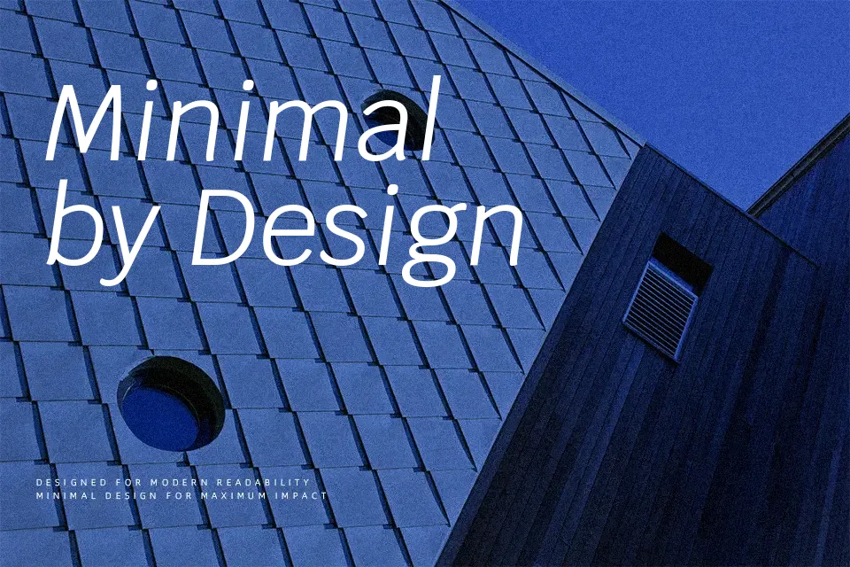
Krub combines geometric structure with subtle humanist curves, so its strokes feel steady without looking cold. The low contrast and open counters keep small text readable, while the slightly condensed width lets you fit more characters into tight layouts like navigation bars or app menus. Multiple weights with matching italics make it easy to build clear hierarchies, from quiet captions to confident labels. In practice, it works particularly well in UI labels, dashboard metrics, and straightforward corporate landing pages where you want clarity without stiffness. It can feel too plain for expressive branding or highly decorative posters, so for character-driven logos or playful packaging, you may want something with more personality.
Best For:
interface labels and menus
business or corporate websites
dashboard data and UI elements
compact headings in web layouts
Not Ideal For:
expressive logo wordmarks
highly decorative posters
kids or playful product packaging
long literary book typesetting
Perfect for business card, editorial, and headline, with a clean and condensed style.
License
Gallery