Krona One Font
Free for Commercial UseAbout
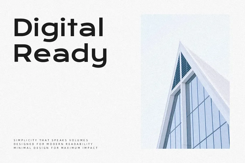
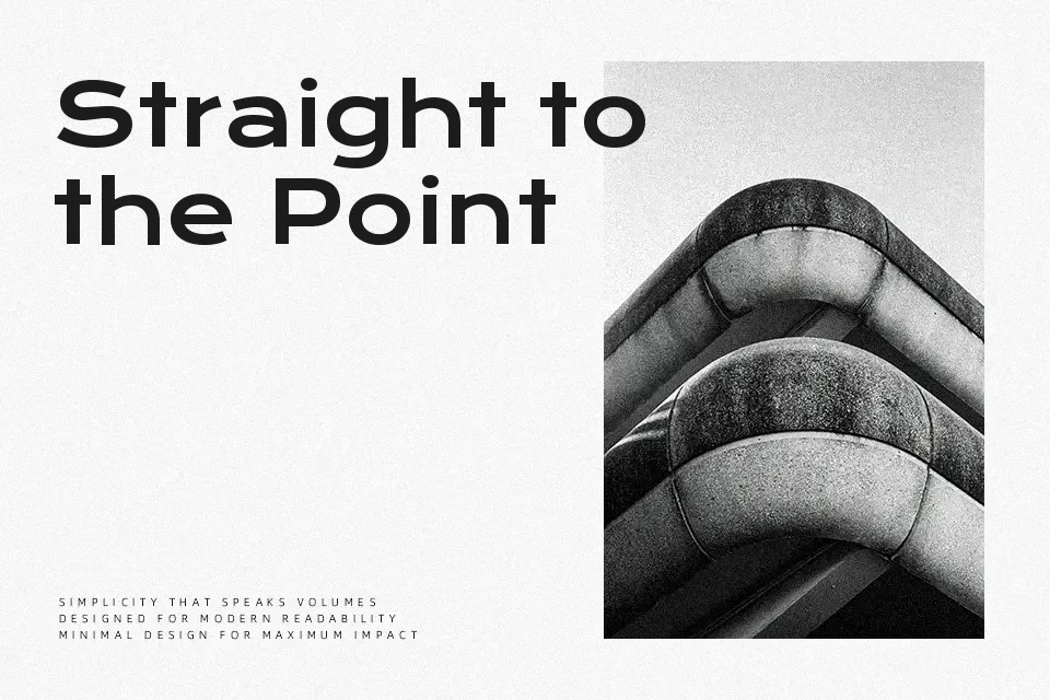
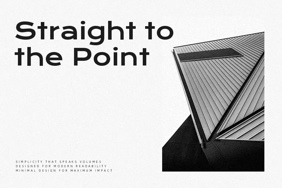
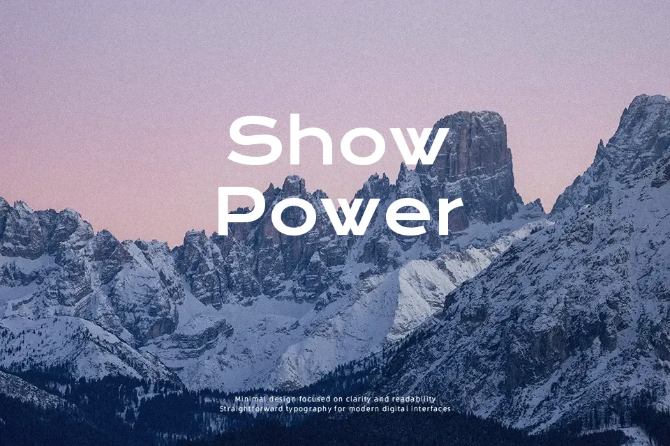
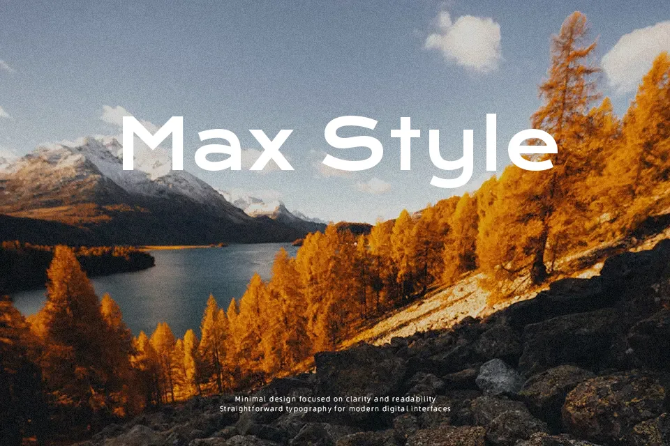
Krona One has a geometric skeleton with low contrast strokes, generous x-height, and semi-extended proportions that keep letters open and easy to scan. Its sans serif shapes feel sturdy and contemporary, while the poster-inspired detailing adds a quiet retro edge instead of shouting for attention. This mix makes it handy for interface headers, landing page sections, and bold callouts where you need personality but still care about readability across sizes. Compared to stricter grotesque sans fonts, Krona One feels looser and more expressive, which is a strength in branding but can look too informal for conservative corporate reports or highly traditional editorial layouts.
Best For:
web hero headlines
app and UI headings
modern branding wordmarks
poster-style social graphics
Not Ideal For:
dense body copy
formal corporate reports
long-form book text
strictly traditional layouts
Perfect for branding, headline, and logo, with a bold and geometric style.
License
Gallery