Kranky Font
Free for Commercial UseAbout
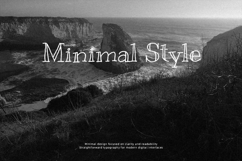
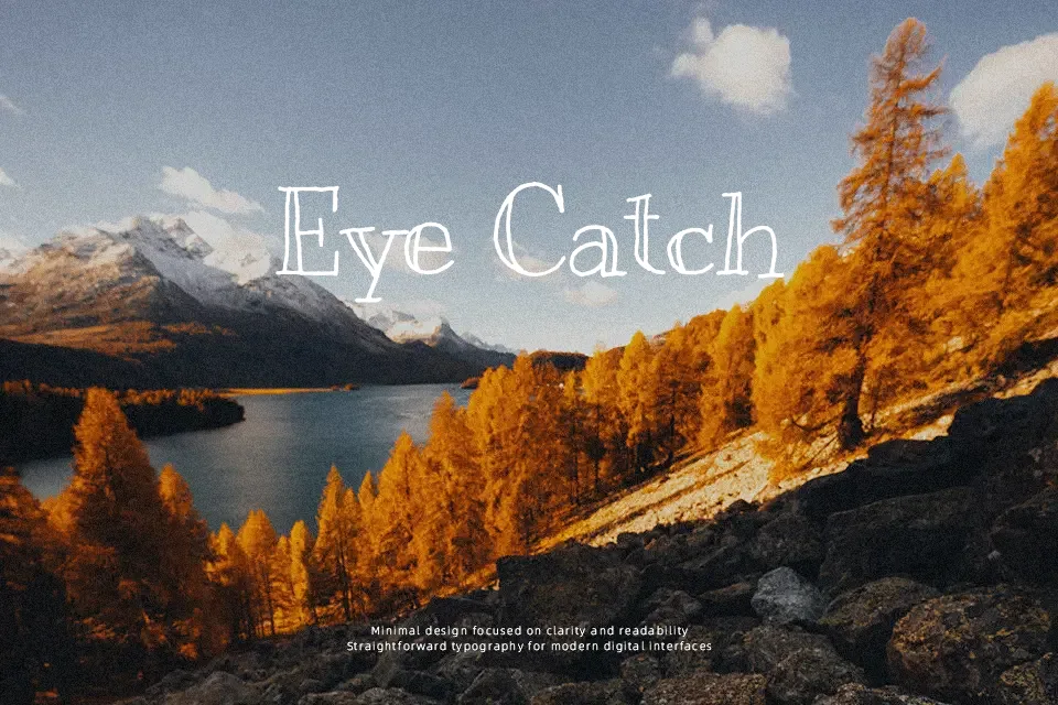
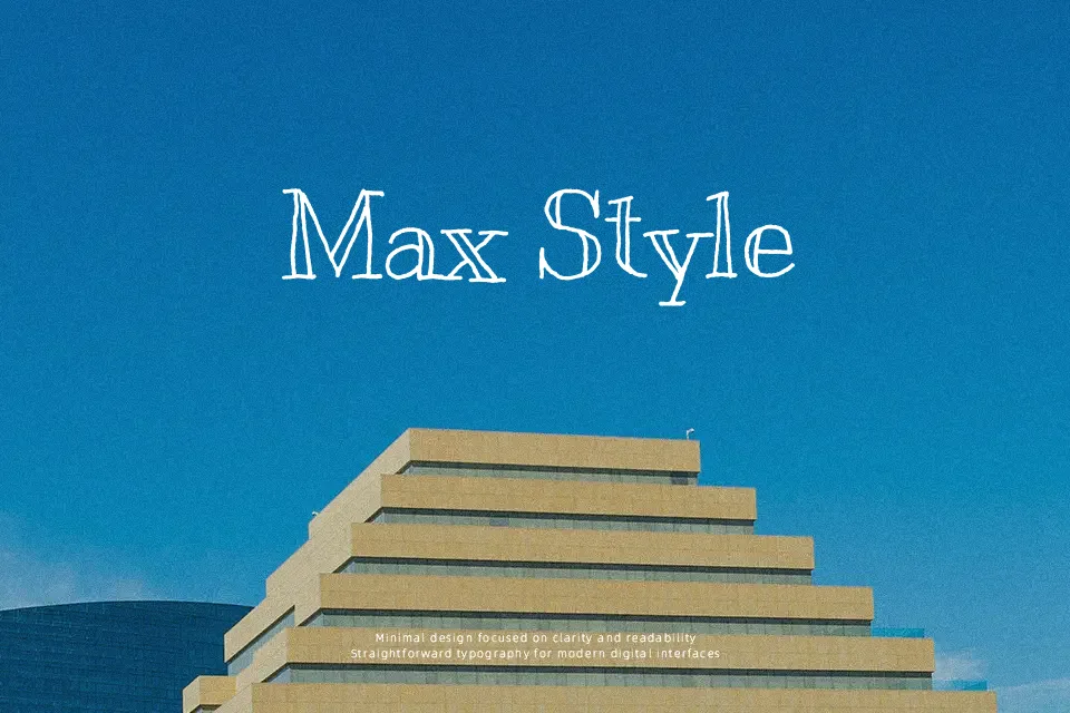
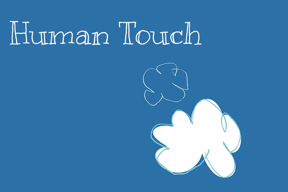
Kranky looks like it was drawn quickly with a felt-tip pen: uneven strokes, bouncy baseline, and wobbling outlines give it a raw, sketchy charm that never feels polished or corporate. Letters lean and jitter, counters are irregular, and spacing is intentionally loose, so words feel animated rather than locked to a grid. It leans strongly decorative and casual, which works nicely for playful headlines, retro-flavored poster titles, YouTube thumbnails, and kids product packaging where personality matters more than precision. On the other hand, its rough texture and inconsistent rhythm can quickly become tiring in dense paragraphs or serious editorial work, so it is best kept for short, attention-grabbing text instead of anything you expect people to read for long stretches.
Best For:
playful display headlines
kids product packaging
offbeat poster titles
quirky social media graphics
Not Ideal For:
long paragraphs
formal documents
minimalist corporate branding
small UI text
Perfect for branding, kids, and logo, with a artistic and display style.
License
Gallery