KR Bite Me Font
Free for personal useAbout
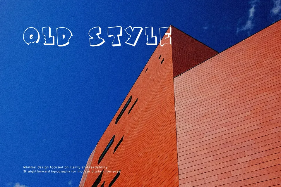
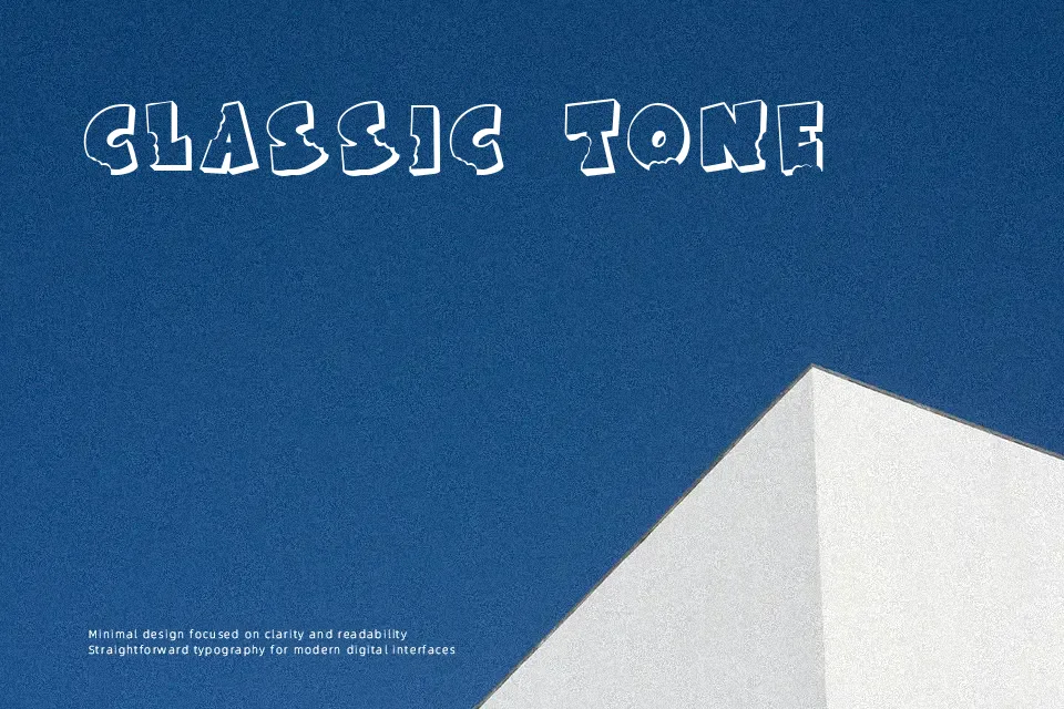
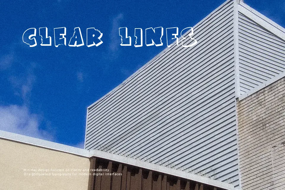
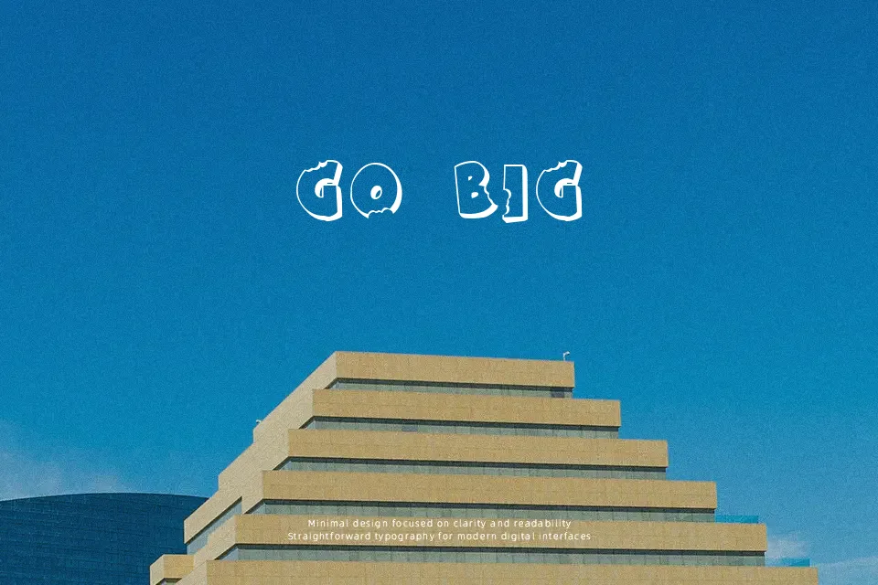
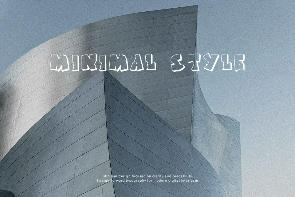
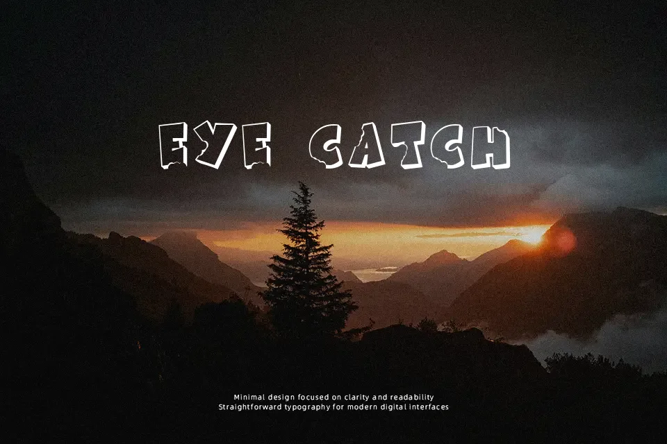
Sharp edges, irregular stroke widths, and chaotic spacing give KR Bite Me a raw, aggressive presence that immediately feels unsettling. The letterforms lean toward a hand-drawn horror aesthetic, with distorted shapes that mimic scratches or bite marks. This makes it effective for Halloween flyers, horror game titles, or gritty band visuals where atmosphere matters more than clarity. However, readability drops quickly at smaller sizes, especially in dense layouts. It performs best in bold headlines or short phrases, while longer text blocks become tiring to read and visually cluttered.
Best For:
halloween event posters
horror game titles
band or music artwork
edgy social media graphics
Not Ideal For:
long paragraph text
corporate presentations
formal branding
small UI text
Perfect for halloween, headline, and music, with a artistic and decorative style.
License
Gallery