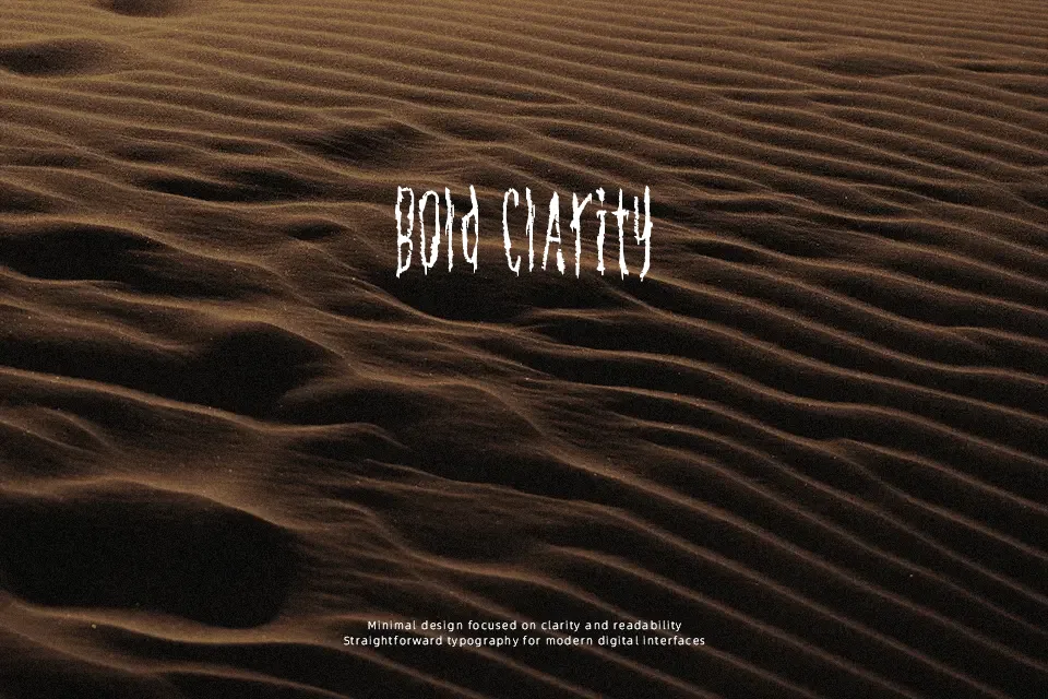
Konflic Font
Free for personal useAbout
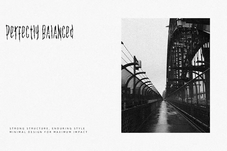
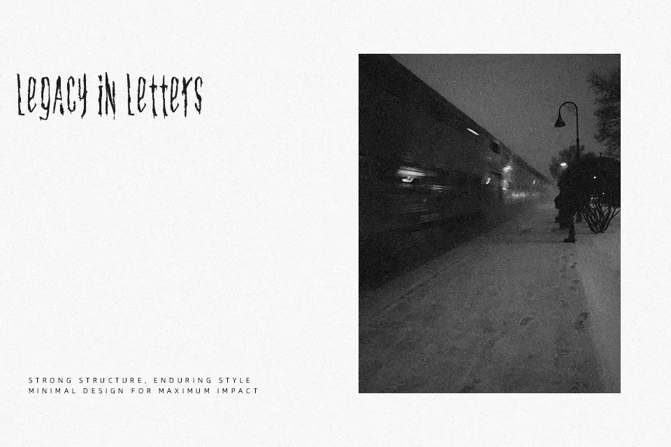
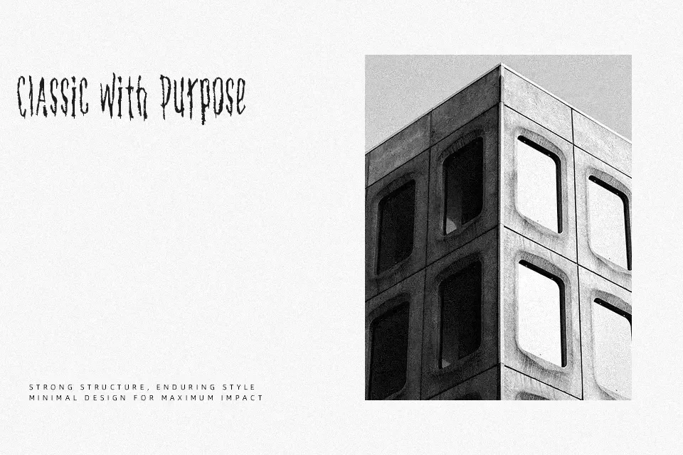
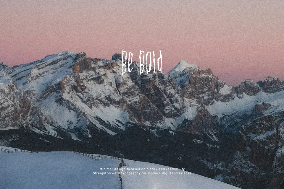
Jagged strokes and uneven spacing define Konflic Font, giving it a tense, almost fractured appearance. The letterforms lean toward a display style with strong contrast and irregular structure, creating a sense of conflict and motion. It works best in high-impact contexts like gaming graphics, underground music posters, or bold social media visuals where attitude matters more than clarity. However, its aggressive shapes can feel overwhelming in longer passages and may lose legibility at small sizes. From a practical standpoint, it performs well as a headline font but struggles when readability becomes the priority.
Best For:
gaming poster headlines
music cover artwork
edgy branding visuals
social media graphics with attitude
Not Ideal For:
long paragraph text
corporate reports
small UI text
formal editorial layouts
Perfect for headline, logo, and music, with a bold and decorative style.
License
Gallery