Komika Krak Font
Free for personal useAbout
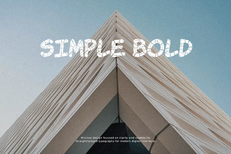
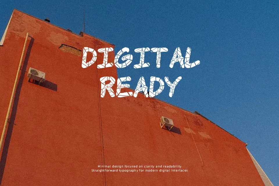
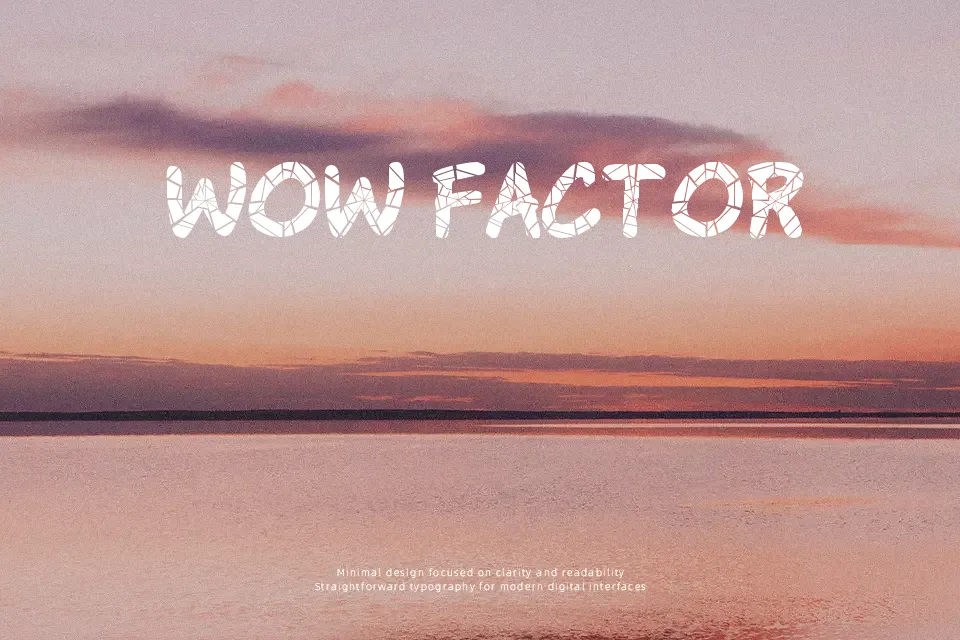
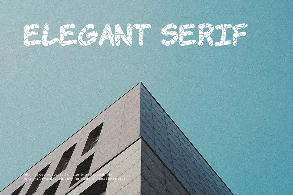
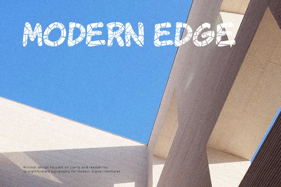
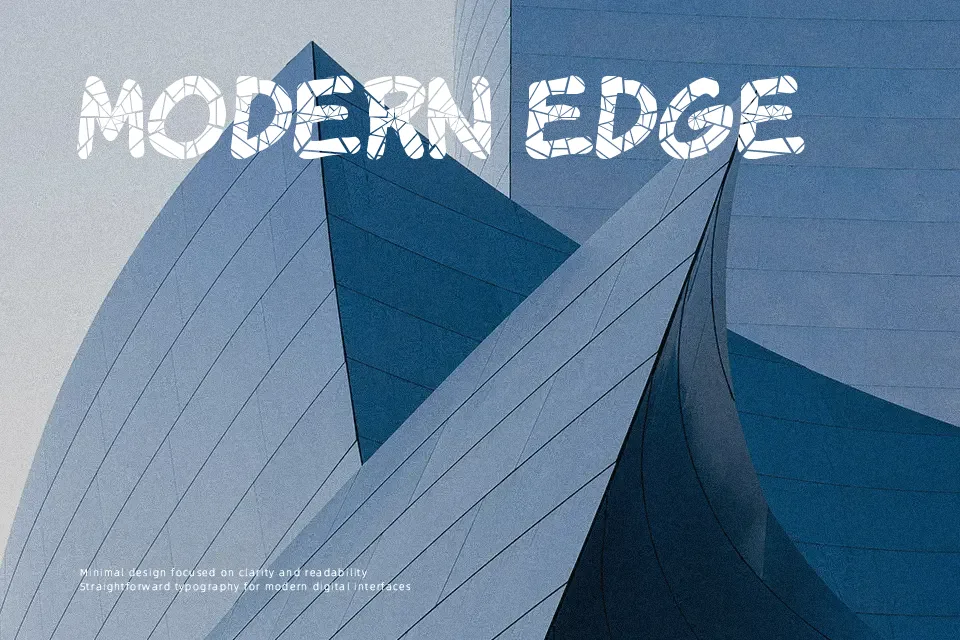
Sharp, irregular strokes and slightly chaotic spacing give Komika Krak a raw comic-book feel, almost like hand-drawn lettering frozen mid-action. The letterforms lean toward exaggerated angles and uneven edges, which amplify its expressive, high-energy style. It works well in comic panels, game titles, or posters that need a loud visual voice. However, the aggressive shapes can quickly become tiring in longer text or small sizes, where readability drops. From a usability standpoint, it shines in short bursts—headlines or captions—but struggles in structured or professional layouts that demand clarity and restraint.
Best For:
comic panel dialogue
gaming thumbnails and titles
poster headlines with strong personality
kids-themed graphics
Not Ideal For:
long paragraph text
corporate reports
small UI labels
formal branding systems
Perfect for gaming, headline, and kids, with a creative and comic style.
License
Gallery