Klee One Font
Free for Commercial UseAbout
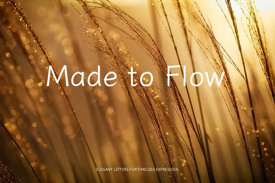
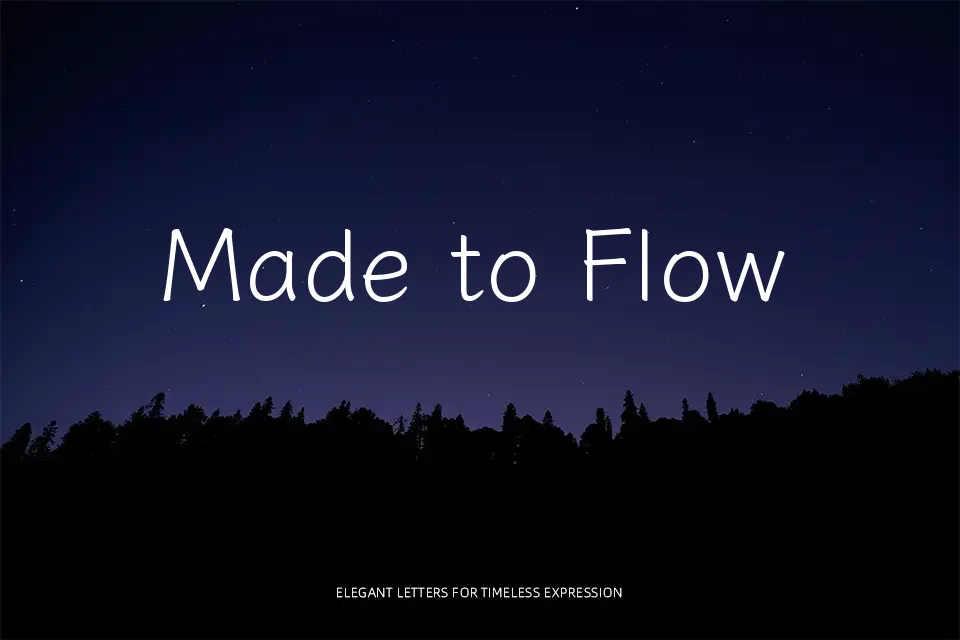
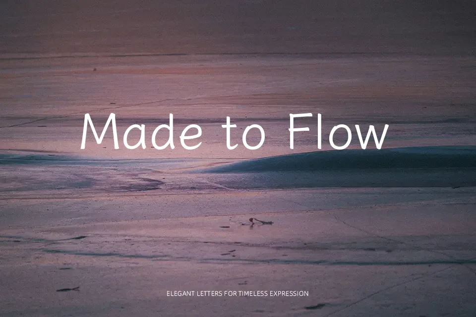
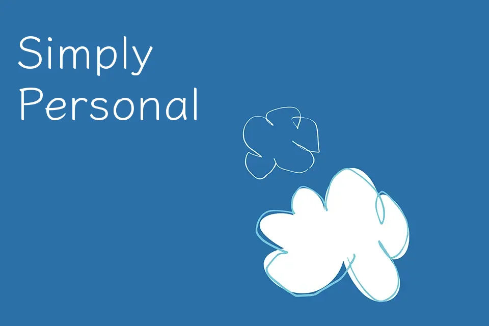
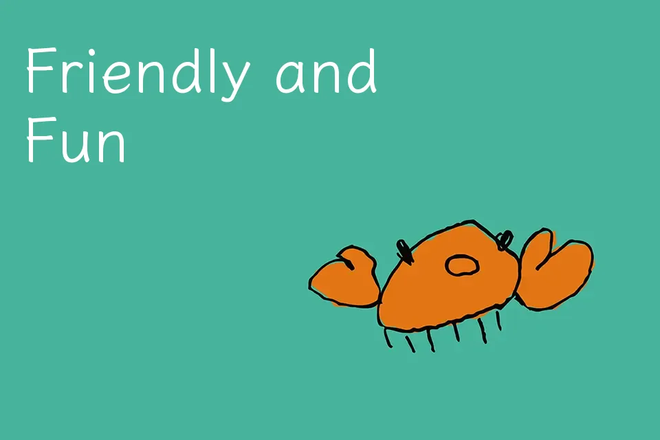
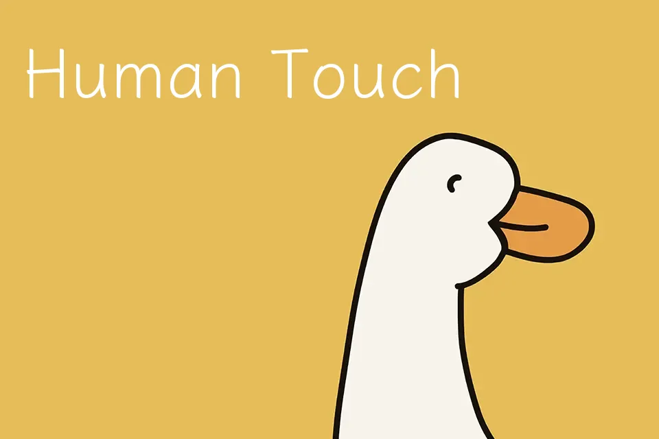
Klee One looks like neat pencil handwriting, with slightly rounded strokes, low contrast, and open counters that keep lines readable even at smaller sizes. The rhythm is steady rather than bouncy, so it feels calm and studious instead of noisy or comic. This makes it useful for annotations on slides, educational materials, cozy blog graphics, and UI captions that should feel personal but still tidy. When pushed into dense body copy or highly corporate branding, the informal texture can feel underdressed and a bit too casual. If you like softer script faces but dislike overly decorative swashes, this sits in a comfortable middle ground.
Best For:
friendly interface labels
educational slides and notes
kids product graphics
casual editorial captions
Not Ideal For:
formal corporate branding
very long body text
highly technical documents
minimalist luxury layouts
Perfect for branding, editorial, and kids, with a calm and handwritten style.
License
Gallery