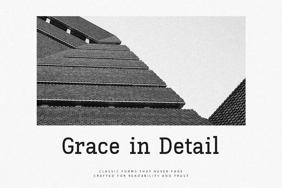
Kay Pho Du Font
Free for Commercial UseAbout
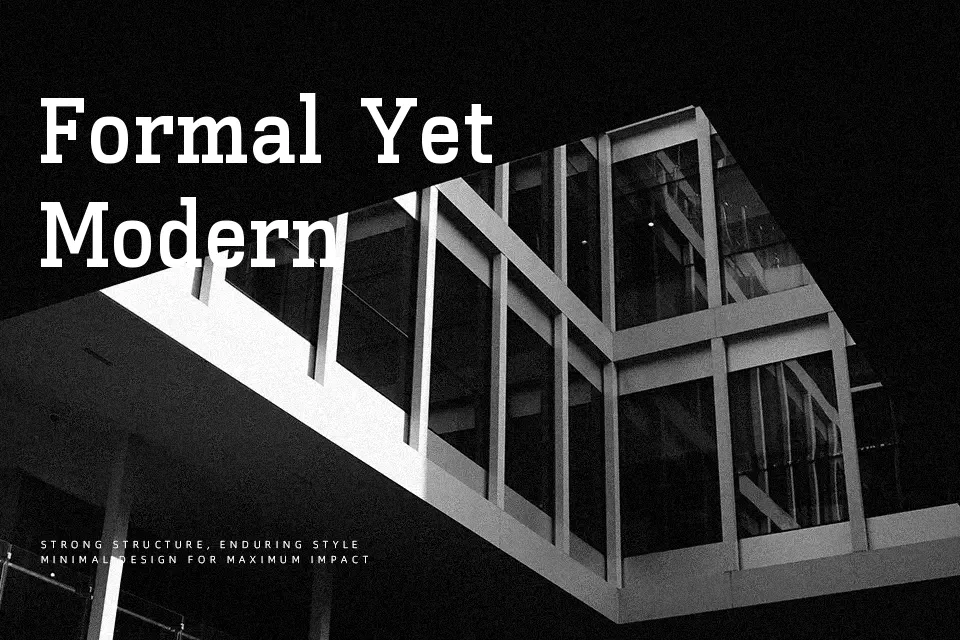
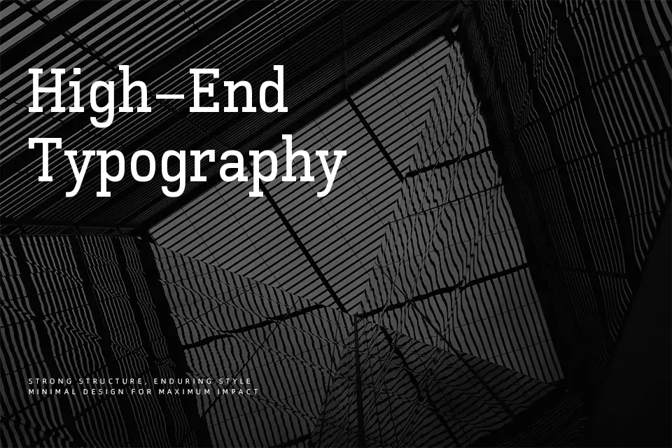
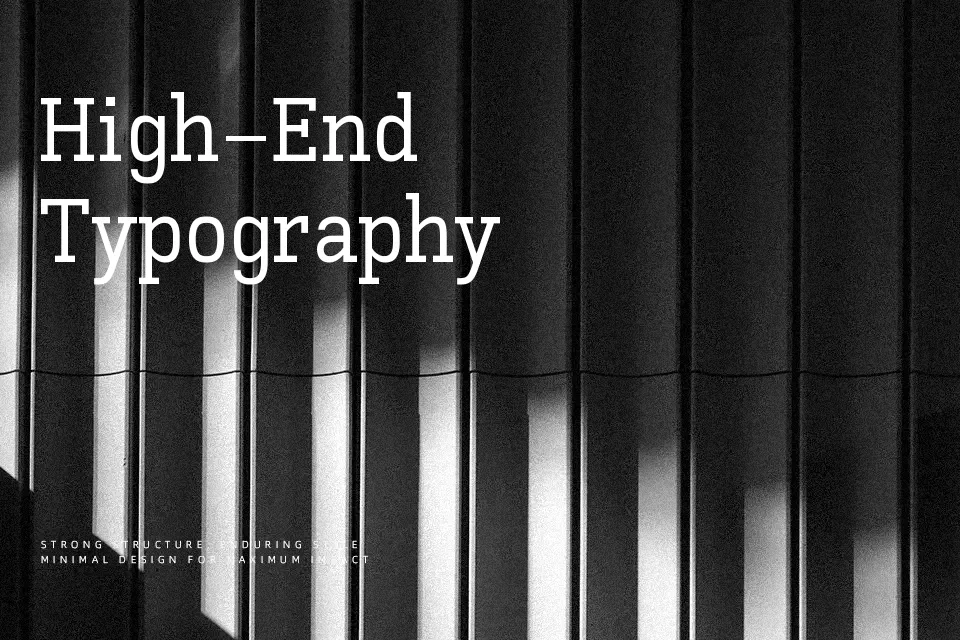
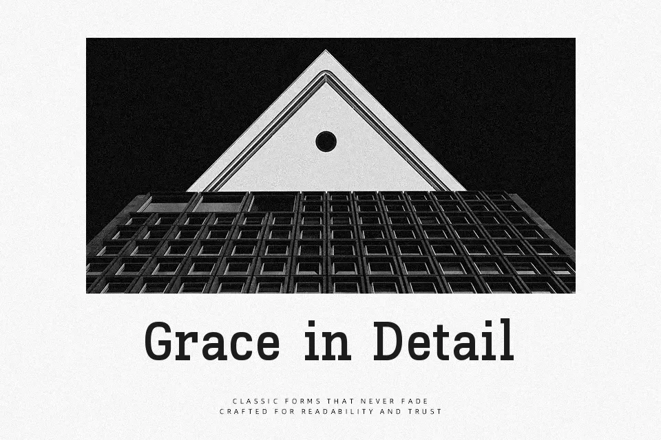
Kay Pho Du combines a calm serif structure with fairly open counters and moderate stroke contrast, so text stays readable even at smaller sizes. The spacing feels steady rather than airy, which gives paragraphs a solid texture suited to publications and long-form content. Its design grows out of Kayah Li letterforms, and the added Latin shares that slightly traditional, bookish tone, making mixed-script layouts feel coherent instead of patched together. I find it works especially well in community reports, language-learning materials, and cultural projects where Kayah Li and Latin need to sit side by side without visual tension. It is less convincing for flashy lifestyle branding or highly expressive logo wordmarks, where you may want something more stylized or condensed.
Best For:
editorial layouts in kayah li
bilingual cultural publications
educational book interiors
steady, readable headings
Not Ideal For:
highly expressive logos
ultra-minimal tech branding
tight UI components
tiny legal footnotes
Perfect for branding, editorial, and headline, with a classic and serif style.
License
Gallery