Kadwa Font
Free for Commercial UseAbout
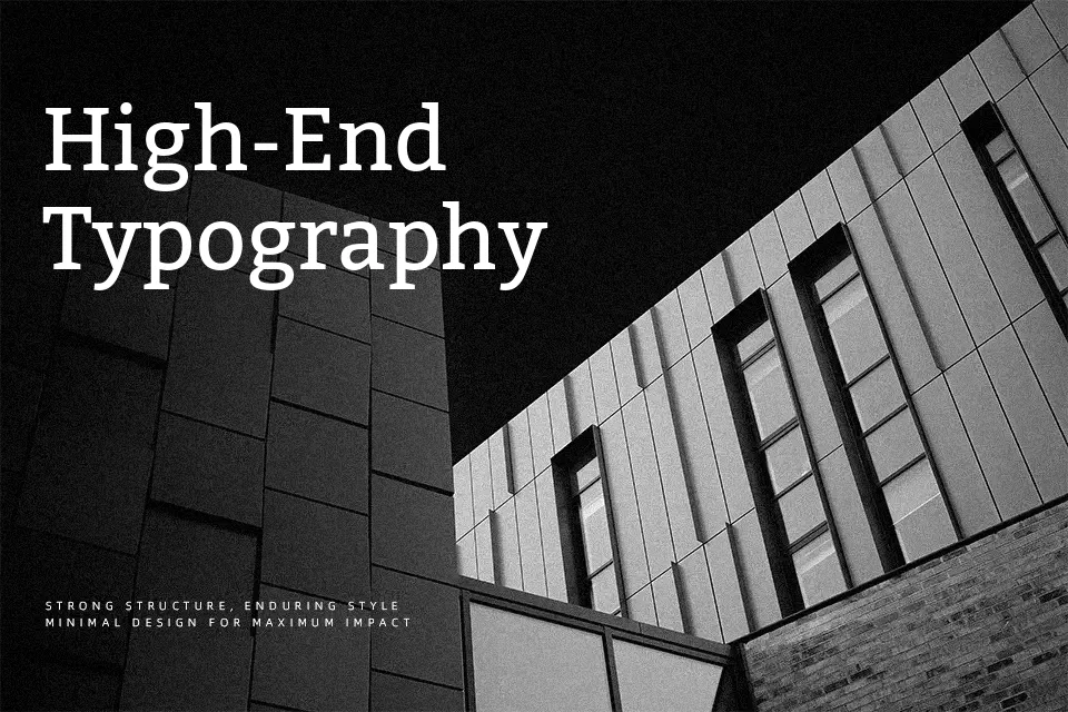
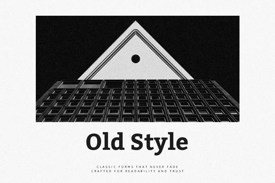
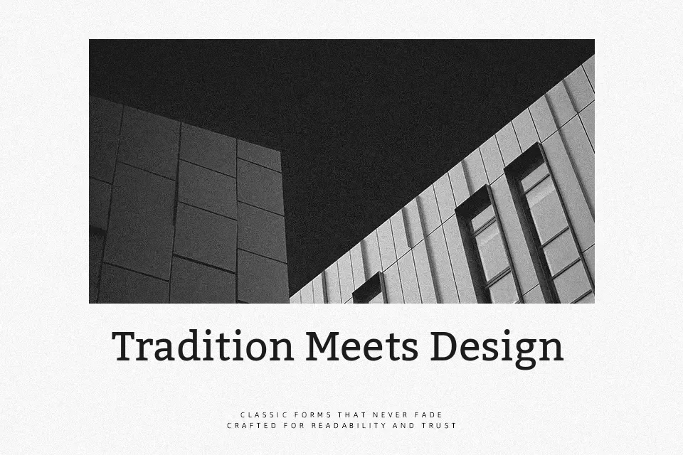
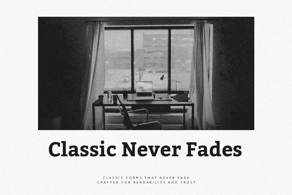
Kadwa takes its cues from Devanagari text type, translating that solidity into Latin forms with blocky serifs, low stroke contrast, and a slightly dark overall color on the page. Stems feel steady and upright, counters stay open, and the spacing is tuned for continuous reading rather than flashy display work. On screen, its chunky serifs and consistent weight help small sizes hold together in UI labels, news articles, and long-form reading, while the bold cut gives headings just enough presence without shouting. If you want something breezy or highly expressive for playful branding, though, Kadwa can feel too serious and dense.
Best For:
editorial body text
news and blog headings
interface labels and menus
Not Ideal For:
playful kids branding
highly decorative logos
elegant wedding stationery
very tight captions at micro size
Perfect for branding, editorial, and headline, with a classic and serif style.
License
Gallery