Junge Font
Free for Commercial UseAbout
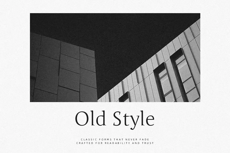
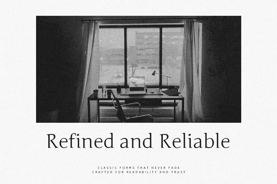
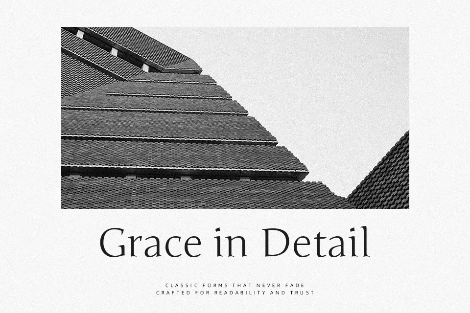
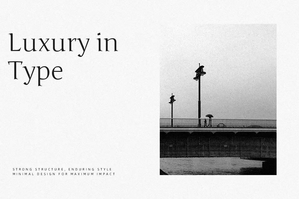
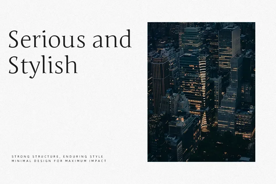
There’s a particular kind of reserve to Junge that sets it apart from more assertive serifs. Its strokes stay consistently thin, transitions between thick and thin are gentle rather than sharp, and the overall spacing lets characters settle without crowding. That measured looseness works in its favor on editorial headers, botanical packaging labels, or a spa website’s navigation text — anywhere the goal is to feel curated rather than loud. The calligraphic heritage shows up in small ways: a slight curve at terminals, letterforms that feel hand-guided without being informal. Where Junge stumbles is in demanding environments. Long body copy at small screen sizes will test readability, and the delicate weight disappears entirely on textured or dark printed backgrounds.
Best For:
botanical or wellness brand copy
editorial section headers
minimalist homepage headings
fragrance or beauty packaging text
Not Ideal For:
body text at small screen sizes
dark or textured print backgrounds
high-energy advertising banners
dense UI components
Perfect for body text, branding, and editorial, with a calm and serif style.
License
Gallery