Julius Sans One Font
Free for Commercial UseAbout
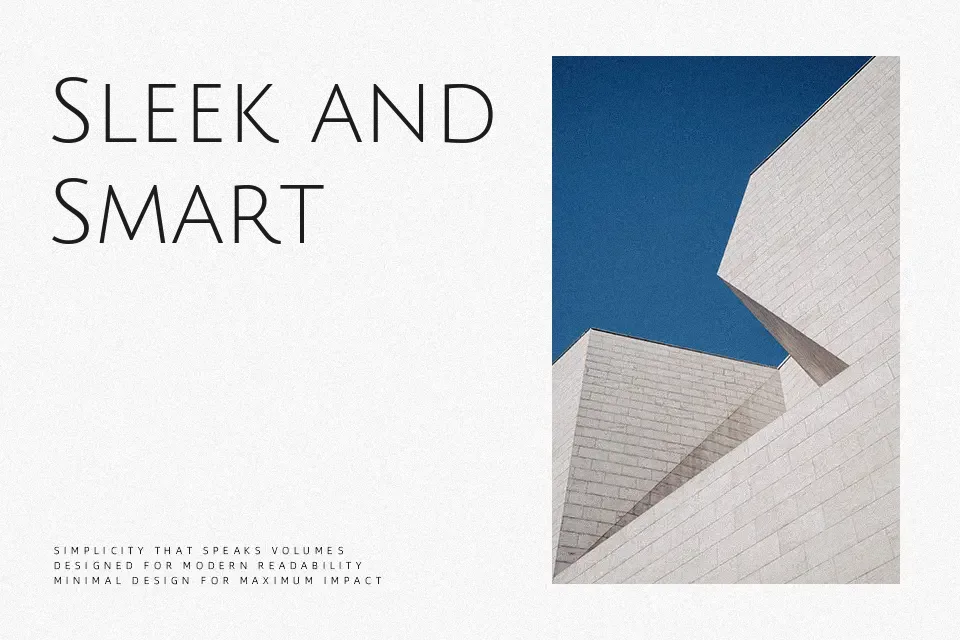
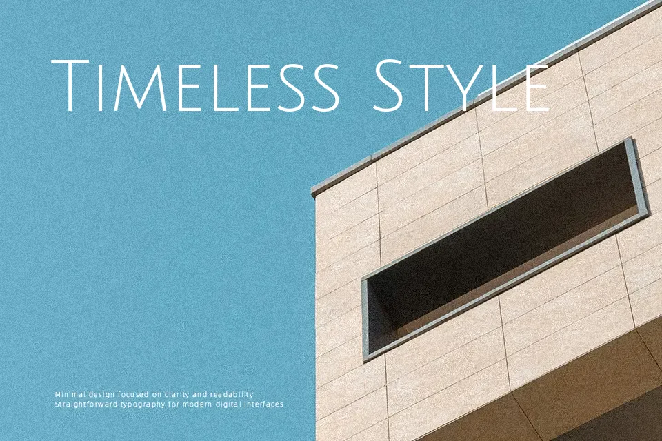
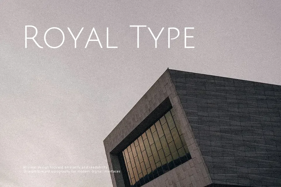
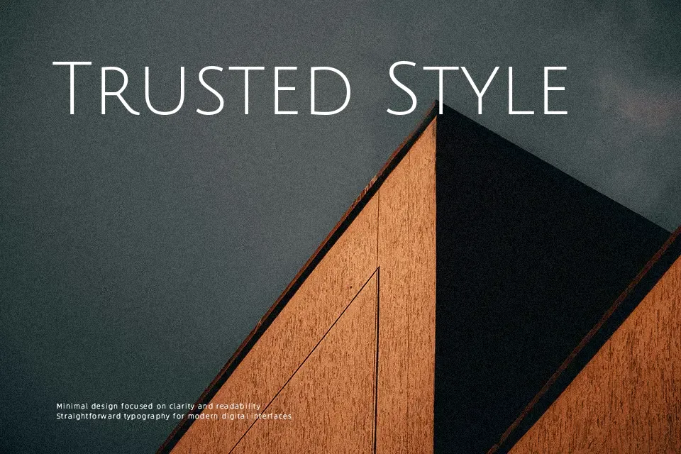
Julius Sans One uses very thin strokes, tall proportions, and generous tracking, so every letter feels airy and deliberate. The caps have a geometric skeleton, but small quirks in curves and joins keep it from looking sterile. On screen it reads clearly at medium sizes, yet the light weight means it can look fragile or uneven if you squeeze it into dense paragraphs or very small UI labels. I tend to reach for it when a layout needs a refined, contemporary accent—portfolio covers, product names, or section titles—rather than as a workhorse text face. If you like sleek sans serifs but find some too heavy or corporate, this one feels closer to a fashion or editorial display cut than to a typical UI font.
Best For:
headline accents in minimalist layouts
fashion or lifestyle branding wordmarks
portfolio covers and section titles
lightweight poster and editorial headers
Not Ideal For:
long reading paragraphs
small UI labels or dense menus
formal corporate reports
very text-heavy presentations
Perfect for branding, editorial, and headline, with a clean and display style.
License
Gallery