Jua Font
Free for Commercial UseAbout
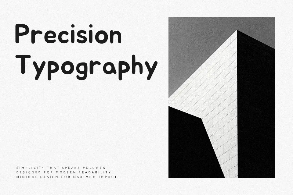
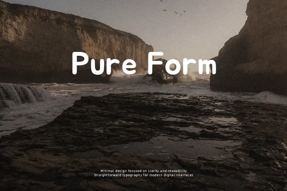
Jua is a heavy, rounded sans serif with thick strokes, low contrast, and generous counters, so letters feel compact yet stay legible on screens and in print. Its smooth curves and even stroke width give it a cheerful, informal character rather than a strict geometric look. The spacing is relatively tight, which helps headlines and short phrases lock together visually, but can start to feel dense if you push it into long text blocks. Jua works especially well for bold headlines on posters, kids’ educational materials, mobile UI labels, and friendly branding where you want a confident voice without sharp edges. For extended reading, editorial layouts, or formal corporate documents, its chunky shapes quickly become tiring, so pairing it with a more neutral text face is usually the better move.
Best For:
bold headlines
kids product packaging
playful app and web UI
casual poster design
Not Ideal For:
long paragraphs
formal documents
dense data tables
minimalist luxury branding
Perfect for branding, headline, and logo, with a bold and display style.
License
Gallery