Josefin Sans Font
Free for Commercial UseAbout
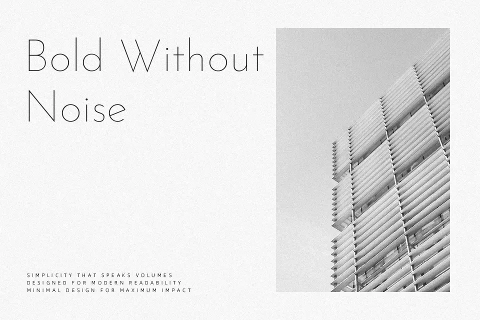
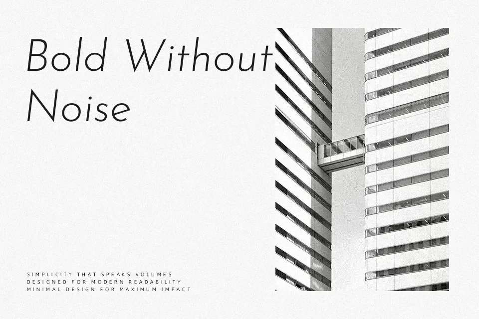
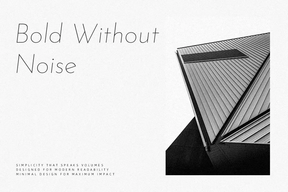
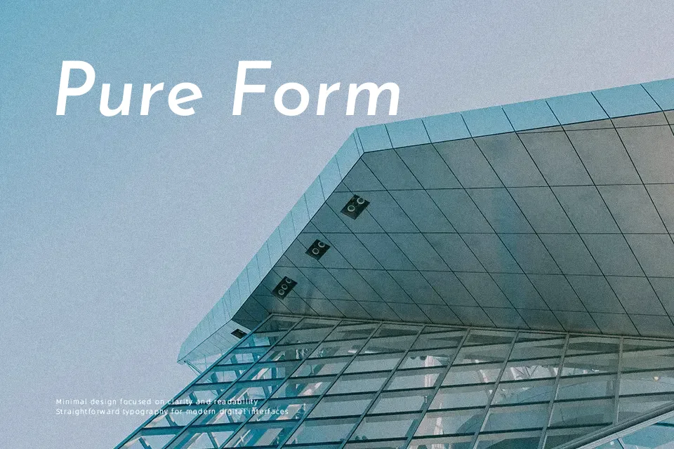
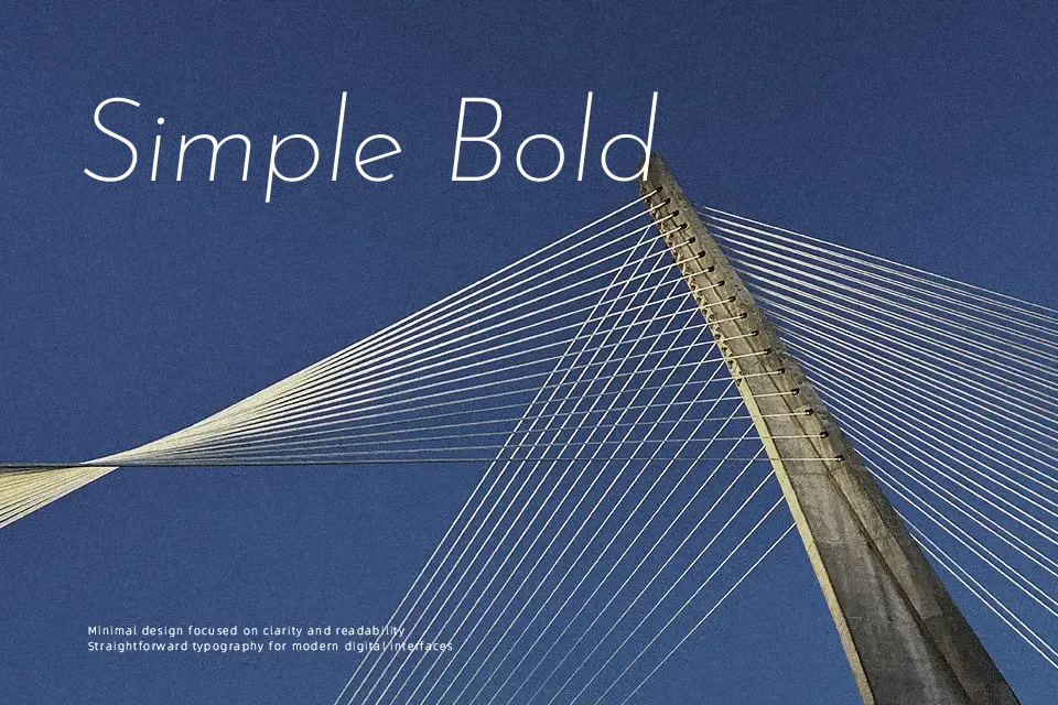
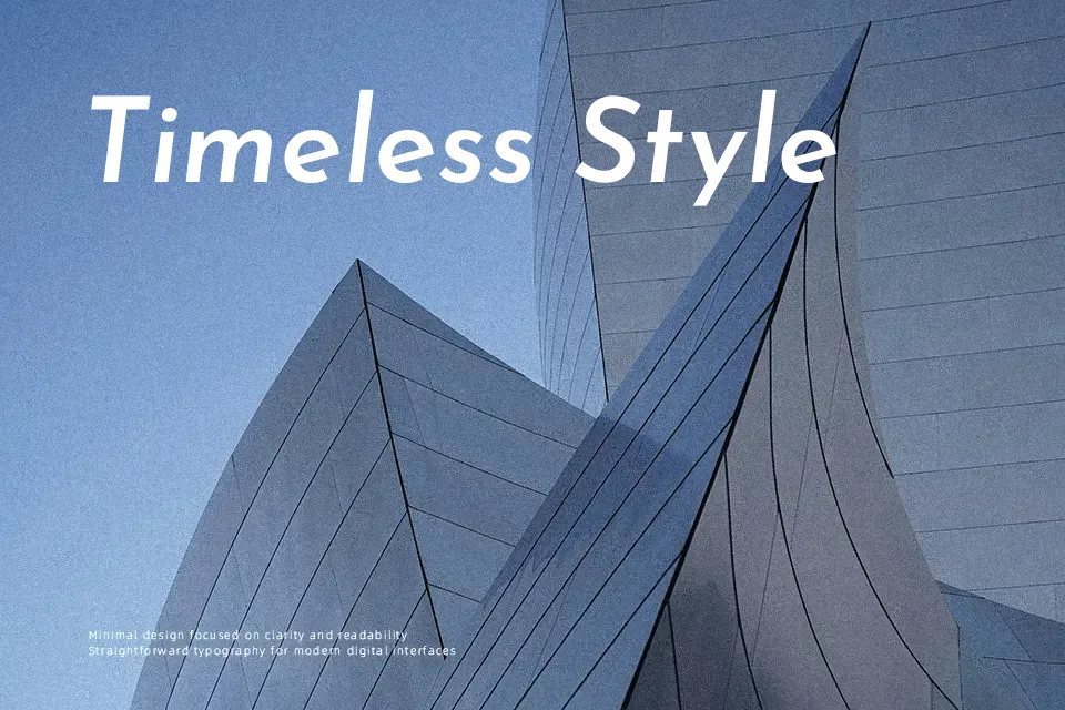
Josefin Sans blends geometric construction with a 1920s-inspired, vintage tone, using slim strokes, sharp terminals, and an unusually tall x-height that keeps letters airy and distinctive at display sizes. The family spans multiple weights and italics, so you can move from whisper-thin headings to stronger, bolder accents while maintaining the same visual voice. It feels modern yet nostalgic, which suits fashion lookbooks, editorial-style landing pages, portfolio sites, and restrained logo wordmarks where you want personality without ornament. Because of its proportions and tight counters, it can feel tiring in dense body copy or very small UI text, so I keep it for titles, pull quotes, and short branded phrases rather than long reading experiences.
Best For:
large headlines on web and mobile
editorial-style hero sections
minimalist branding wordmarks
portfolio and case study titles
Not Ideal For:
long-form body paragraphs
very small UI labels or captions
highly formal corporate documents
complex data-heavy interfaces
Perfect for advertising, editorial, and headline, with a classic and condensed style.
License
Gallery