Jacques Francois Font
Free for Commercial UseAbout
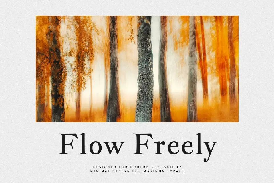
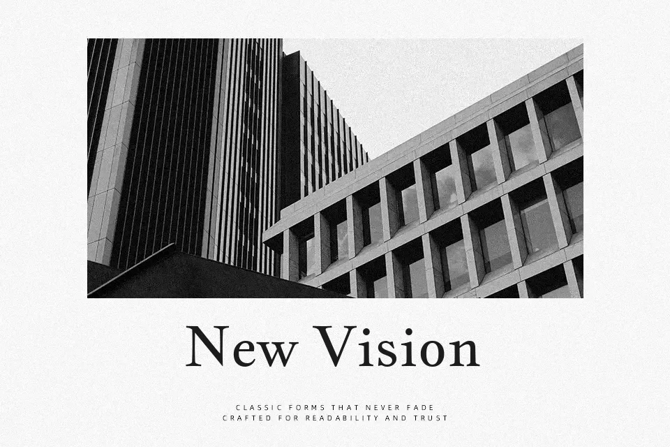
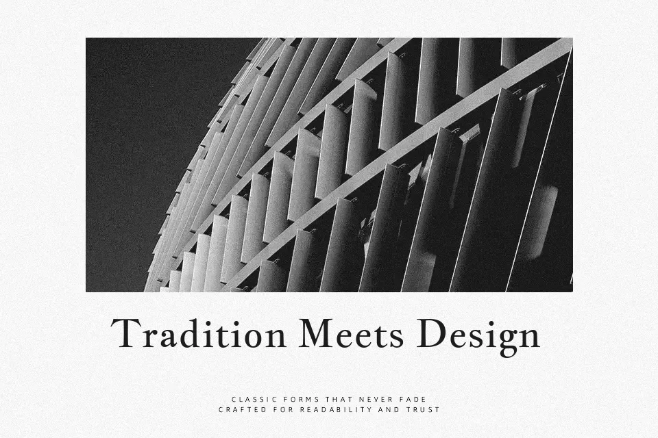
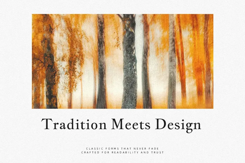
Jacques Francois revives an eighteenth-century Dutch-French serif, but tones down the contrast and raises the x-height so it reads more steadily on modern screens. The letters feel slightly compact, with crisp but not overly sharp serifs and a fairly even color across lines of text. That mix gives it a composed, literary voice that suits long-form reading, heritage brands, and cultural projects where you want history to show without turning into ornament. It tends to shine in mid-size text and restrained headlines; if you push it into ultra-small UI copy or pair it with very loud display fonts, its subtle detailing can get lost or feel mismatched.
Best For:
editorial headings and subheads
literary book interiors
heritage or museum branding
classy product descriptions
Not Ideal For:
very small UI labels
highly futuristic branding
dense data tables
ultra-minimal tech interfaces
Perfect for body text, branding, and editorial, with a classic and serif style.
License
Gallery