IM Fell Double Pica Font
Free for Commercial UseAbout
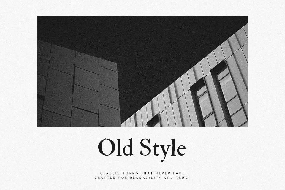
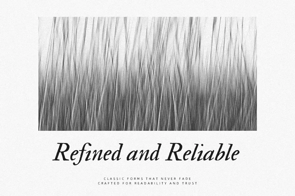
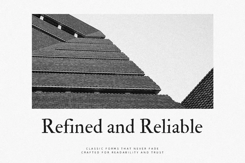
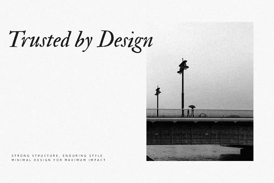
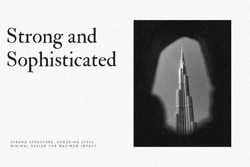
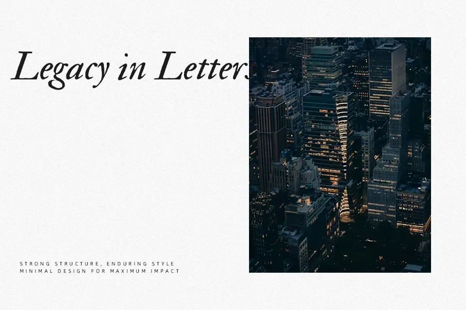
IM Fell Double Pica carries the quirks of hand-cut metal type: slightly rough contours, moderate contrast, and compact spacing that together read as authentically old rather than polished or corporate. The Roman and Italic styles share a sturdy structure, with assertive serifs and a narrow texture that immediately signals “early print” on the page. I like it for projects that want to reference academic presses, antique book jackets, museum ephemera, or period film title cards, especially when paired with a quieter modern sans for balance. It can feel heavy and fatiguing in long, dense body copy on screens, or in minimalist tech and startup branding, where its historical noise fights against clean, neutral systems.
Best For:
literary book covers and reprints
museum or heritage branding elements
historical or period-film posters
editorial headlines with a scholarly tone
Not Ideal For:
long digital body text at small sizes
minimalist tech or product interfaces
highly corporate presentations and reports
clean geometric logo systems
Perfect for branding, editorial, and headline, with a artistic and serif style.
License
Gallery