Iceland Font
Free for Commercial UseAbout
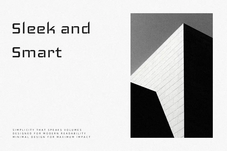
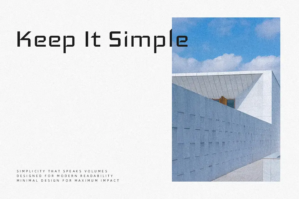
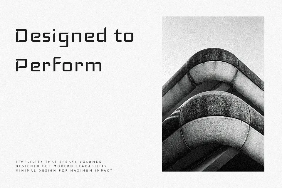
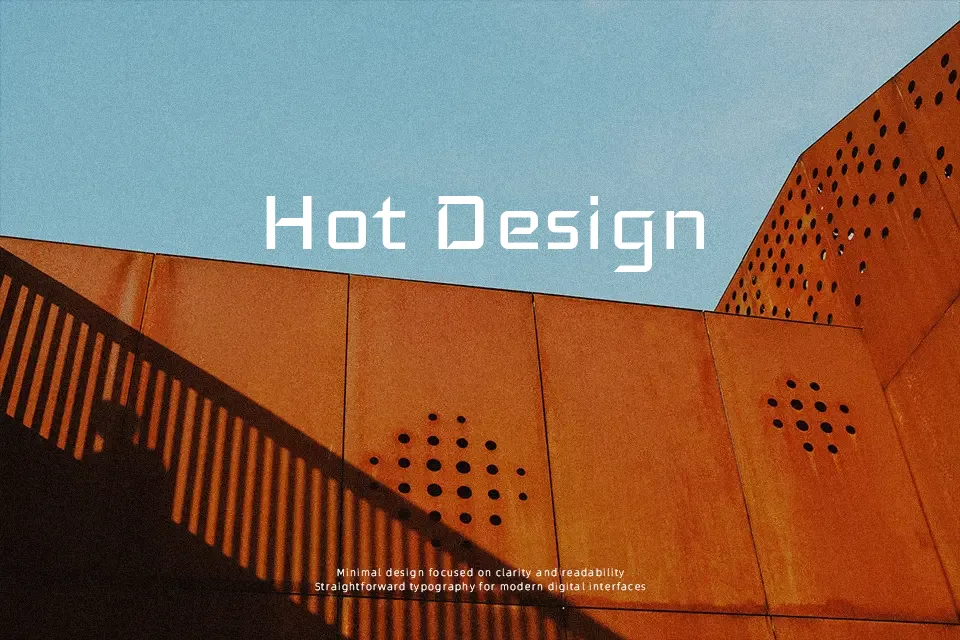
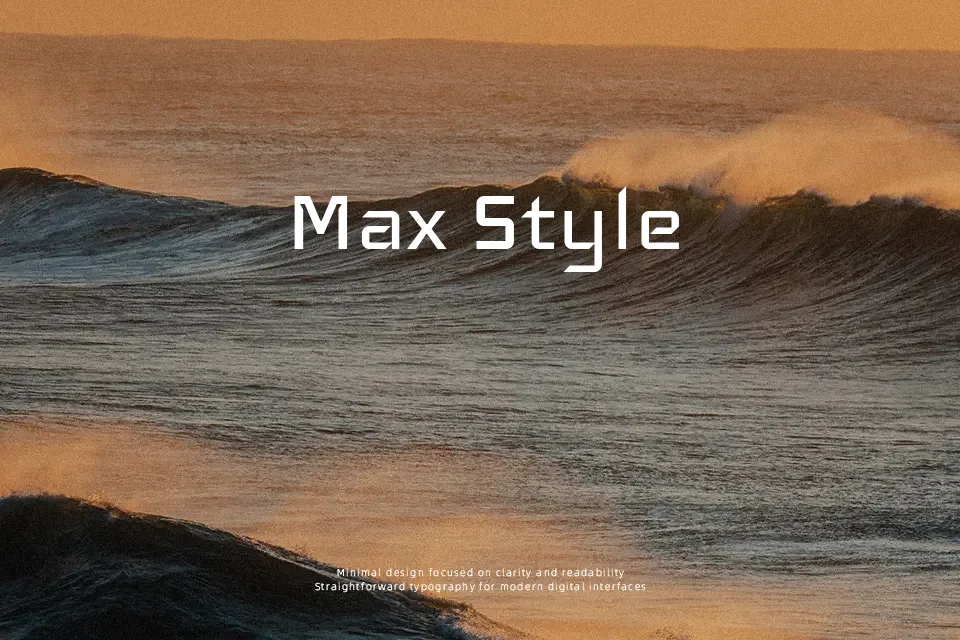
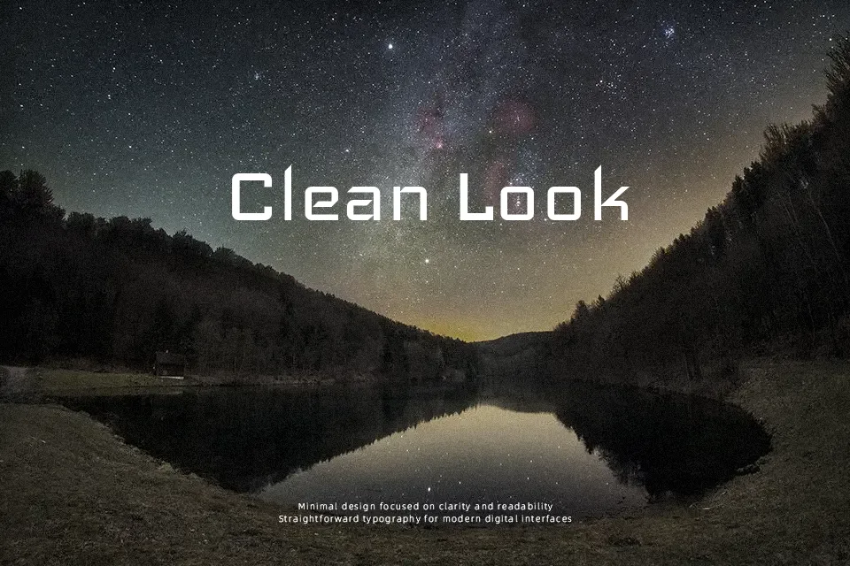
Iceland uses squared counters, straight strokes, and tight, mechanical curves to create a rigid, digital look that feels deliberately cold and utilitarian. The letterforms are modular and squarish rather than smooth, so text feels more like a UI component than handwriting. In practice it works nicely for game titles, cyberpunk key art, streaming overlays, and short UI labels where a techno atmosphere matters more than warmth. For long reading, formal reports, or brands that need a human touch, its harsh geometry can feel stiff and fatiguing, so it is better kept for short, high-impact text.
Best For:
gaming overlays
sci-fi posters
short digital headlines
tech product branding
Not Ideal For:
long paragraphs
formal documents
warm lifestyle brands
small UI body text
Perfect for film, gaming, and headline, with a bold and display style.
License
Gallery