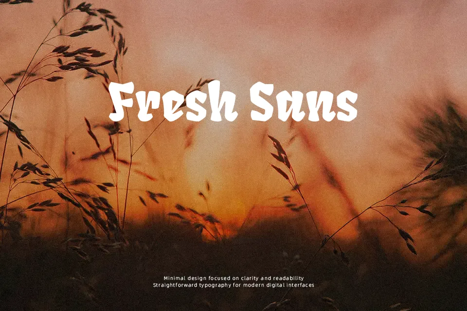
Fruktur Font
Free for Commercial UseAbout
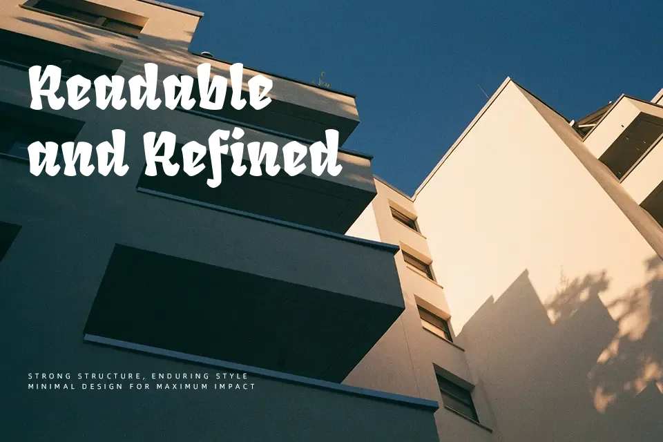
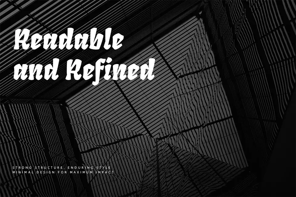
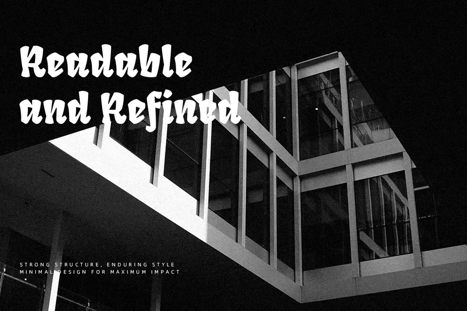
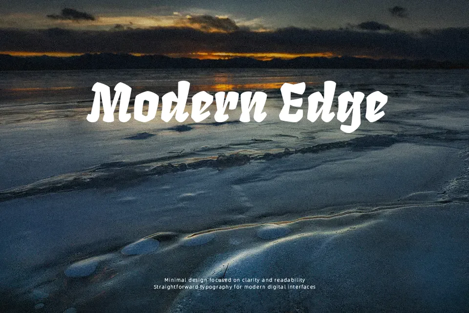
Fruktur reads like a hybrid between warm blackletter and an upright italic: chunky strokes, compact proportions, and slightly softened corners give it a punchy but approachable look. The counters stay open enough that words remain readable when set large, yet the texture quickly feels dense if you try to use it for running text. It comes into its own on projects that need street-style energy with a bit of goth flair—think band artwork, gaming covers, Halloween graphics, or bold YouTube thumbnails rather than restrained editorial work. If you’re torn between classic Fraktur and more casual display faces, this sits comfortably in the middle and works well when you want impact without full-on historical heaviness.
Best For:
headline logos
music or gaming covers
event posters and flyers
Halloween or horror graphics
Not Ideal For:
body copy or long reading
minimal corporate branding
formal documents
Perfect for branding, gaming, and headline, with a artistic and blackletter style.
License
Gallery