Fraunces Font
Free for Commercial UseAbout
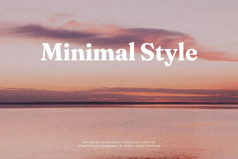
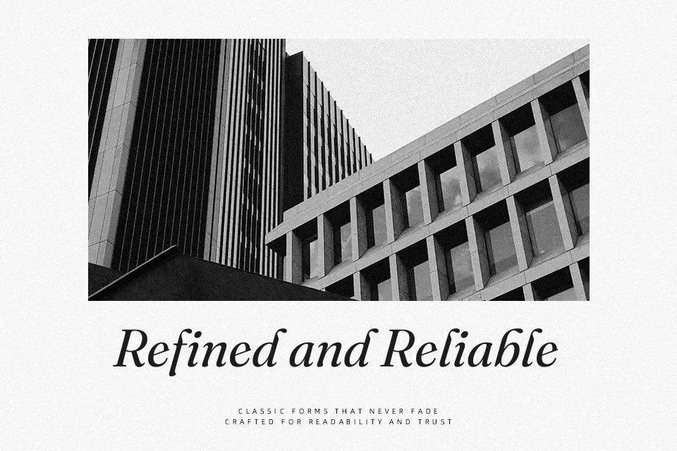
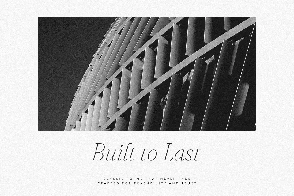
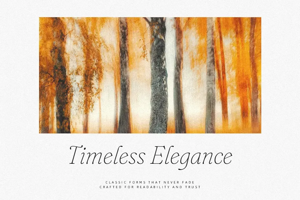
Fraunces is a display-focused old-style serif with soft corners, chunky wedge-like serifs, and a gentle wonkiness that adds personality without turning into a novelty face. Its variable axes for weight, softness, and “wonk” let you dial the look from refined to almost cartoonish, so you can fine-tune how loud or calm the typography feels. In practice, it shines in brand wordmarks, editorial headlines, and packaging systems where you want something traditional at a glance but more playful on closer inspection. I would avoid using it for dense body copy or highly formal documents, as the exaggerated curves and contrast can become tiring over long reads or feel too informal for strict corporate work.
Best For:
expressive editorial headlines
character-driven branding systems
packaging and label typography
hero text on marketing websites
Not Ideal For:
long body paragraphs
strict corporate documents
small-size UI labels
highly technical reports
Perfect for branding, headline, and logo, with a artistic and display style.
License
Gallery