Forum Font
Free for Commercial UseAbout
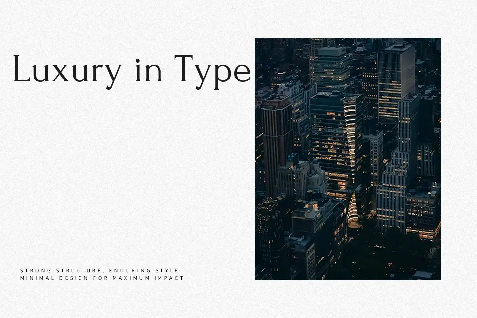
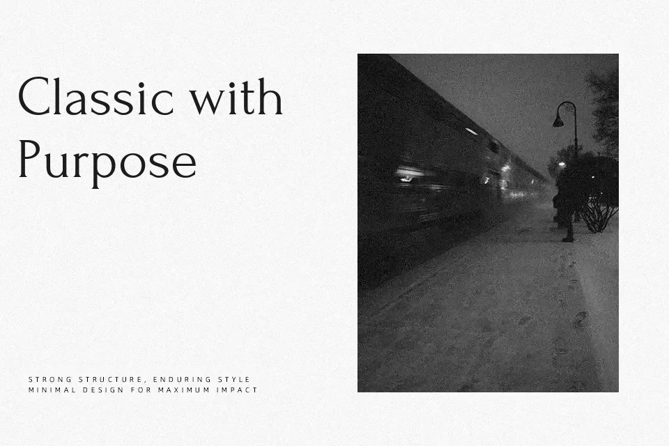
Forum is a high-contrast serif with narrow, upright shapes, crisp triangular serifs, and open counters that echo inscriptional Roman lettering without feeling stiff. The single weight is on the lighter side, so it brings a refined presence rather than heavy impact, while the spacing is tuned to stay readable at moderate body sizes and clear in headings. Visually it comes across as cultured and slightly formal, well suited to book-inspired branding, museum or gallery posters, wine or specialty food labels, and long-form editorial pages that want a historical note without looking dusty. It is less convincing for tiny UI labels or dense technical documentation, where the delicate details and contrast can tire the eye or break down on low-resolution screens.
Best For:
editorial headlines and decks
cultural or literary branding
event posters for museums or galleries
labels for wine and crafted food
Not Ideal For:
very small UI text
dense technical manuals
mobile apps with low-resolution displays
highly informal kids content
Perfect for branding, editorial, and headline, with a classic and display style.
License
Gallery