Fira Sans Extra Condensed Font
Free for Commercial UseAbout
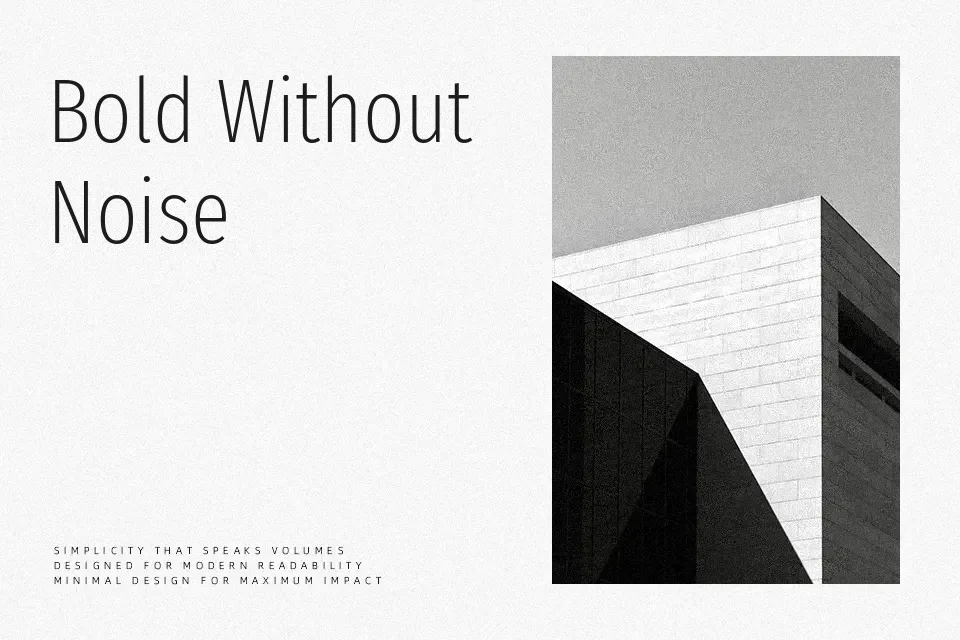
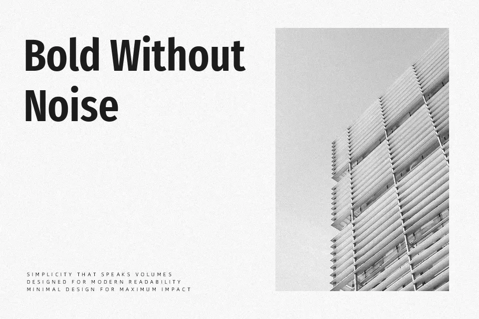
Fira Sans Extra Condensed keeps the humanist structure of Fira but pulls the letters into a much slimmer footprint, with clean verticals, open counters, and relatively tight tracking that still stays readable at medium sizes. The overall impression is **modern** and utilitarian rather than flashy, so it works nicely in dashboards, mobile apps, and information-dense layouts where you need more content on a line without feeling cramped. It can handle short blocks of copy, labels, and subheads, but extended paragraphs start to feel a bit compressed compared to the regular Fira Sans widths. If you like fonts such as condensed UI grotesks but want something slightly softer and more human, this strikes a good balance.
Best For:
UI labels and menus
data-heavy dashboards
space‑constrained headlines
sidebar or caption text
Not Ideal For:
long-form reading text
formal editorial body copy
highly decorative branding
Perfect for advertising, editorial, and headline, with a clean and condensed style.
License
Gallery