Fauna One Font
Free for Commercial UseAbout
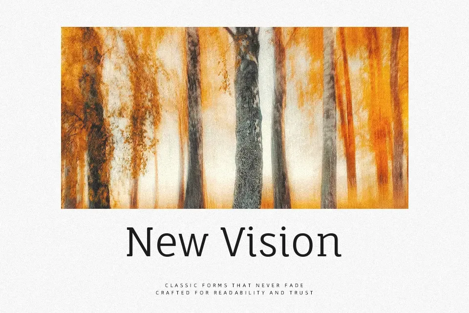
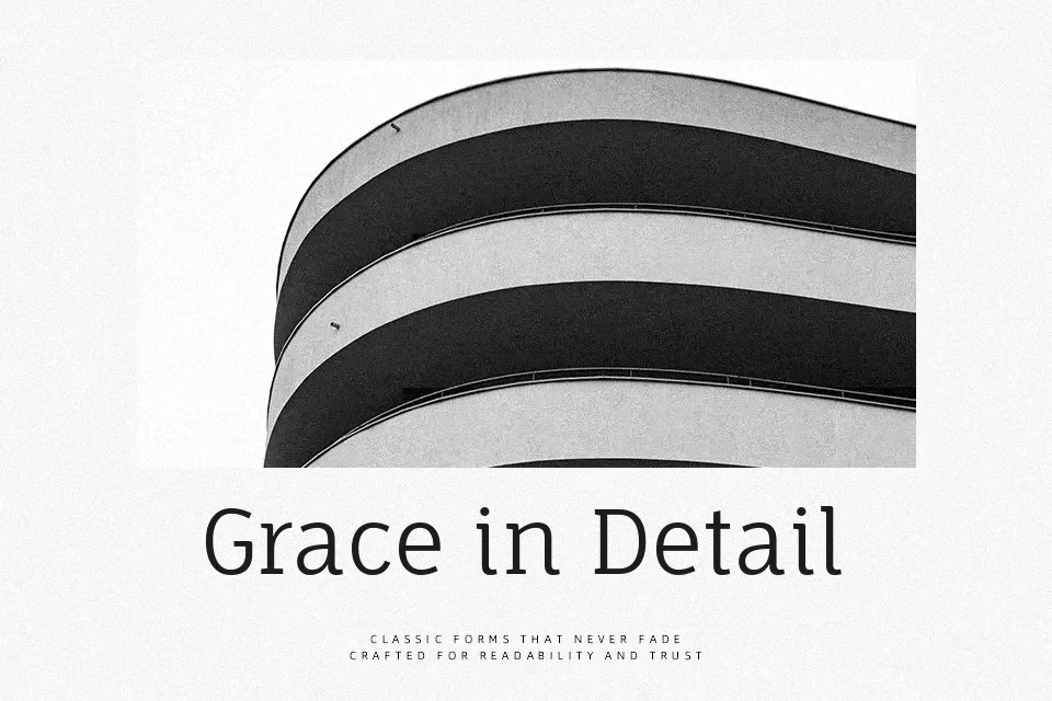
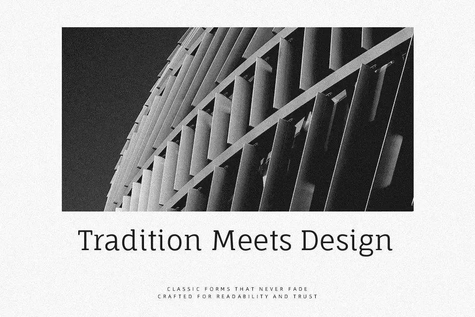
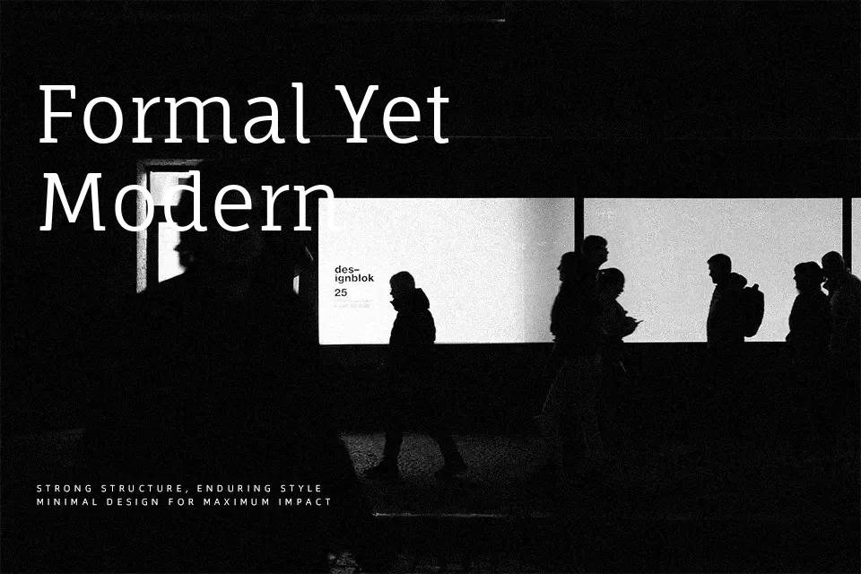
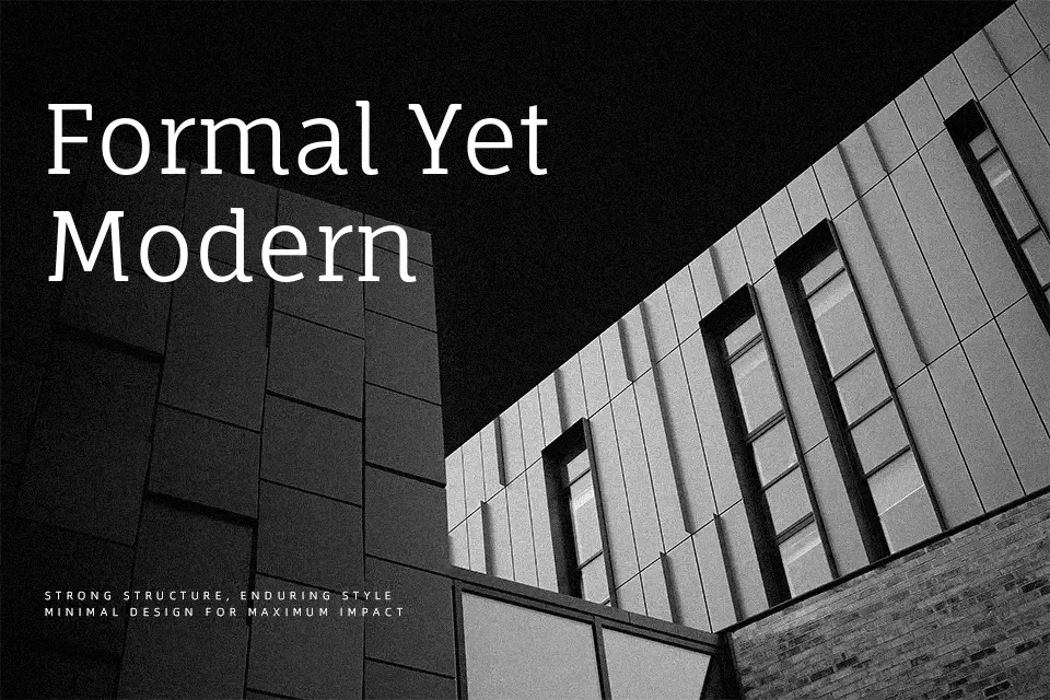
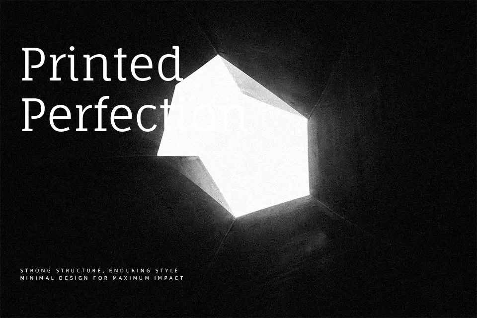
Fauna One has low-contrast strokes, rounded terminals, and a slightly condensed structure that keeps lines compact without feeling cramped. The overall **character** sits between classic serif and humanist slab, so it feels calm and contemporary rather than stiff or overly formal. In practice, it holds up nicely in small to medium-sized body text, especially for blogs, long-form articles, and content-heavy landing pages where you want a softer voice than a strict old-style serif. It also scales to understated headlines or UI labels, but the single regular weight means it struggles in layouts that rely heavily on bold hierarchy or ultra-large display typography. If you like the warmth of humanist serifs but find some book faces too traditional, this sits in a comfortable middle ground.
Best For:
editorial-style websites
long-form blog articles
soft, friendly branding
subtle headings and accents
Not Ideal For:
heavy display headlines
interfaces needing many weights
highly formal corporate documents
tight logo wordmarks
Perfect for body text, branding, and editorial, with a calm and serif style.
License
Gallery