Exo 2 Font
Free for Commercial UseAbout
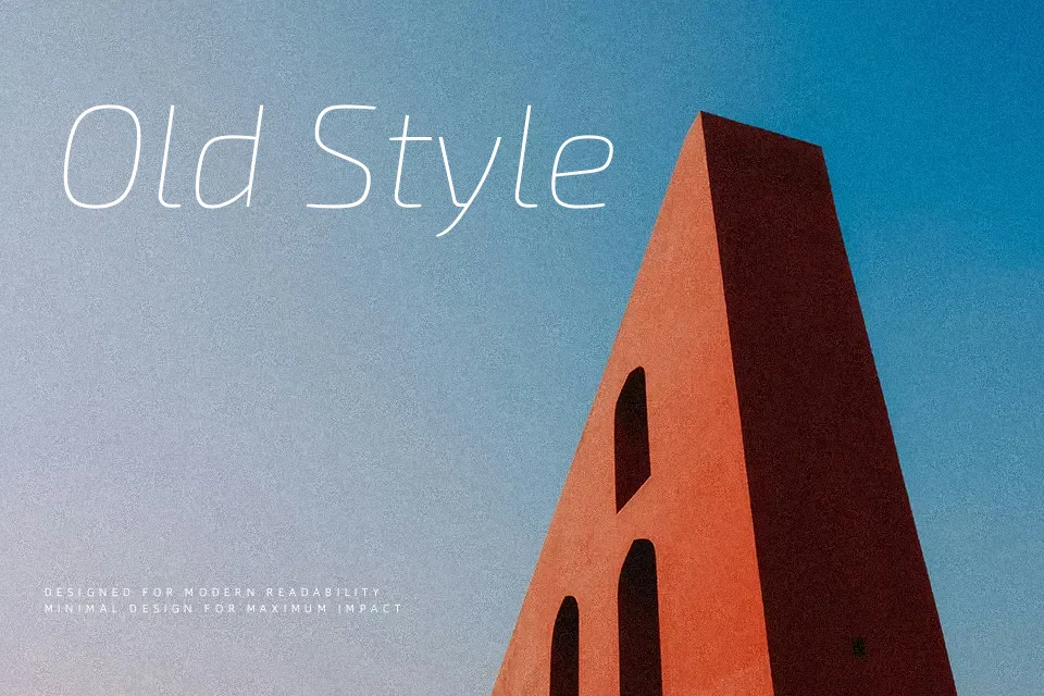
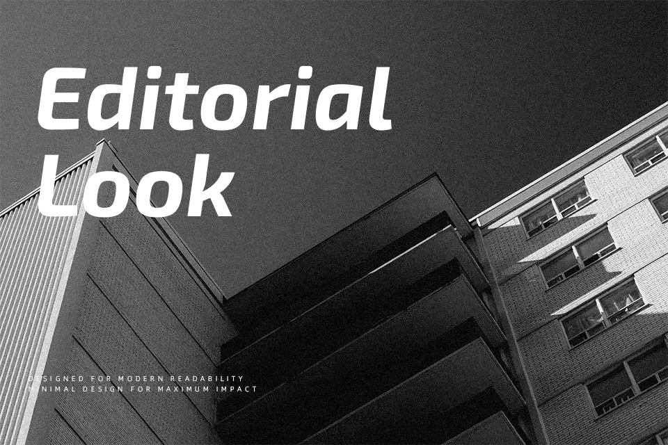
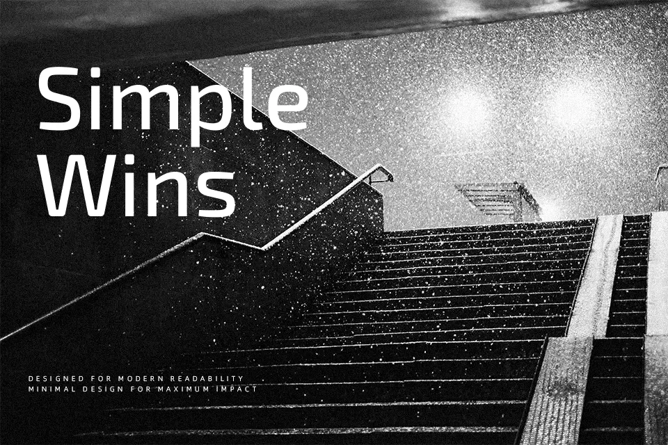
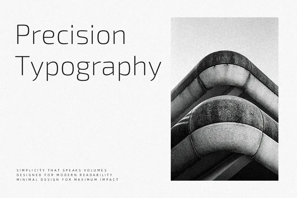
Exo 2 takes the skeleton of a geometric sans and softens it, with controlled stroke contrast, generous x-height, and spacing tuned for screens. It carries a clear technological voice, but the curves feel more organic than many “tech” fonts, so labels, buttons, and microcopy do not look overly mechanical. In practice, it shines in interface design, product landing pages, and data-heavy dashboards, where multiple weights help you build hierarchy without reaching for a second family. If you need a serif-like flow for long editorial reading, it can feel a bit cold and engineered, so I would pair it with a warmer text face there. Compared with other geometric sans families, it leans more futuristic than workhorse grotesks but remains more readable than many sci‑fi display options.
Best For:
UI Design labels and navigation
Tech product landing pages
Data dashboard headings and metrics
Modern branding for digital products
Not Ideal For:
Very long print novels
Traditional formal documents
Highly ornamental logo wordmarks
Luxury-focused editorial layouts
Perfect for advertising, branding, and headline, with a clean and geometric style.
License
Gallery