Englebert Font
Free for Commercial UseAbout
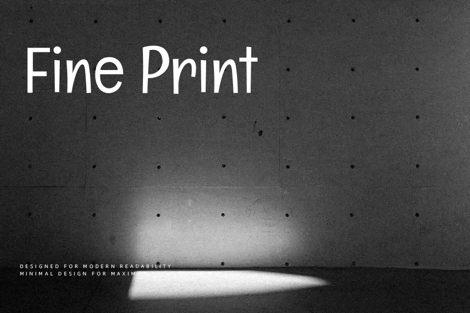
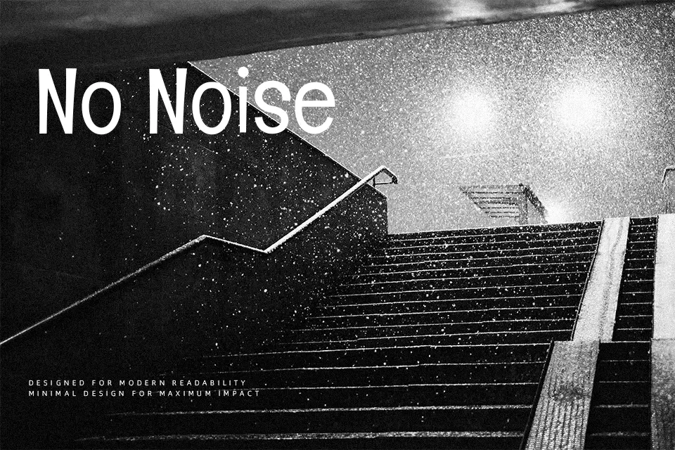
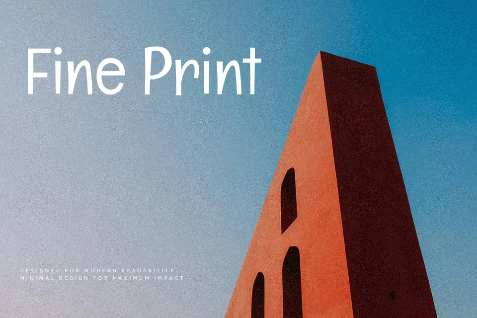
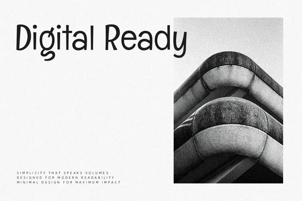
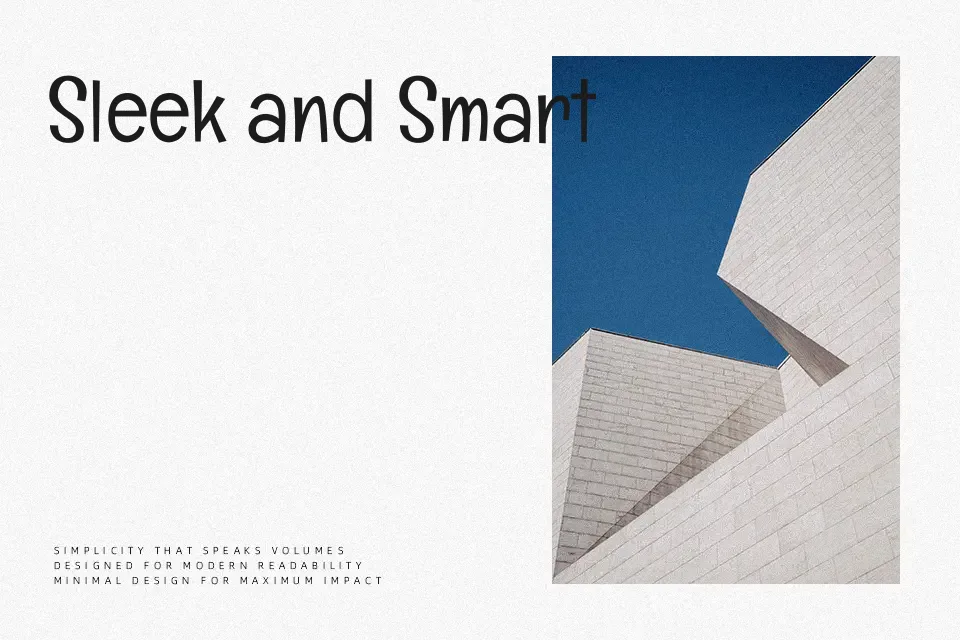
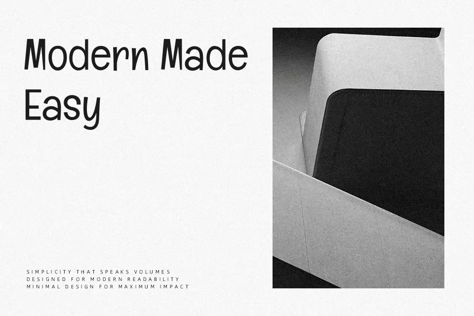
Englebert has slender strokes, open counters, and a loose, handwritten-like construction that still reads as a clean sans serif. The letters lean slightly with irregular touches, giving text a human, informal tone rather than a polished corporate feel. It tends to shine in short, punchy lines—think display titles, labels, or UI tags—where its gentle awkwardness feels intentional and charming. For dense editorial layouts or strict, formal branding systems it can look too casual, so you may want a more neutral grotesk there. If you like relaxed geometric sans styles but want something more characterful, this strikes a nice middle ground.
Best For:
friendly headlines
casual product labels
social media graphics
lightweight UI text
Not Ideal For:
long paragraphs
formal corporate reports
legal or academic documents
high-contrast print body text
Perfect for branding, headline, and logo, with a clean and display style.
License
Gallery