Electrolize Font
Free for Commercial UseAbout
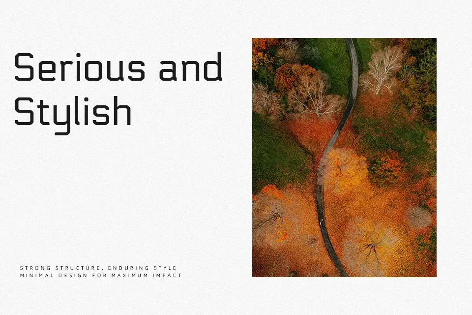
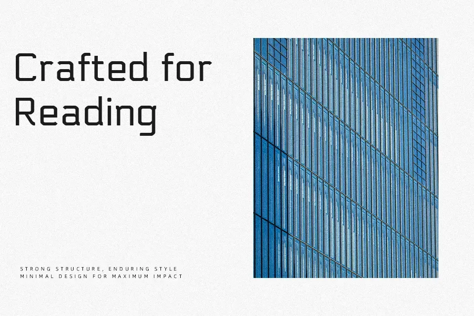
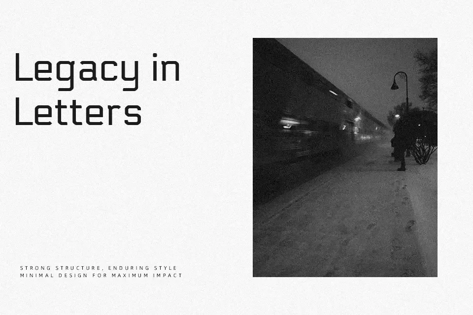
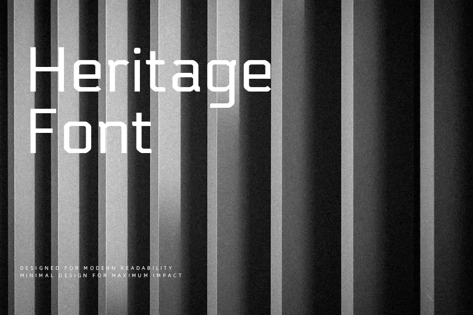
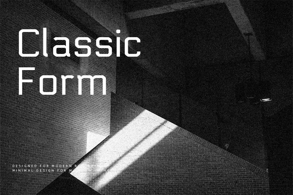
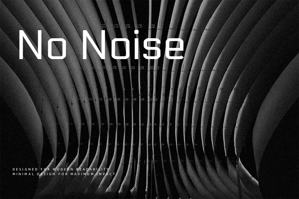
Electrolize uses compact, rectangular letterforms with straight strokes, tight joins, and generous counters that keep the texture clean even at smaller sizes. The overall impression is modern and faintly industrial: it feels technical without becoming gimmicky, thanks to humanistic proportions that soften the geometry. I like it for interface typography, streaming overlays, and tech product landing pages where you want a “digital” voice that still reads quickly. It can also work for short editorial callouts or numeric data in dashboards. On the other hand, the rigid structure and single weight make it less convincing for long-form reading, expressive branding, or projects that need warmth or ornament, where a more nuanced family will serve you better.
Best For:
UI labels and dashboards
tech product landing pages
gaming or sci-fi titles
data-heavy infographic accents
Not Ideal For:
long paragraphs or books
formal corporate documents
romantic or hand-crafted branding
projects needing multiple weights
Perfect for advertising, gaming, and headline, with a clean and geometric style.
License
Gallery