DK Kaikoura Font
Free for personal useAbout
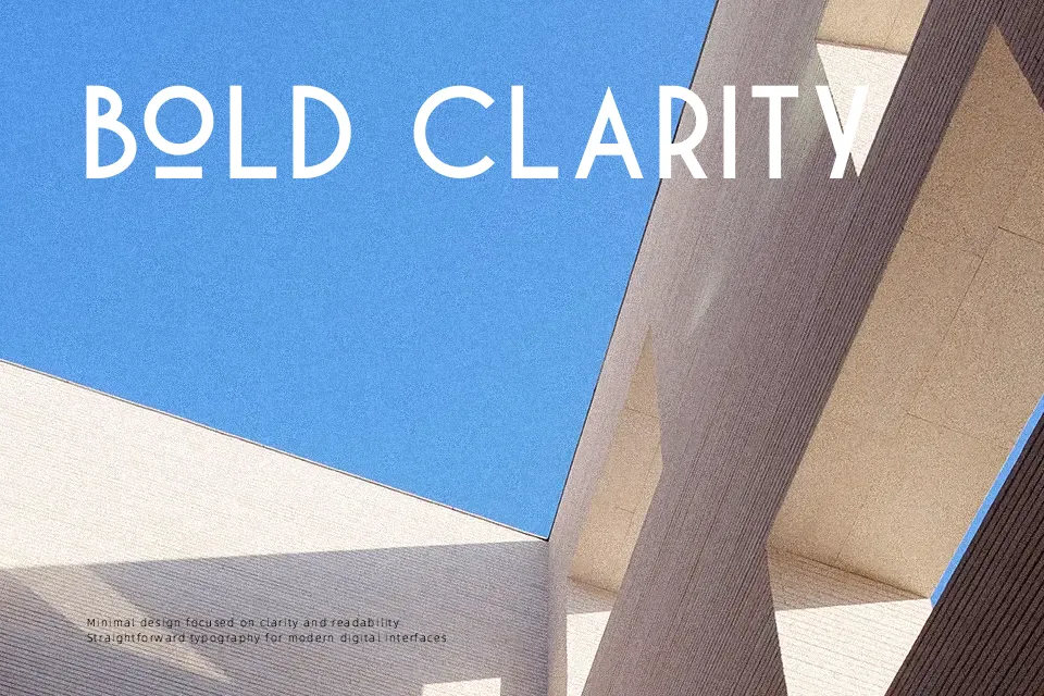
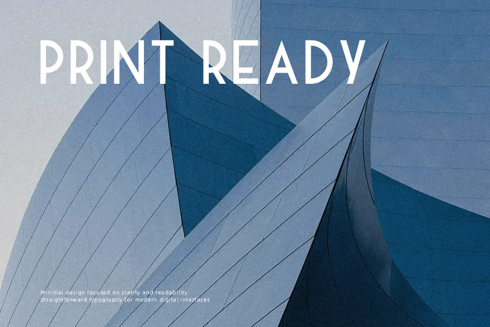
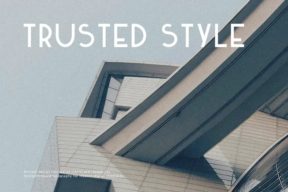
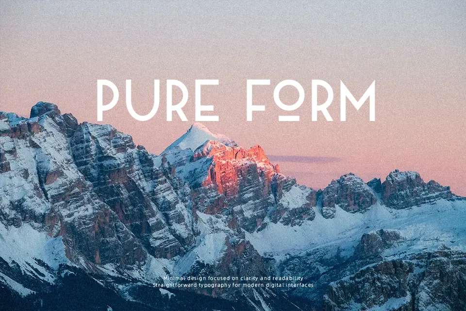
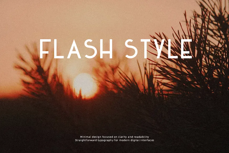
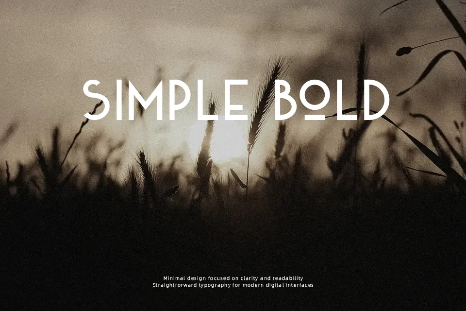
DK Kaikoura leans into an Art Deco look with high-contrast geometric capitals, clean vertical strokes, pointed joins, and generous spacing that gives each letter room to stand out. It feels decorative rather than neutral, with a polished vintage tone that works well on poster titles, restaurant marks, packaging, and editorial covers that need a 1920s-inspired voice. The all-caps structure gives it presence, but that same rigidity makes it less convincing in long text or compact interface settings. I would use it when the lettering needs to carry the mood on its own, not when clarity at small sizes is the main job.
Best For:
Art Deco poster headlines
vintage café branding
packaging with a retro tone
editorial cover titles
Not Ideal For:
long reading text
small UI labels
dense mobile layouts
formal corporate documents
Perfect for branding, headline, and packaging, with a artistic and decorative style.
License
Gallery