DK Henceforth Font
Free for personal useAbout
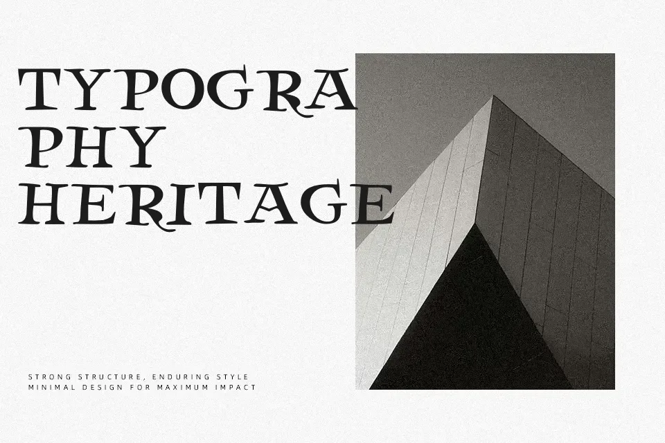
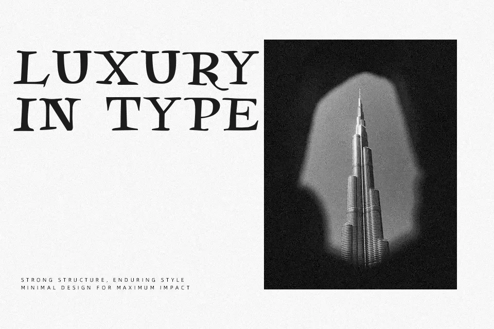
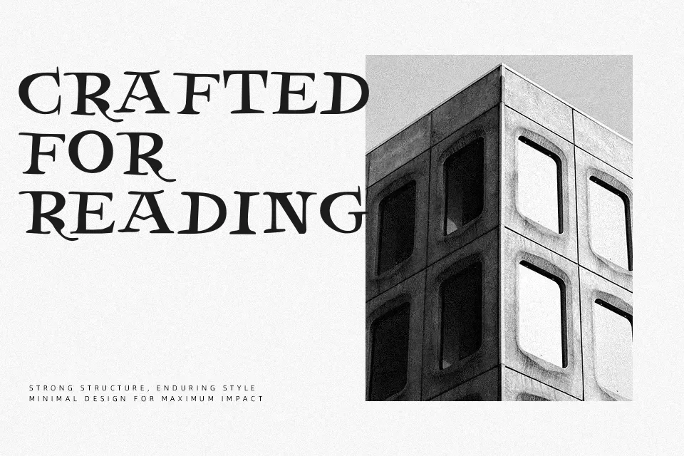
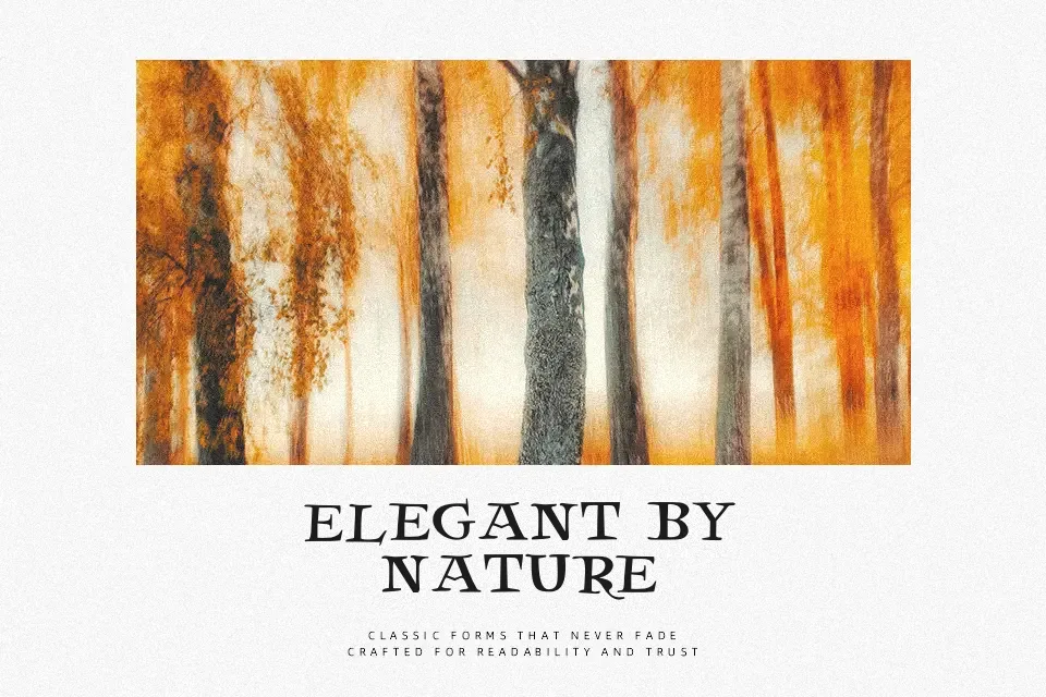
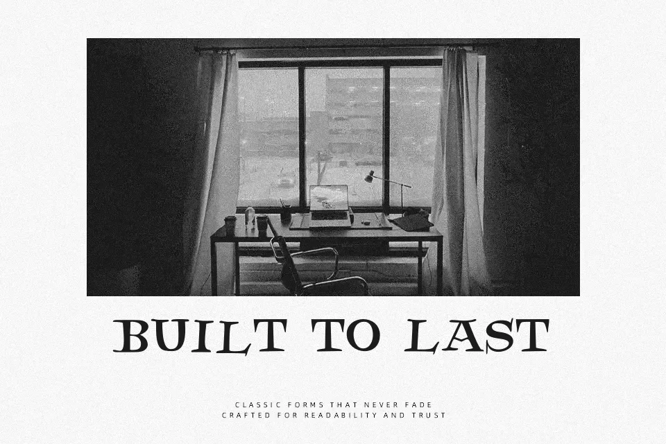
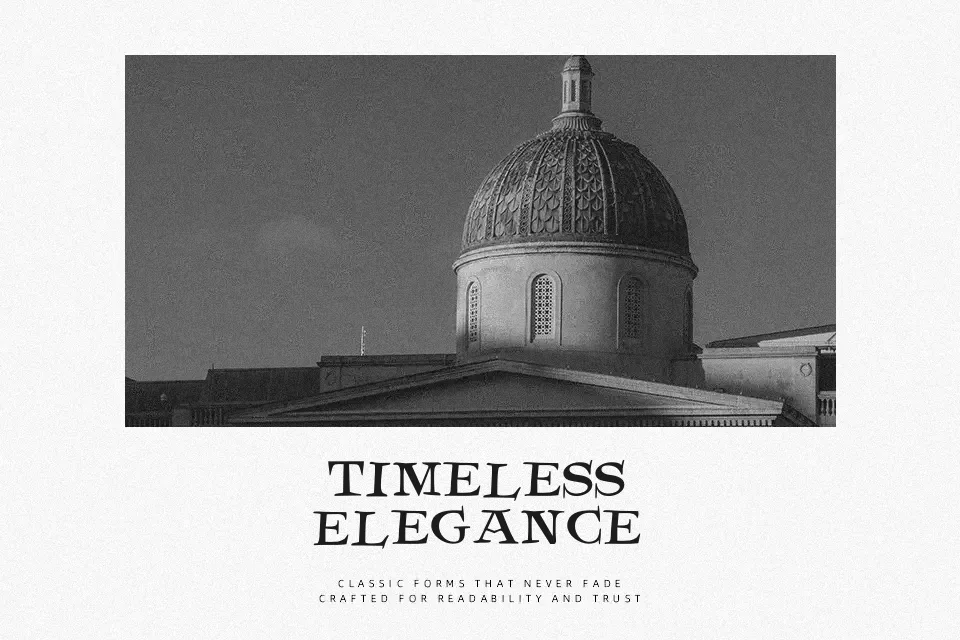
DK Henceforth Font has a condensed serif structure with high contrast strokes, pointed serifs, and slightly aggressive curves that give it a stern, theatrical voice. The spacing feels tight enough for impactful titles, while the letterforms carry a worn, almost gothic tension without becoming fully blackletter. It works best when you want a headline to feel severe, historical, or ominous, especially for book covers, music graphics, liquor labels, or moody brand marks. It is less comfortable in long reading passages, cheerful packaging, or UI copy, where its sharp details start to feel heavy and distracting.
Best For:
dark book covers,album artwork,dramatic poster titles,moody branding
Not Ideal For:
body text,kids packaging,friendly UI copy,light wedding stationery
Perfect for branding, headline, and logo, with a artistic and decorative style.
License
Gallery