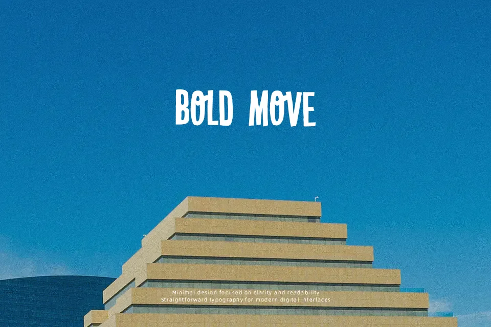
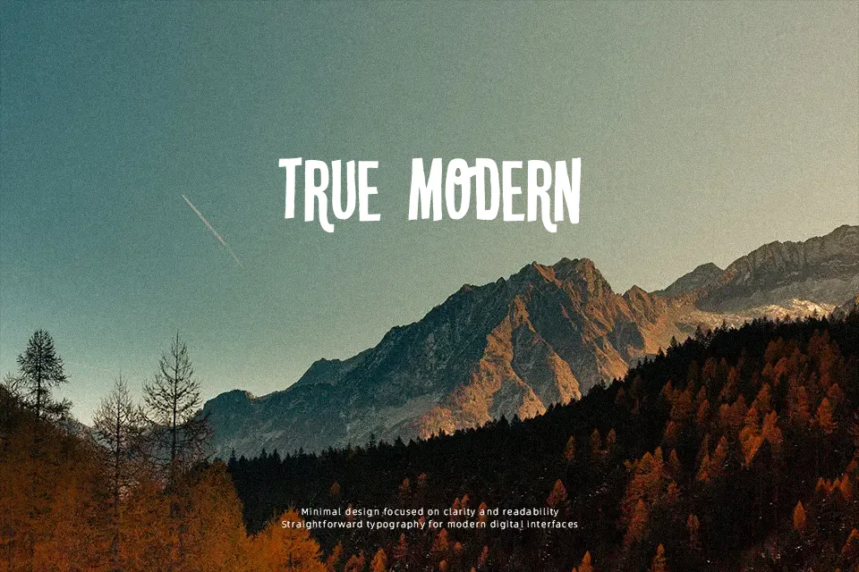
DK Crypt Font
Free for personal useAbout
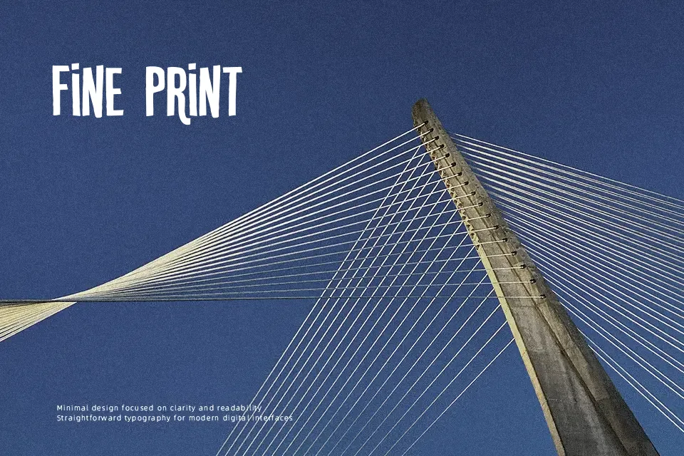
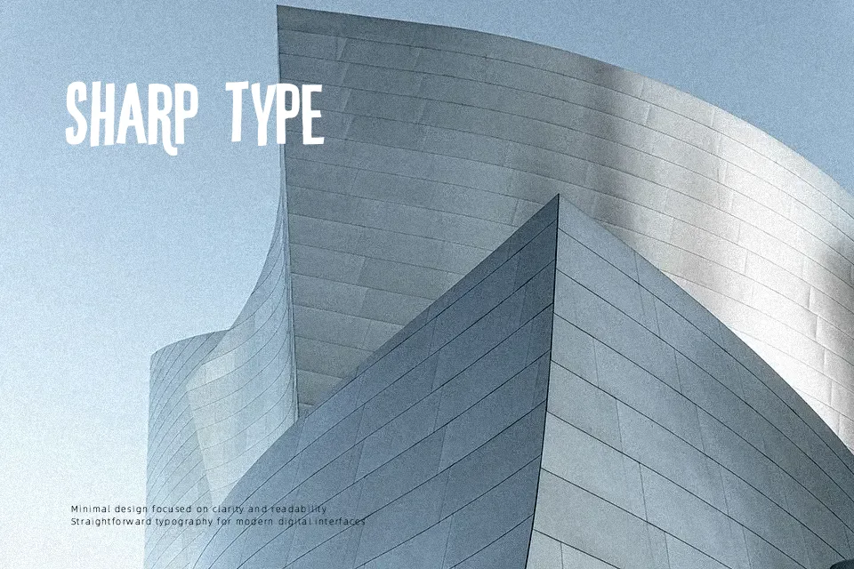
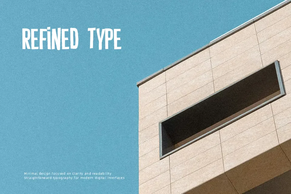
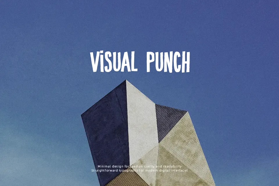
DK Crypt leans into old pulp-horror territory with tall, condensed capitals, uneven edges, and a slightly battered silhouette that keeps the letters feeling alive rather than mechanical. The strokes are fairly heavy, spacing is tight, and the narrow structure helps short words stack well on posters, teaser graphics, escape room material, or chapter openers for spooky fiction. It works best when you want tension without turning fully into novelty lettering. That said, the font loses comfort quickly in long lines, and some shapes become cramped at small sizes, so it is better used for impact than reading ease.
Best For:
horror film titles, Halloween event posters, escape room branding, spooky book covers
Not Ideal For:
body text, small UI labels, formal corporate layouts, long editorial reading
Perfect for film, gaming, and halloween, with a dark and condensed style.
License
Gallery