Dixociative Font
Free for personal useAbout
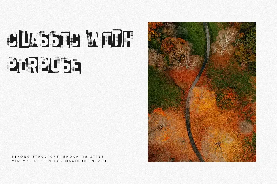
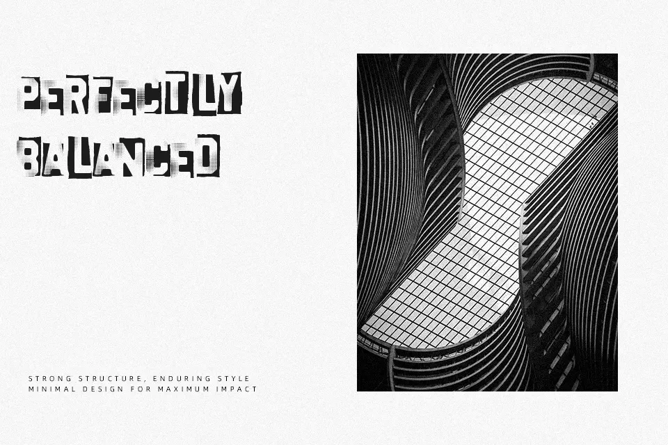
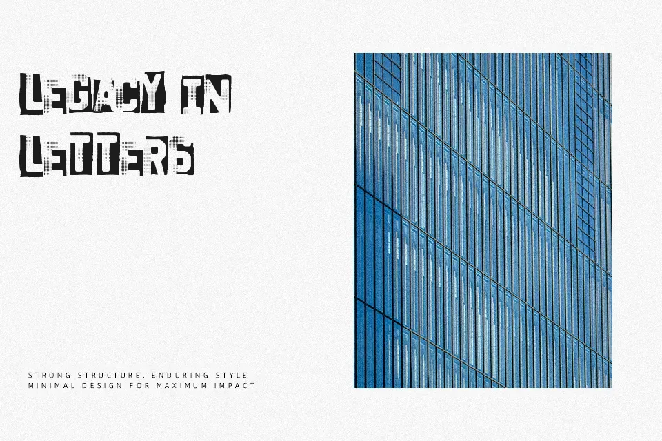
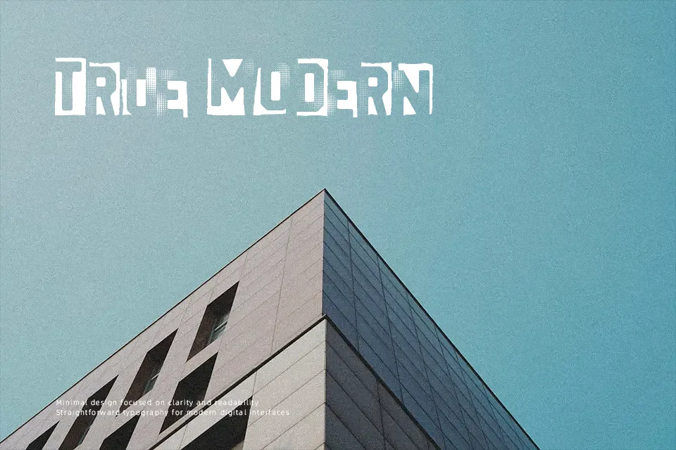
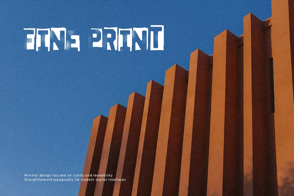
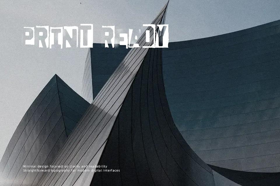
Dixociative Font is a narrow, high-contrast display design built from angular strokes, uneven cut-ins, and fragmented counters that give each letter a damaged, vibrating look. Spacing feels tight, which helps short words hit hard, especially in titles and cover art. It reads as decorative and slightly aggressive rather than clean or formal. I would use it for horror flyers, experimental album graphics, or seasonal event headers where discomfort is part of the mood. It loses clarity quickly in small sizes, though, so it is a poor fit for body copy, interface labels, or branding that needs a calm and trustworthy tone.
Best For:
horror posters,album cover titles,Halloween event graphics,experimental headline art
Not Ideal For:
body text,UI labels,corporate branding,formal editorial layouts
Perfect for halloween, headline, and music, with a dark and condensed style.
License
Gallery