Changa Font
Free for Commercial UseAbout
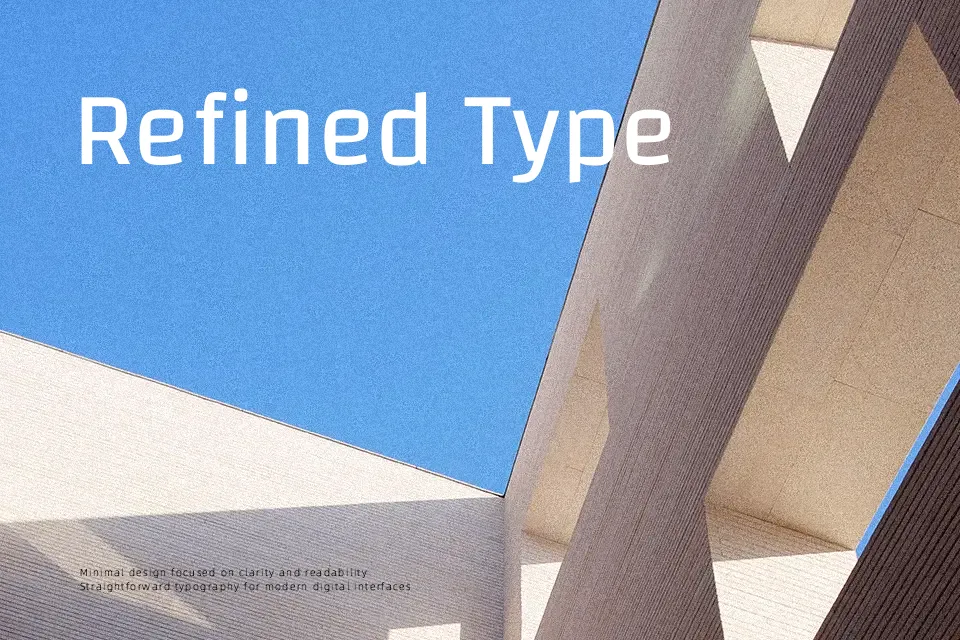
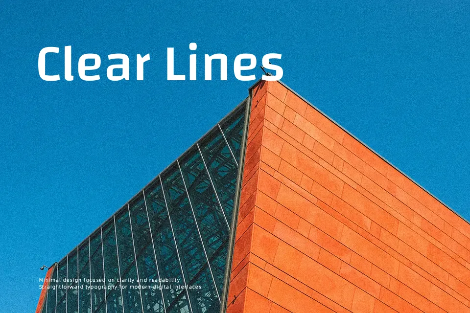
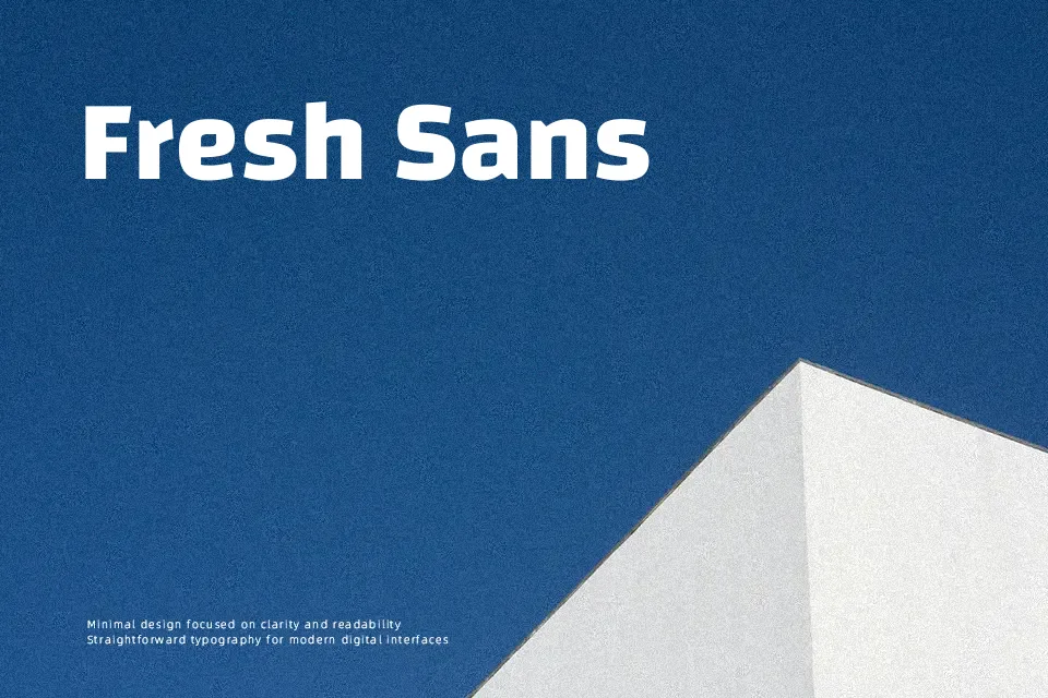
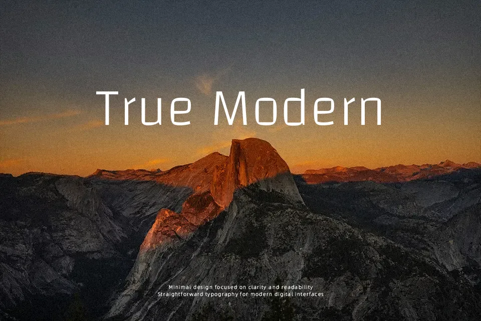
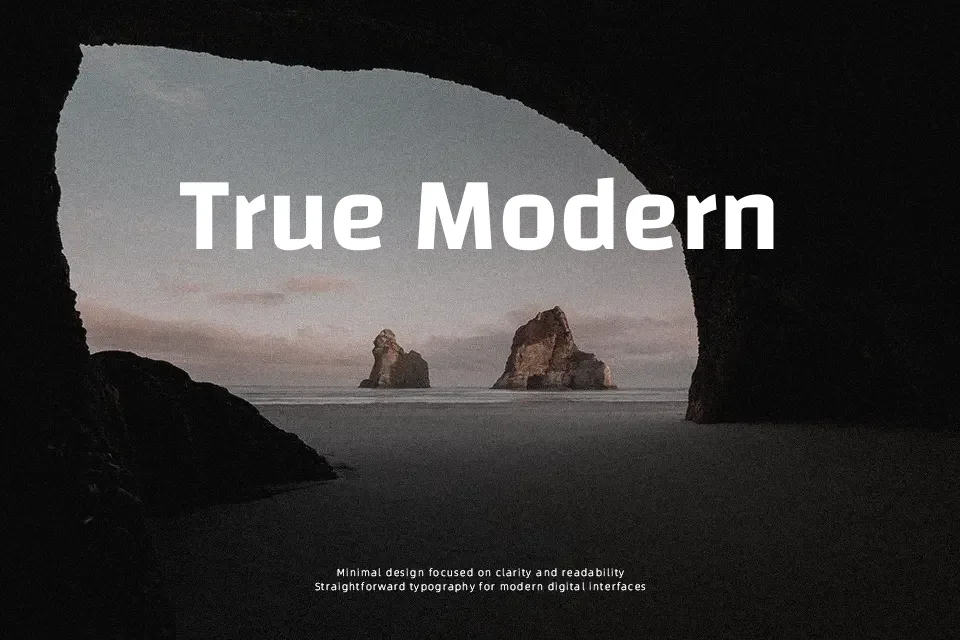
Changa combines short ascenders and descenders with a square, compact construction, so lines can sit close together without feeling cramped. Its strokes are sturdy and mostly monolinear, giving text a contemporary, slightly technical voice that still reads smoothly at medium sizes. Because it handles both Latin and Arabic scripts with consistent visual rhythm, it suits dashboards, app menus, and signage systems that need clear hierarchy in very limited vertical space. It can feel a bit rigid for warm, highly expressive branding, and long, book-style reading can come across as tiring compared with more relaxed text faces.
Best For:
UI labels and controls
bilingual wayfinding and signage
tight web or app headlines
data-heavy dashboards
Not Ideal For:
long-form editorial reading
highly decorative branding
formal printed documents
very small caption text
Perfect for branding, editorial, and headline, with a clean and geometric style.
License
Gallery